gpuix-svelte
Work in progress. Experimental — built on Svelte's unreleased
custom renderer API. Tested on macOS / Windows, also compatible with Linux.
[!IMPORTANT]
Needs Node.js >= 24 or Bun >= 1.4.0. The liquid-glass FFI demo alone needs Node 26.1,
which is where the built-in node:ffi it drives its ObjC shim through landed (Bun uses bun:ffi).
Svelte custom renderer for GPUI (Zed's GPU-accelerated UI framework), via
@gpuix/native. Native desktop windows from ordinary
Svelte components — no webview.
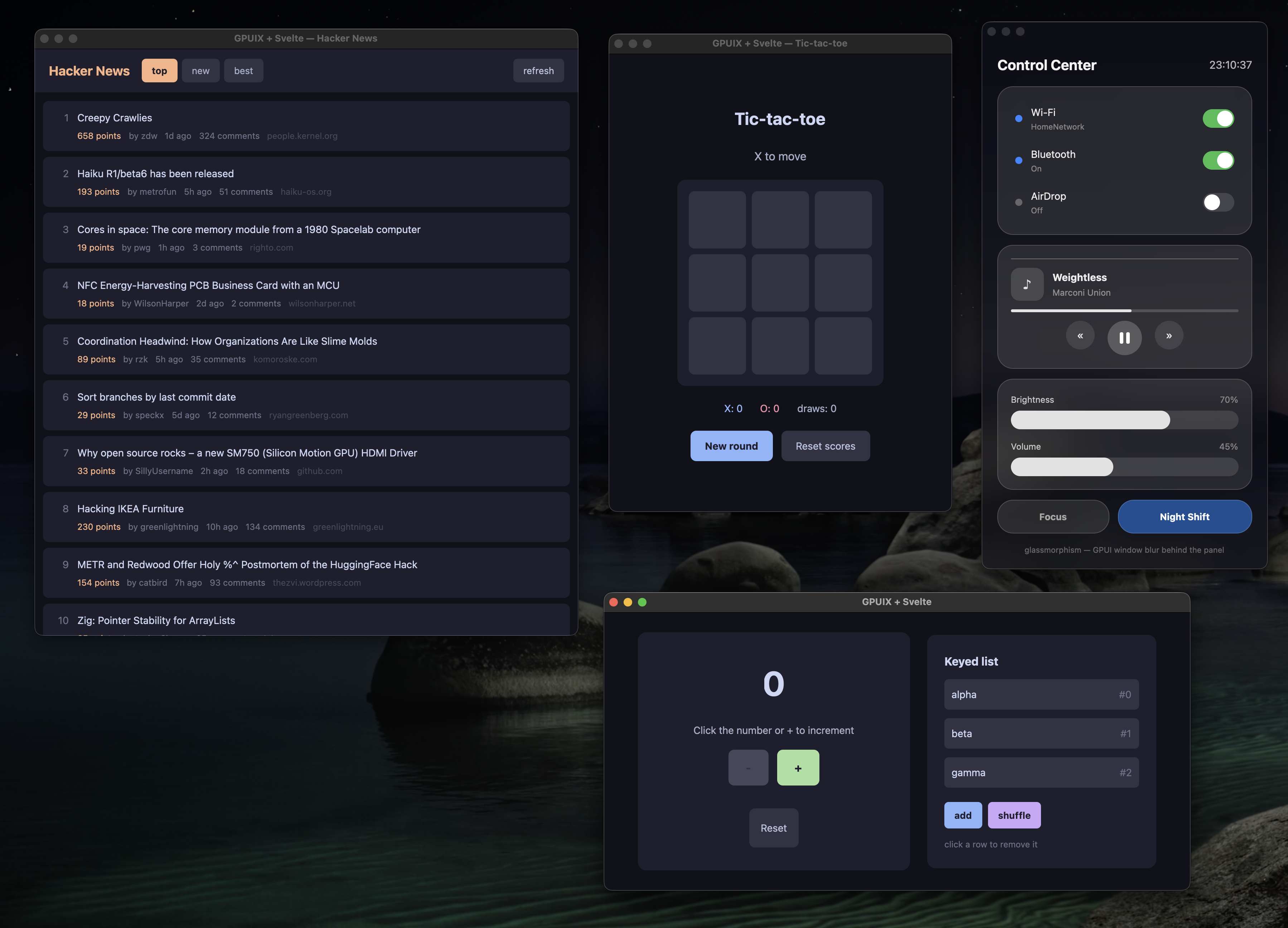
What does it look like?
The four demos — Hacker News, tic-tac-toe, the liquid-glass control center and the counter — each in
its own native window.
Try it
No Rust or other toolchains needed — the native binary comes prebuilt from npm.
git clone https://github.com/khromov/gpuix-svelte
cd gpuix-svelte
npm install
npm run demo              # all four demos at once
npm run demo:counter      # counter — edit examples/counter/Counter.svelte and save to hot-reload
npm run demo:tictactoe    # tic-tac-toe with score tracking
npm run demo:hn           # Hacker News reader (live data, scrollable list)
npm run demo:glass        # liquid-glass control center (GPUI's blurred translucent window)
npm run demo:glass-ffi    # same app on REAL Liquid Glass — NSGlassEffectView via FFI
                          # (macOS 26+; falls back to the window blur elsewhere)
npm run demo:styling      # styling playground — which CSS text reaches GPUI and which is dropped
npm run demo:web          # tic-tac-toe in a browser, on GPUI's WebAssembly/WebGPU build (Bun only)
npm run tutorial          # interactive onboarding guide — 12 steps with live samples and quizzes
npm run brain             # Substrate, a "second brain": notes, links, images and voice memos,
                          # searched by meaning, keyword and image content with on-device models,
                          # plus an OpenAI-compatible chat over it all. Bun only; run
                          # `npm run brain:install` first — see examples/second-brain/README.md
npm run brain:compile     # Substrate as dist/Substrate.app (macOS), models and all
npm test                  # headless renderer tests
New here? npm run tutorial (or bun run tutorial) opens a guided walkthrough of the renderer that
is itself a gpuix-svelte app: each step pairs an explanation and a diagram with the source of a
small component and that component running live, and ends with a quiz.
Every command has a Bun twin under a bun: prefix — npm run bun:test,
npm run bun:demo, npm run bun:demo:counter, and so on. They run the same entry points through
Bun, which gets the .svelte loader as a --preload instead of an --import. Dependencies
still come from npm install either way; there is one lockfile, and CI runs both runtimes.
The one exception is Substrate (npm run brain), which is built on Bun's own APIs — bun:sqlite,
Bun.spawn IPC, Bun.Image, HTMLRewriter, bun:ffi — and shows what a complete application
on this renderer looks like: a hand-rolled router, .svelte.ts state modules that survive hot
reloads, light and dark themes as one set_css_vars() palette, the package's Scroller and
Portal, a background worker process for transformers.js, and OS integrations for everything GPUI
has no API for.
Build a standalone binary
Bun can compile an example into one executable that runs without Node, Bun or node_modules:
npm run compile        # tic-tac-toe → dist/tictactoe (dist\tictactoe.exe on Windows)
npm run compile:app    # macOS: additionally wraps it as dist/Tic-tac-toe.app
The result is ~80 MB — the Bun runtime, the Svelte runtime and the 17 MB GPUI addon. It is built
for the machine it runs on: run the same command on macOS (arm64), Linux (x64) or Windows (x64) to
get that platform's binary. There is no cross-compiling, since npm only installs the addon prebuilt
for the host.
The output is unsigned by default, and macOS blocks a downloaded unsigned copy until it is allowed
under System Settings → Privacy & Security. See Signing.
Run it in a browser
The same components run on the web, because GPUI itself compiles to WebAssembly and paints a
WebGPU canvas. This is not a DOM renderer — no HTML elements are produced — so what you get is the
desktop app, pixel for pixel, inside a <canvas>:
npm run demo:web                  # → http://localhost:4173
npm run demo:web -- --production  # minified, Svelte's production runtime
examples/tic-tac-toe/web.ts is the entry, and it is the same two lines as the desktop one — the
component, the renderer and your styles are unchanged. Only the plumbing differs:
- Bun only.
@gpuix/native ships the wasm and points its browser field at it, and the loader
imports the binary with with { type: 'file' } — an attribute only Bun's bundler reads.
- The page must be cross-origin isolated. GPUI's wasm uses shared memory, so whatever serves it
has to send
Cross-Origin-Opener-Policy: same-origin and
Cross-Origin-Embedder-Policy: require-corp, and serve .wasm as application/wasm.
scripts/web.ts does this; opening the HTML from disk will not work.
- The window options are ignored.
title, width and height mean nothing to the wasm
renderer — the canvas fills the page, so size it with CSS in index.html.
- It is a 19.9 MB download, uncompressed. Serve it with compression in anything real.
Signing
macOS
compile signs when CODESIGN_IDENTITY names a Developer ID Application certificate in your
keychain; compile:app also notarizes and staples the bundle when NOTARY_PROFILE names a
notarytool keychain profile, and leaves dist/Tic-tac-toe.zip ready to ship. One-time setup:
Create an app-specific password at https://account.apple.com → Sign-In and Security →
App-Specific Passwords.
Store it under a profile name, with the team ID from your certificate:
xcrun notarytool store-credentials notary --apple-id [email protected] --team-id TEAMID --password xxxx-xxxx-xxxx-xxxx
A 403 "required agreement is missing or has expired" means the Account Holder has to accept the
current Program License Agreement at https://appstoreconnect.apple.com/agreements; it can take a
while to propagate after that.
Put both variables in a .env at the repo root — gitignored, and Bun loads it when it runs the
script — so plain npm run compile:app signs from now on:
CODESIGN_IDENTITY="Developer ID Application: Your Name (TEAMID)"
NOTARY_PROFILE=notary
If Apple rejects a submission the script prints the submission output and exits;
xcrun notarytool log <submission-id> --keychain-profile notary has the reason.
Use in your own project
npm install gpuix-svelte
That is the whole install. The renderer only works with one specific build of Svelte's unreleased
custom-renderer branch, so the package ships that build inside itself (as a bundled dependency,
under node_modules/gpuix-svelte/node_modules/svelte) and its loaders resolve every svelte
import to that copy — from your .svelte files, your .ts files and the package alike. Do not
add svelte to your own dependencies: the registry's svelte has the same version number and
none of the API, and the package would ignore it anyway. Bun and pnpm work the same way.
starter/ is the smallest complete project — copy it and npm install.
// app.ts
import { render_hot } from "gpuix-svelte";

render_hot(new URL("./App.svelte", import.meta.url), {
  title: "Hello GPUI",
  width: 820,
  height: 560,
});
Run it through the package's bin:
npx gpuix-svelte app.ts          # Node
npx gpuix-svelte --bun app.ts    # Bun
Three things have to be true before your entry module resolves, and the bin does all of them: Svelte
must be resolved with the custom-renderer condition (without it svelte is its server build and
mount() doesn't exist), the .svelte loader must be installed, and on Node the package's
TypeScript sources need tsx (it ships as a dependency — Node's own type stripping
refuses to run under node_modules). Spelled out, the bin runs
node --conditions custom-renderer --conditions development --import tsx --import gpuix-svelte/register app.ts
bun  --conditions custom-renderer --conditions development --preload gpuix-svelte/plugin app.ts
which you can run by hand instead (on Bun, preload = ["gpuix-svelte/plugin"] in a bunfig.toml
replaces the --preload; tsx has to come before gpuix-svelte/register, or it falls back to
off-thread hooks the .svelte loader can't chain with, and a bare --import tsx only resolves
where your package manager hoists it — the bin resolves its own copy). Flags before the entry go
to the runtime (gpuix-svelte --experimental-ffi app.ts); arguments after it go to your script.
Plain JavaScript entries work too; .ts is what the examples use.
The package ships TypeScript sources, not declaration files, so to typecheck your own code against
it tsc needs "allowImportingTsExtensions": true (which implies "noEmit": true — a tsx or
bundler workflow), @types/node, a paths entry pointing at the bundled Svelte (it is nested
inside the package, where tsc would not look from your files) and a *.svelte module
declaration — starter/tsconfig.json and starter/svelte.d.ts are the copy-and-paste versions:
// tsconfig.json
{
  "compilerOptions": {
    "module": "nodenext", "strict": true, "noEmit": true, "allowImportingTsExtensions": true,
    "customConditions": ["custom-renderer", "development"], "types": ["node"],
    "paths": {
      "svelte": ["./node_modules/gpuix-svelte/node_modules/svelte"],
      "svelte/*": ["./node_modules/gpuix-svelte/node_modules/svelte/*"]
    }
  }
}
See HOWTO.txt for a few more details and troubleshooting notes.
Styling
There is no CSS engine. The style attribute is parsed into a plain object and sent to GPUI,
whose layout is flexbox in logical pixels. <style> blocks work for class rules, compiled the
same way.
<div class="btn" style="padding: 8px 16px; border-radius: 8px">Click</div>

<style>
  .btn { background-color: #313244; color: #cdd6f4; }
  .btn:hover { background-color: #45475a; }
</style>
What works
- Inline
style and style: directives. Box shorthands (padding: 8px 16px, margin,
border-width, border-radius, gap, inset) expand to GPUI's longhands.
<style> rules made of classes, at most one tag, and :hover / :active: .btn,
.btn.primary, .a, .b, div. Scoped per component like Svelte's DOM output. Specificity is
class count, then source order; inline style always wins. class: directives and dynamic
class strings restyle live.hover="..." and active="..." attributes: :hover and :active styles set directly on the element.var(--token) and var(--token, fallback) in class rules and inline styles, on any property.
Values come from set_css_vars({ token: '#fff' }); a theme switch is one call — see
Theming with CSS variables.- Any CSS colour syntax: hex,
rgb(), hsl(), named colours.
display: flex | grid and the flexbox properties, position: absolute, overflow: hidden | scroll,
opacity, cursor, white-space, text-overflow, font-*, text-align.
What doesn't work
- Units other than
px (rem, em, vh), and % or auto outside width / height /
min-* / max-*. Dropped with a warning, so margin: 0 auto never centers.
- Shorthands GPUI has no field for:
flex: 1 (use flex-grow: 1), border: 1px solid #fff (use
border-width + border-color), background: linear-gradient(...), box-shadow.
line-height: 1.5 means 1.5 px. Always give it a unit.display: none and visibility do nothing. Use {#if}.- Other selectors: descendant combinators,
:global, attribute selectors, @media, nesting.
Refused at compile time with a warning.
transform, transition, z-index, text-decoration, letter-spacing are silently ignored.
Only text properties (colour, font) inherit from a parent.- Probably a lot of other things from CSS.
Working, standard CSS semantics
Values are logical pixels unless noted. Only the listed keywords are recognised.
- Layout:
display: flex | grid; flex-direction: row | column; flex-wrap: wrap | wrap-reverse | nowrap;
flex-grow, flex-shrink, flex-basis; gap, row-gap, column-gap.
- Alignment:
align-items: center | start | end; align-self: center | start | end | stretch | baseline;
align-content: center | start | end | space-between | space-around | space-evenly | stretch | normal;
justify-content: center | start | end | space-between | space-around (the flex- prefixed forms too;
no space-evenly for justify-content).
- Sizing:
width, height, min-width, min-height, max-width, max-height in px, % or auto.
- Spacing:
padding, margin and their four sides, with 1 to 4 value shorthands.
- Position:
position: relative | absolute; top, right, bottom, left; inset.
- Overflow:
overflow, overflow-x, overflow-y as hidden | scroll.
- Paint:
background-color, color, border-color in any CSS colour syntax; opacity;
border-width and its four sides; border-radius and its four corners, with 1 to 4 value shorthands.
- Text:
font-size, font-family, font-weight (100–900, normal, bold);
text-align: left | center | right | start; line-height in px; white-space: nowrap | normal;
text-overflow: ellipsis.
- Interaction:
cursor with the CSS keyword set (pointer, text, grab, grabbing, move,
crosshair, not-allowed, the *-resize family, copy, alias, context-menu, default);
pointer-events: none | auto; user-select: none; :hover and :active rules in <style>.
Working, non-standard CSS semantics
Accepted, but not what CSS would mean by it.
- Unitless numbers are pixels:
padding: 12, font-size: 18.
grid-template-columns: 3 and grid-template-rows: 2 take a count of equal tracks, not a track list.
grid-column-min and grid-row-min (min-content | max-content) set each track's minimum; neither
is a CSS property.justify-content: between | around are aliases for space-between and space-around.position: fixed lays out exactly like absolute; there is no viewport to fix to.text-overflow: ellipsis-start truncates from the left.line-clamp: N works unprefixed, without display: -webkit-box.font-weight also takes thin, extralight, light, medium, semibold, extrabold, black
and any number from 1 to 1000.hover="..." and active="..." are attributes that take the same CSS text as style and apply
only while the pointer is over, or pressing, the element. CSS cannot write a :hover rule inline;
here <div style="color: #ccc" hover="color: #fff"> is the same as .x { color: #ccc } plus
.x:hover { color: #fff }. If both exist, the attribute wins.selection-color sets the text-selection highlight; CSS has no equivalent.- With
pointer-events unset, an element that paints a background or is position: absolute blocks
clicks to whatever is behind it, and mouse events never bubble. Put hitbox="self" on the
clickable element: the renderer then gives every descendant without a listener of its own
(<img> and <svg> included; inputs, scroll containers and focusable elements excepted)
pointer-events: none, so badges and icons pass the click through, while a child with its own
handler keeps its hitbox. Setting pointer-events yourself still wins.
onclick is the primary button alone, as in the DOM. A right or middle click is onauxclick,
where e.isRightClick tells the two apart and e.x / e.y are window coordinates, so a menu
rendered through <Portal> can be placed straight at them. macOS's ctrl+click is not routed
there — it arrives as an ordinary onclick with e.modifiers.ctrl, so a handler that wants the
platform's secondary click has to check for it. hitbox="self" shields aux clicks like any other.- Animation goes through the
motion={{ initial, animate, transition }} prop (left, top, width,
height, opacity, border-radius), not transition.
npm run demo:styling shows all of these side by side.
Theming with CSS variables
Class rules are compiled ahead of time, but a var() in one resolves at runtime against a map you
control, so a palette is one object and a theme switch is one call:
<script>
  import { set_css_vars } from 'gpuix-svelte';

  const LIGHT = { surface: '#fbf7ef', ink: '#2a251f', border: '#e2d8c4' };
  const DARK = { surface: '#231f1b', ink: '#ece3d3', border: '#36302a' };
  let { dark } = $props();

  $effect(() => set_css_vars(dark ? DARK : LIGHT));
</script>

<div class="card">…</div>

<style>
  .card { background-color: var(--surface); color: var(--ink); border-color: var(--border); }
  .card:hover { border-color: var(--ink); }
  .badge { padding: var(--badge-pad, 2px 6px); }
</style>
set_css_vars restyles exactly the elements whose style read a variable, in one batch, and a call
whose values are all already in force is a no-op. A var() works on any property, pixel-only ones
included, and inside inline style= too. var(--name, fallback) uses the fallback while the
variable is unset; without one the declaration is dropped, and the name is warned about once when
the frame that read it ships — the $effect above runs after Svelte has styled the tree, so
variables it defines are never reported. Keys are accepted with or without the --. Substrate
(examples/second-brain/lib/theme.ts) is the worked example: one palette object per mode, handed
over from App.svelte in an $effect.
Components
Two .svelte files ship in the package and compile through your loader like your own:
<script>
  import Scroller from 'gpuix-svelte/components/Scroller.svelte';
  import Portal from 'gpuix-svelte/components/Portal.svelte';
</script>
Scroller — GPUI paints no scrollbar, so this is a scroll column with a drawn thumb: it
measures its painted bounds and scroll offset, draws the thumb in a gutter and drags it on an
overlay (GPUI doesn't capture the pointer, so a move with no button held counts as the release).
Props: gap and pad for the content column, grow (its flex-grow), scroll={false} to clip
without a thumb, follow to keep the bottom in view while content grows (a streaming reply), and
testid. Colours come from var(--scroller-thumb) and var(--scroller-thumb-hover), with greys
as fallbacks.
A plain scroll column still lays out and paints every child on every frame, on screen or not, so a
long list gets slow in proportion to its length. virtual renders GPUI's native <virtual-list>
instead: every direct child is one row (wrap each item in a div with width: 100%, since rows
size to their content and the list has no gap), GPUI builds and paints only the rows near the viewport, estimate is the
height hint for rows it has not measured yet, and follow becomes the list's own tail-following.
The thumb then works in rows rather than pixels, from getListScrollTop and the visibleRange
event, and a drag scrolls with scrollToItem. Substrate's timeline is the example: 50 cards went
from ~

 gpuix-svelte is a custom renderer that lets ordinary Svelte components paint native desktop windows through GPUI (Zed's GPU-accelerated UI framework), with no webview involved.