


)
)













What is this?
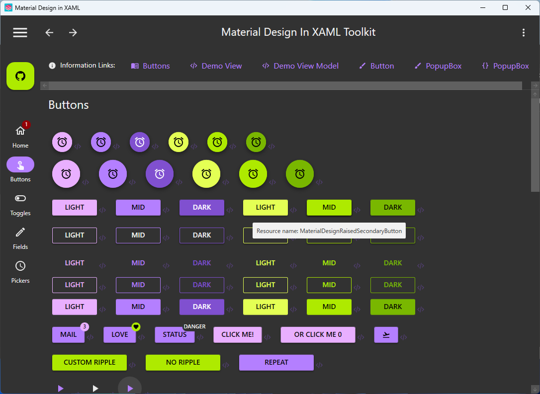
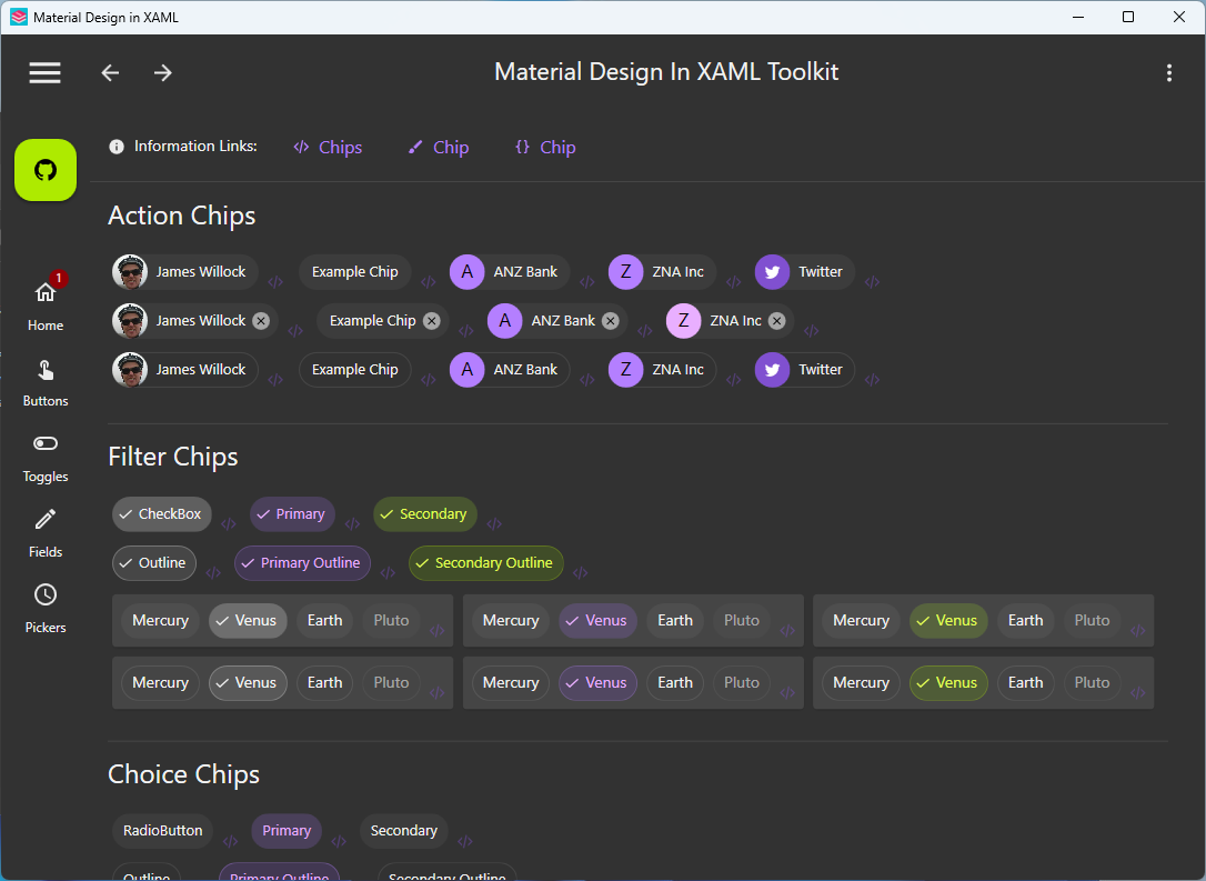
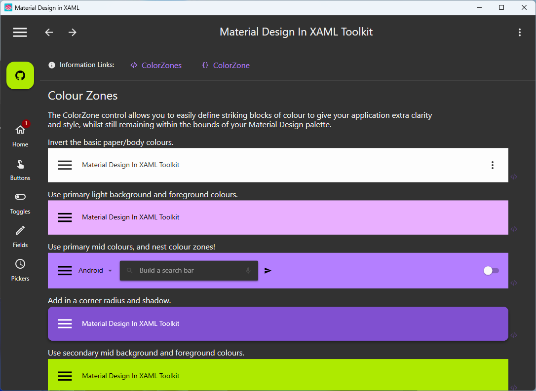
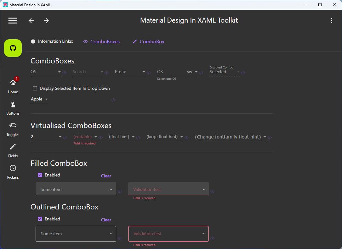
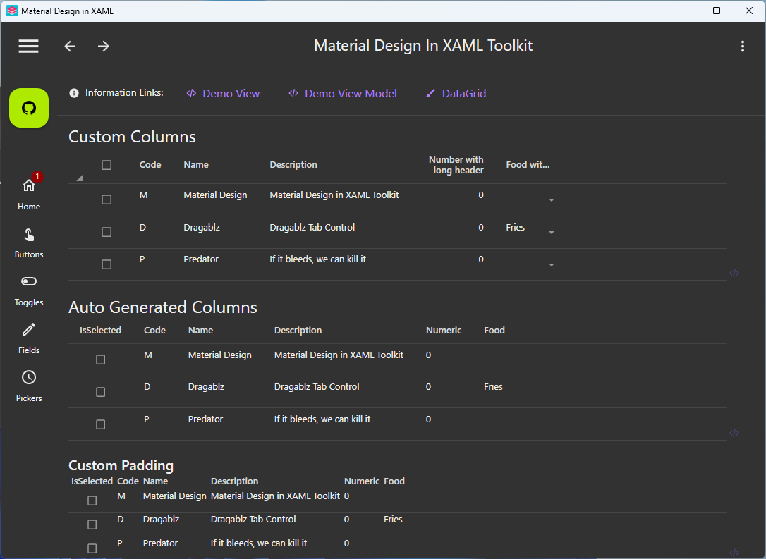
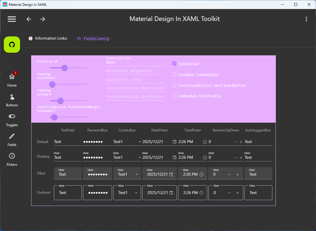
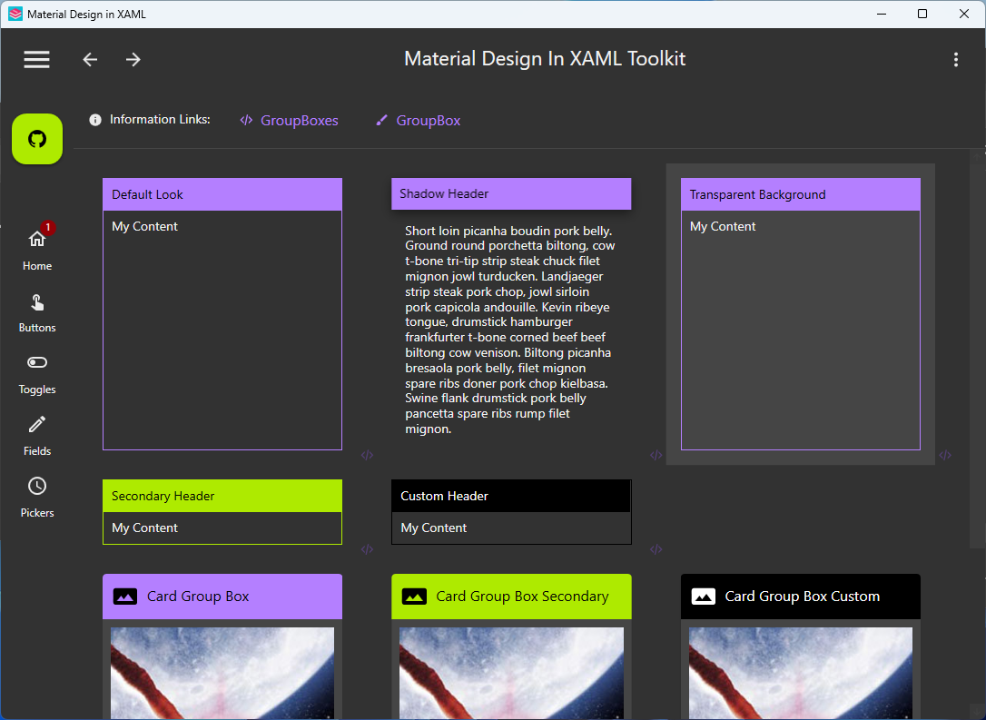
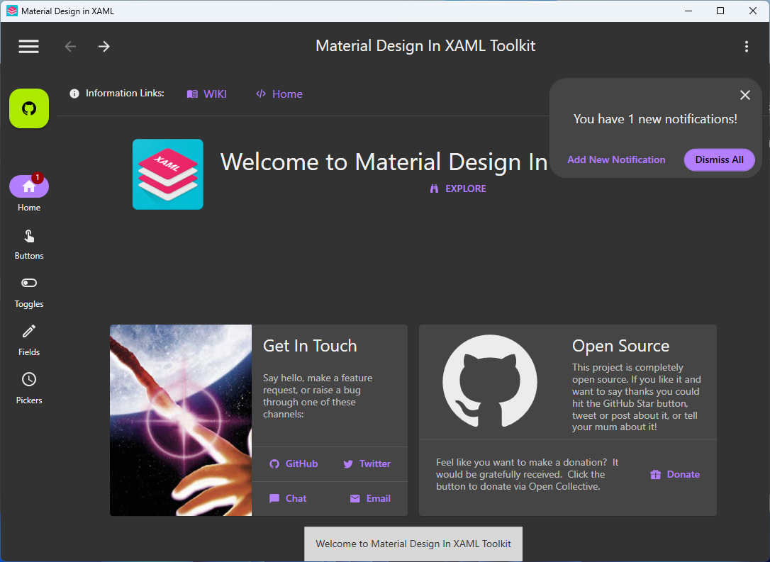
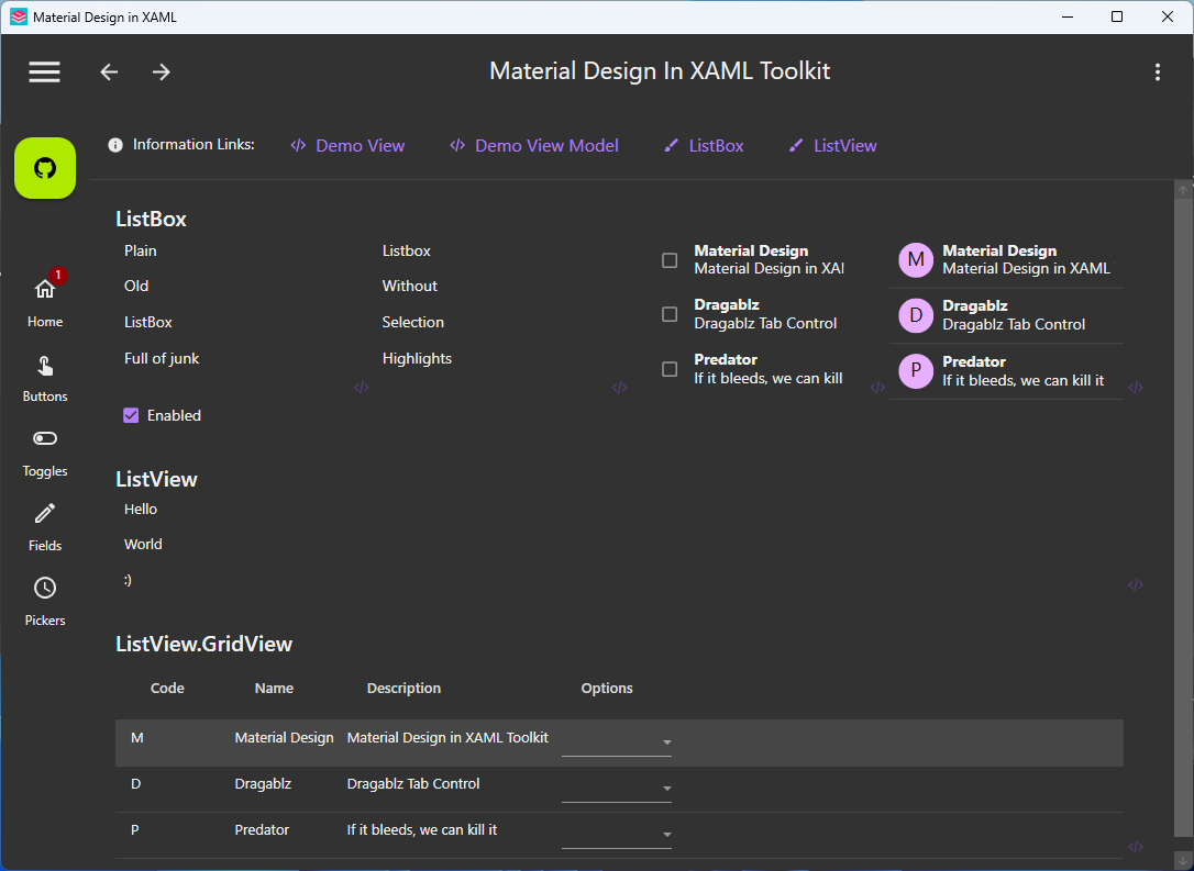
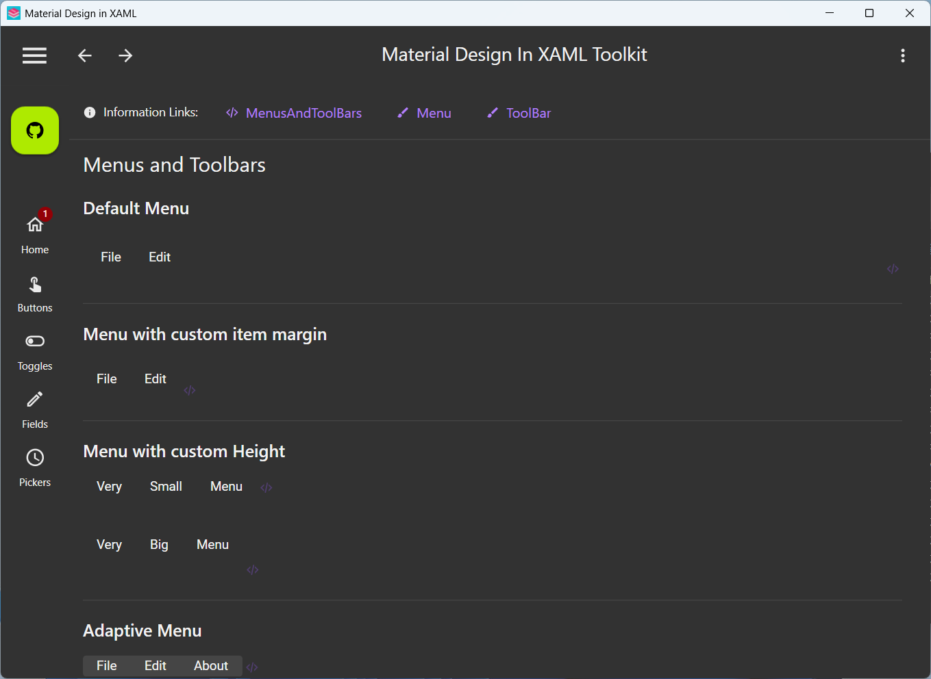
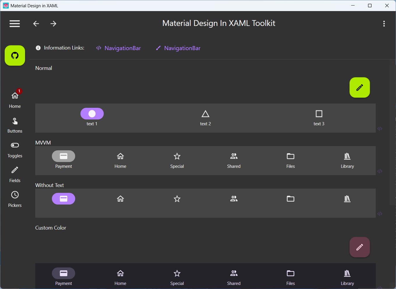
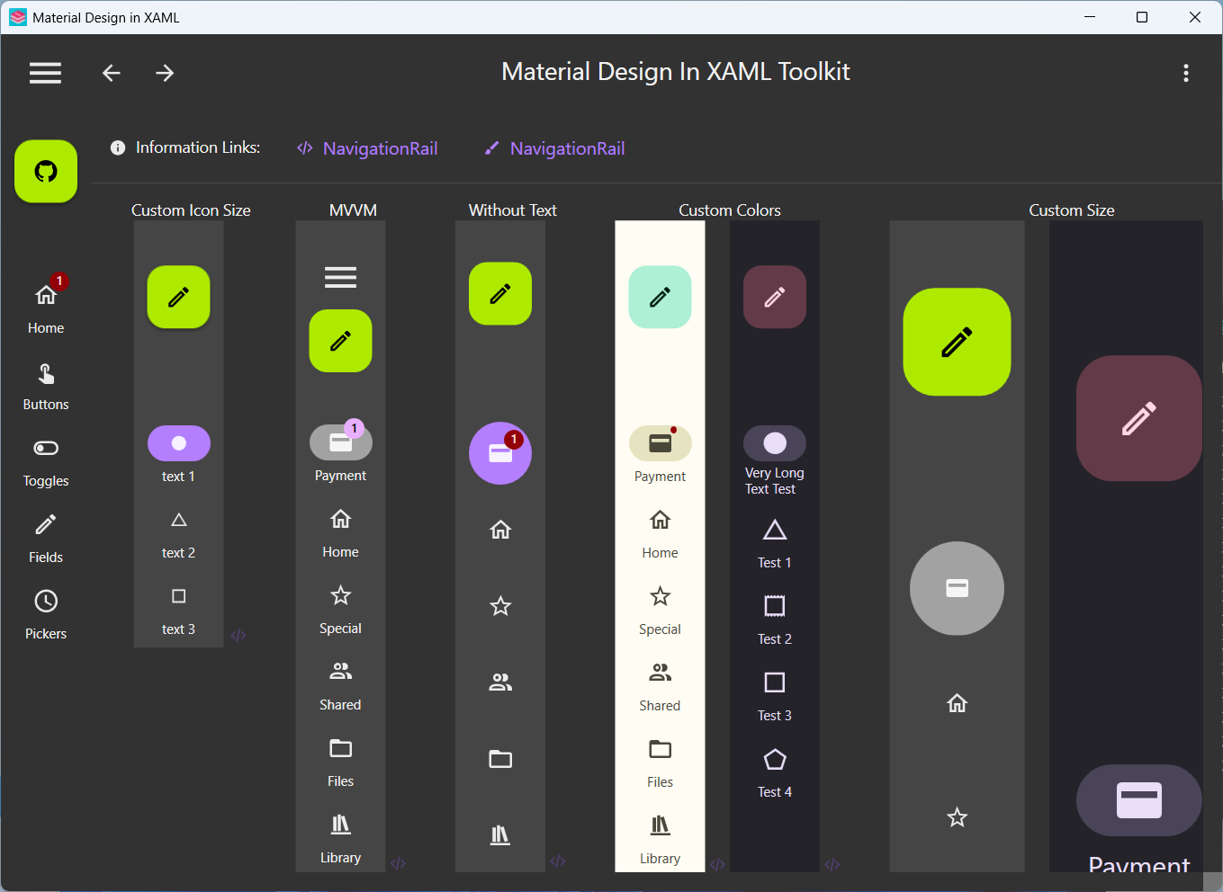
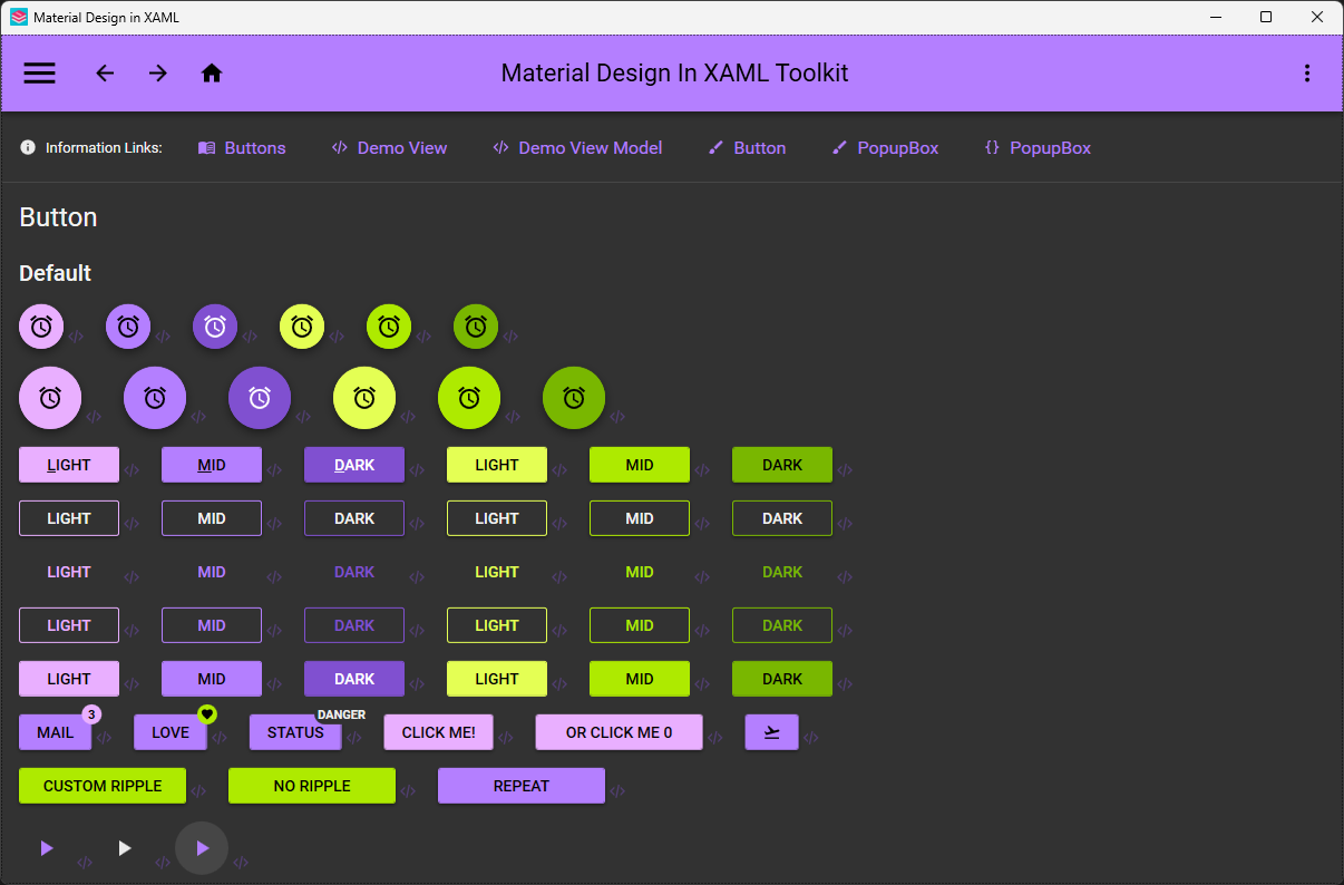
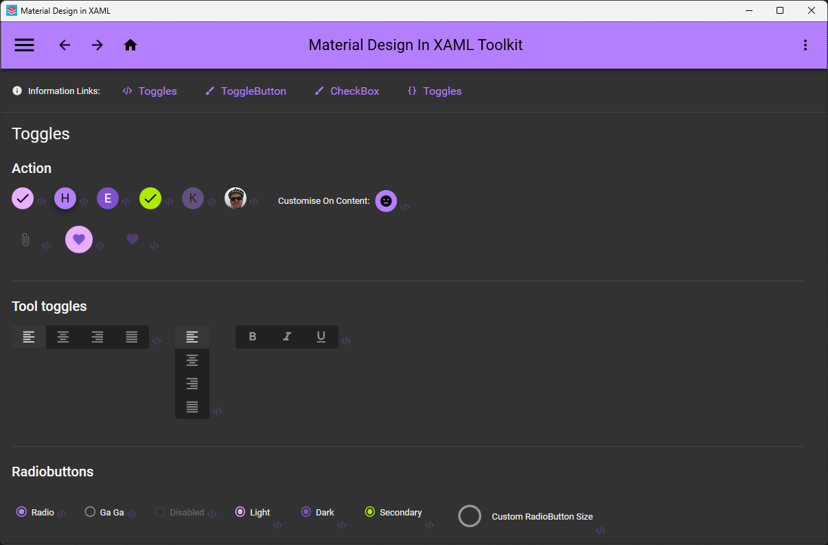
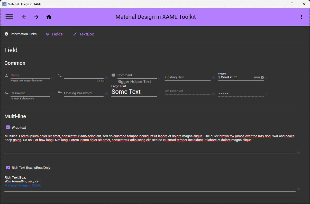
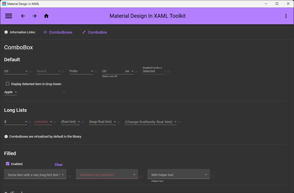
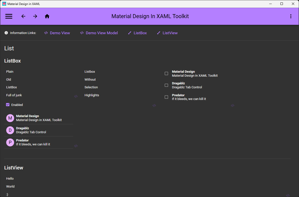
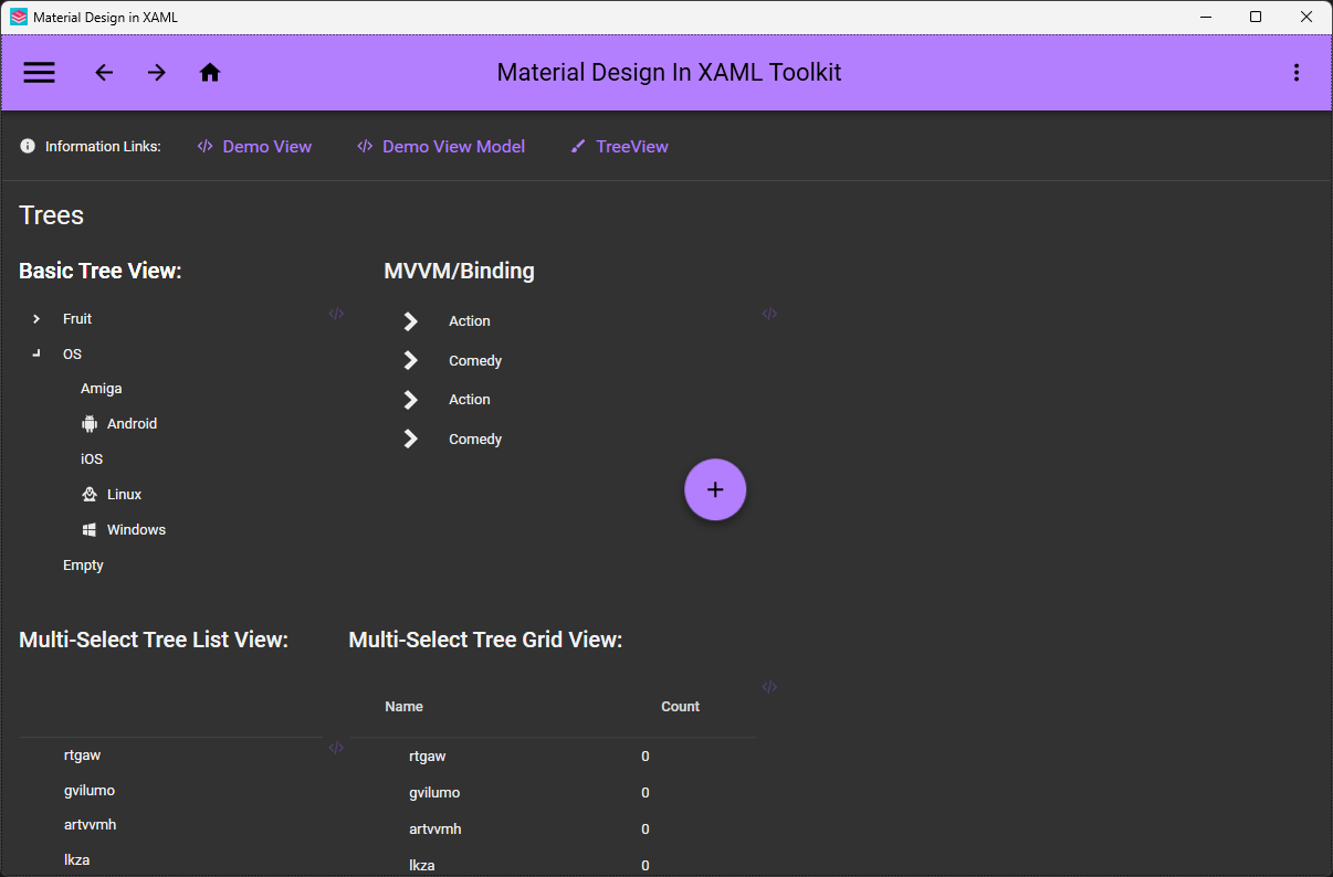
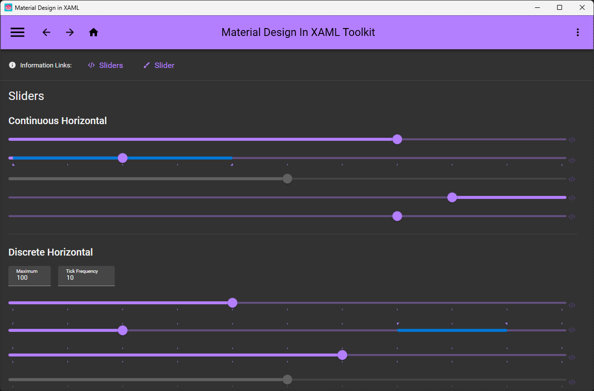
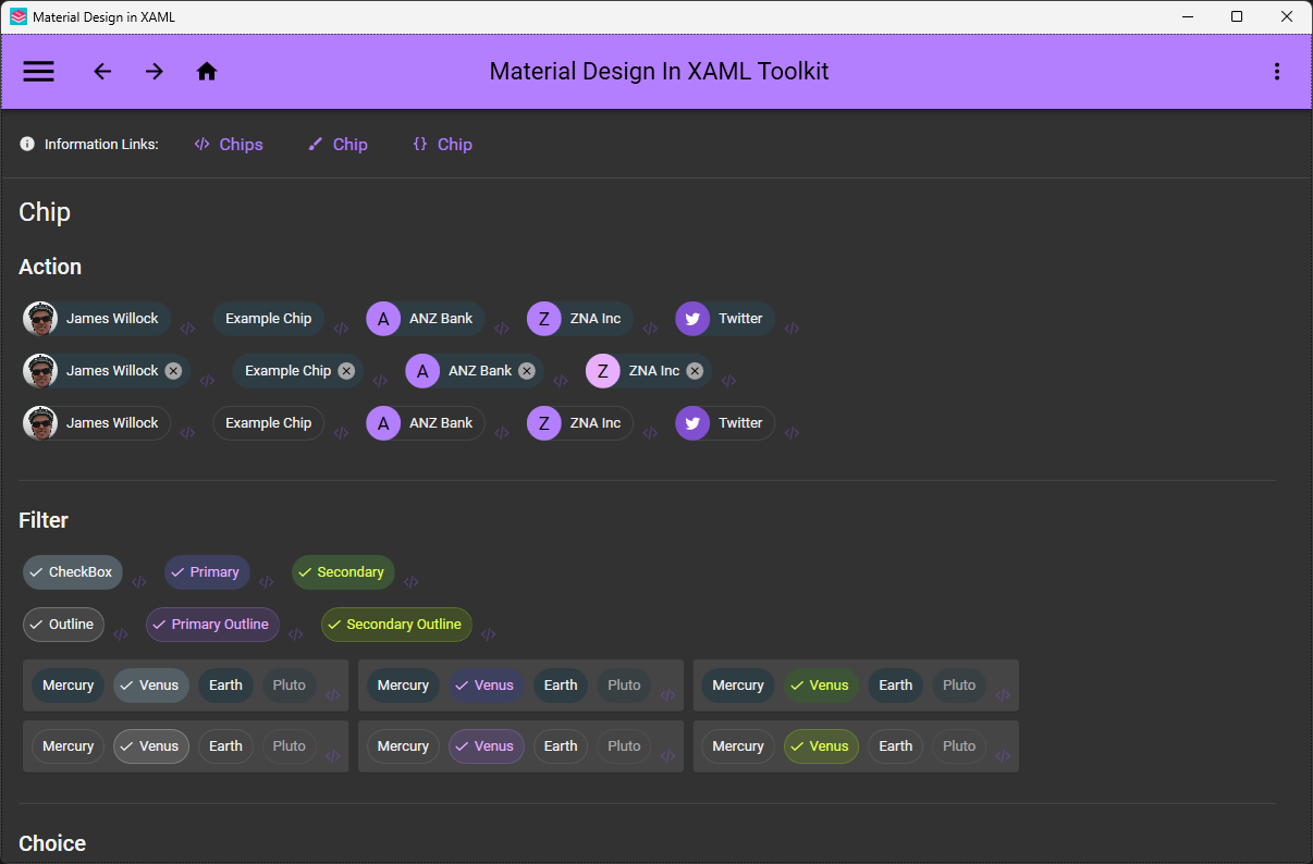
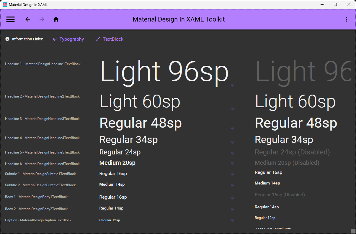
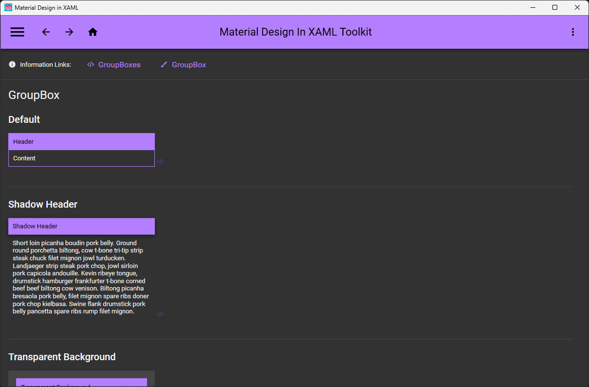
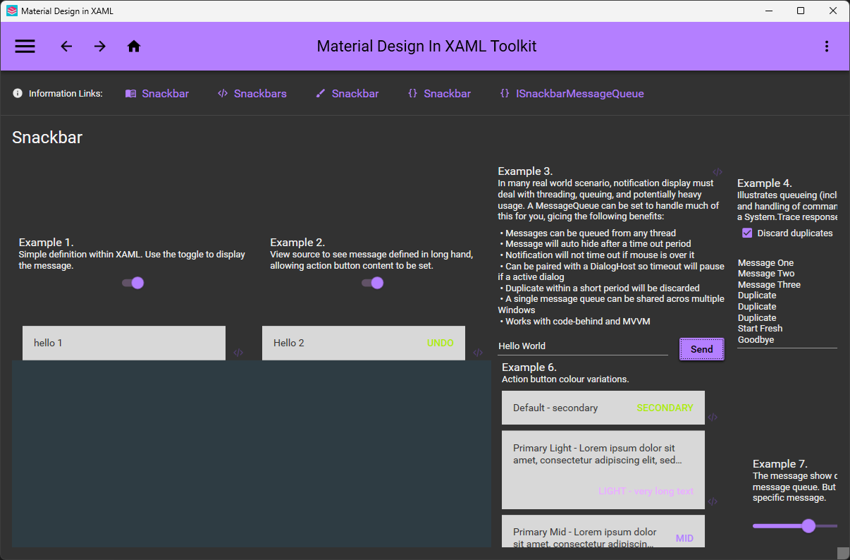
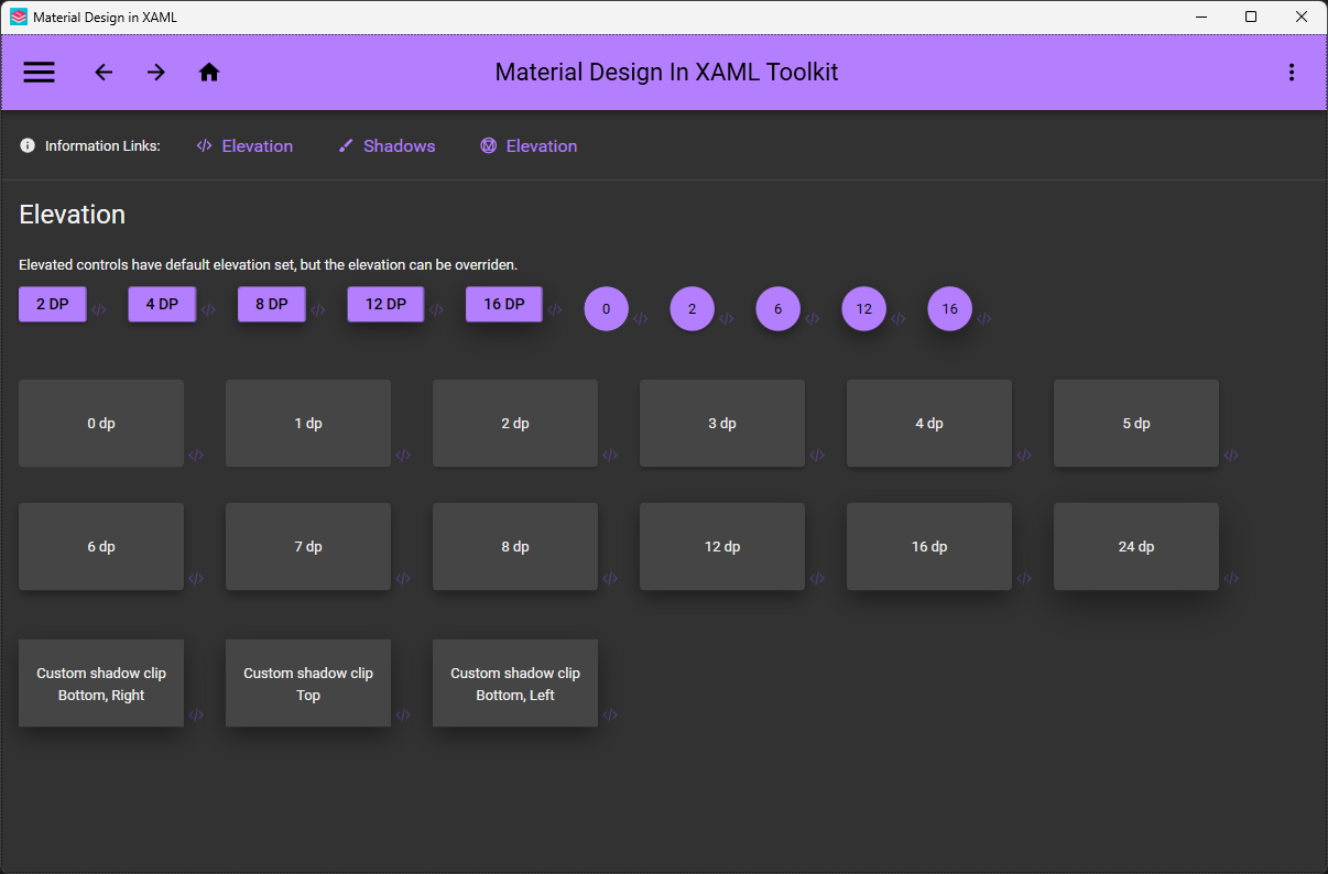
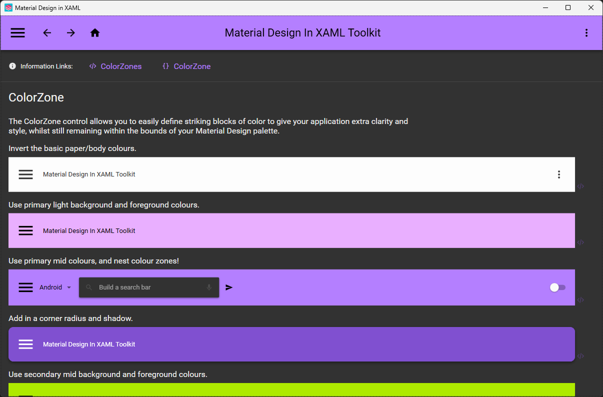
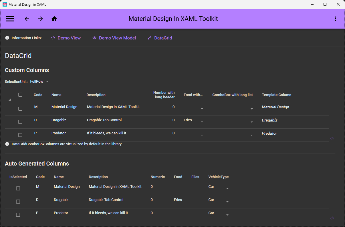
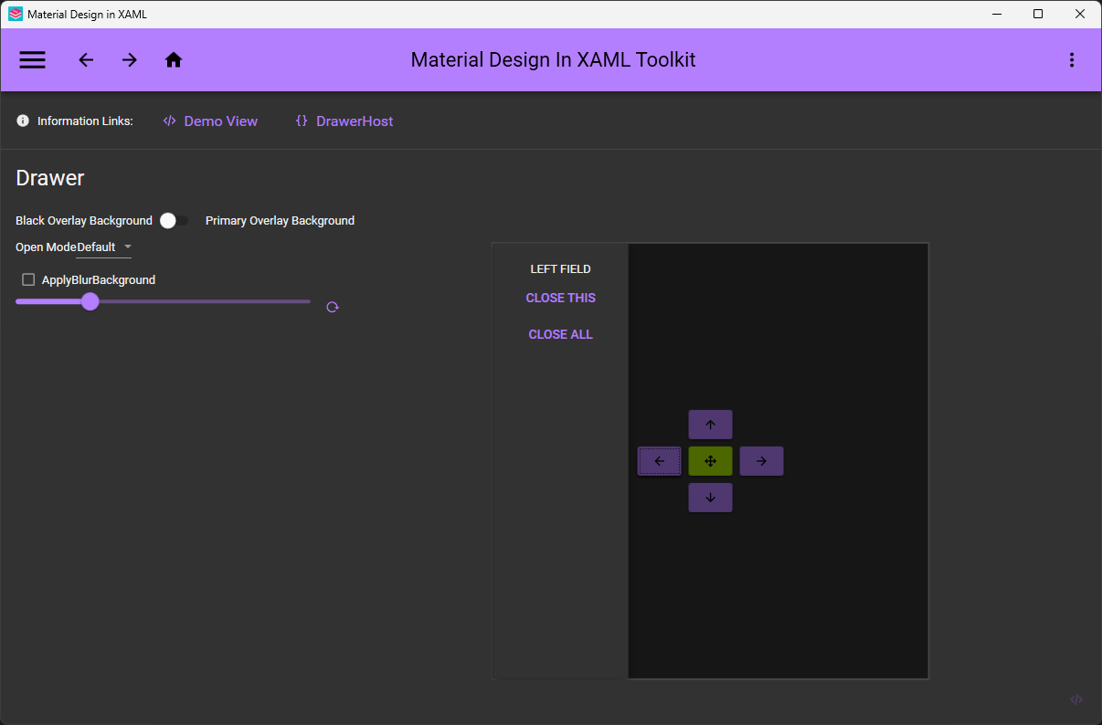
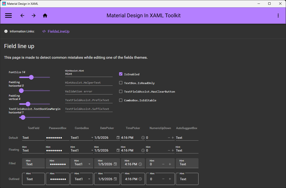
 Google's Material Design brought to WPF: an open-source theme and control library for Windows desktop apps written in C# or VB.Net. It restyles all major WPF controls and adds Material-flavored extras.
Google's Material Design brought to WPF: an open-source theme and control library for Windows desktop apps written in C# or VB.Net. It restyles all major WPF controls and adds Material-flavored extras.So is it an app I install, or something I add to my own project?A library, not an app: you reference it from an existing WPF project, and it applies Material Design styling to the controls you already use, plus ships some of its own.
A library, not an app: you reference it from an existing WPF project, and it applies Material Design styling to the controls you already use, plus ships some of its own.How do I add it to a WPF project?Install the toolkit via Visual Studio's NuGet package manager or the command line, then alter App.xaml (and MainWindow.xaml) per the getting-started guide. To target Material Design 3, use MaterialDesign3.Defaults.xaml.
Install the toolkit via Visual Studio's NuGet package manager or the command line, then alter App.xaml (and MainWindow.xaml) per the getting-started guide. To target Material Design 3, use MaterialDesign3.Defaults.xaml.What do I need to have installed before starting?A WPF project and Visual Studio 2022. If you want to build the toolkit's source yourself, you additionally need the .NET desktop development workload.
A WPF project and Visual Studio 2022. If you want to build the toolkit's source yourself, you additionally need the .NET desktop development workload.Is Material Design 3 support fully ready yet?You can already target MD3 via MaterialDesign3.Defaults.xaml, but its dedicated demo app is still under development — the Material Design 2 demo remains the complete reference containing all controls.
You can already target MD3 via MaterialDesign3.Defaults.xaml, but its dedicated demo app is still under development — the Material Design 2 demo remains the complete reference containing all controls.Is this Windows-only, or can I use it for Mac or Linux apps too?Windows-only — it targets WPF, the Windows desktop framework, so macOS and Linux are out of scope.
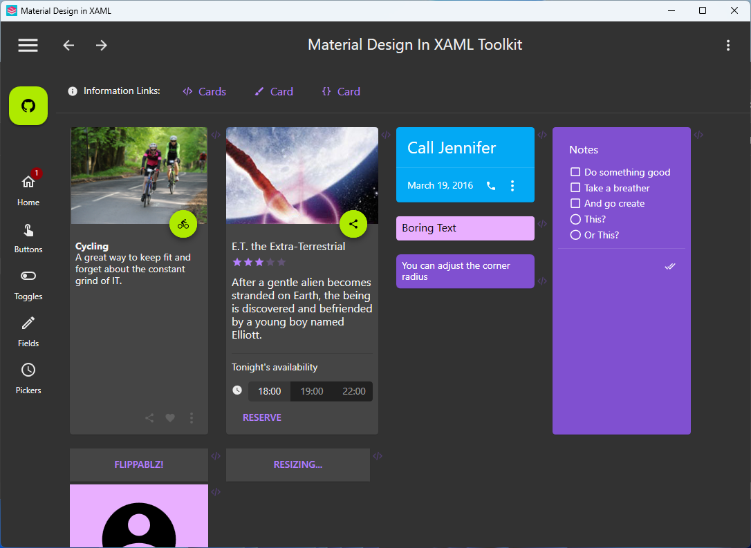
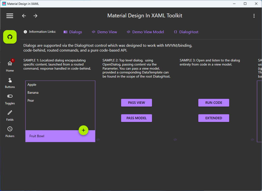
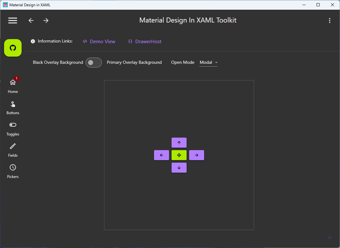
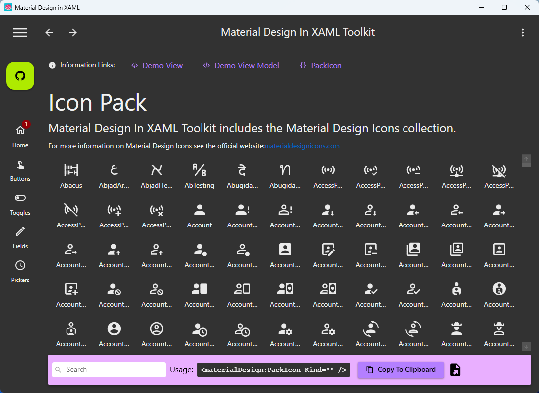
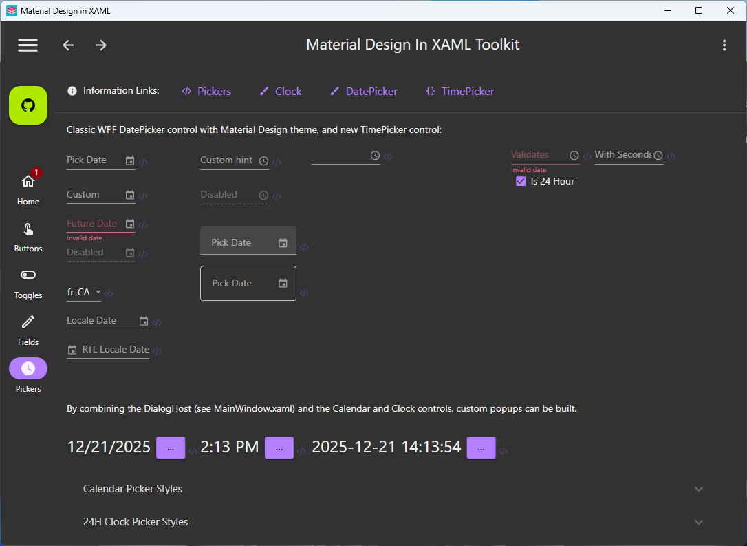
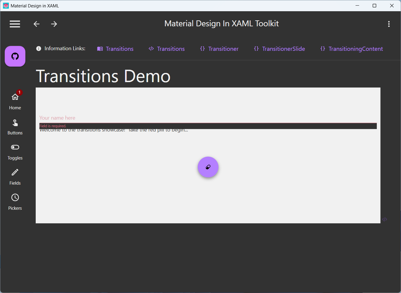
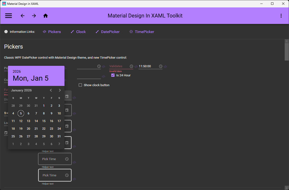
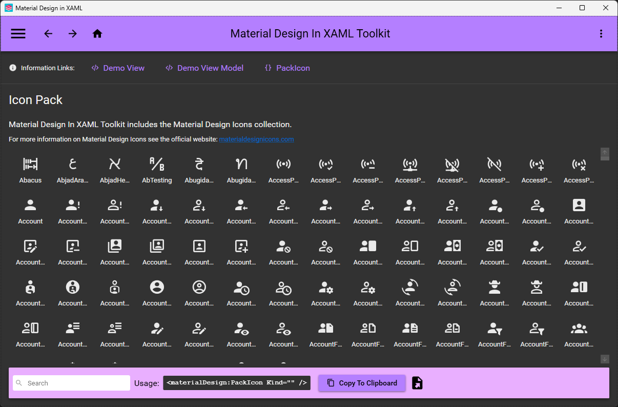
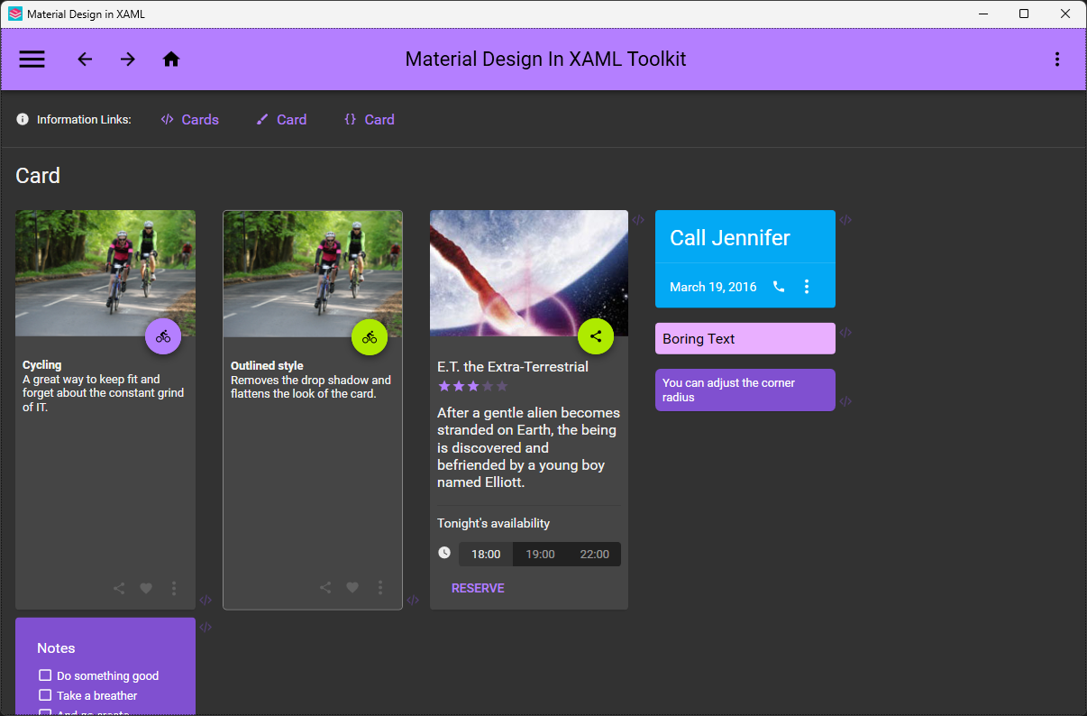
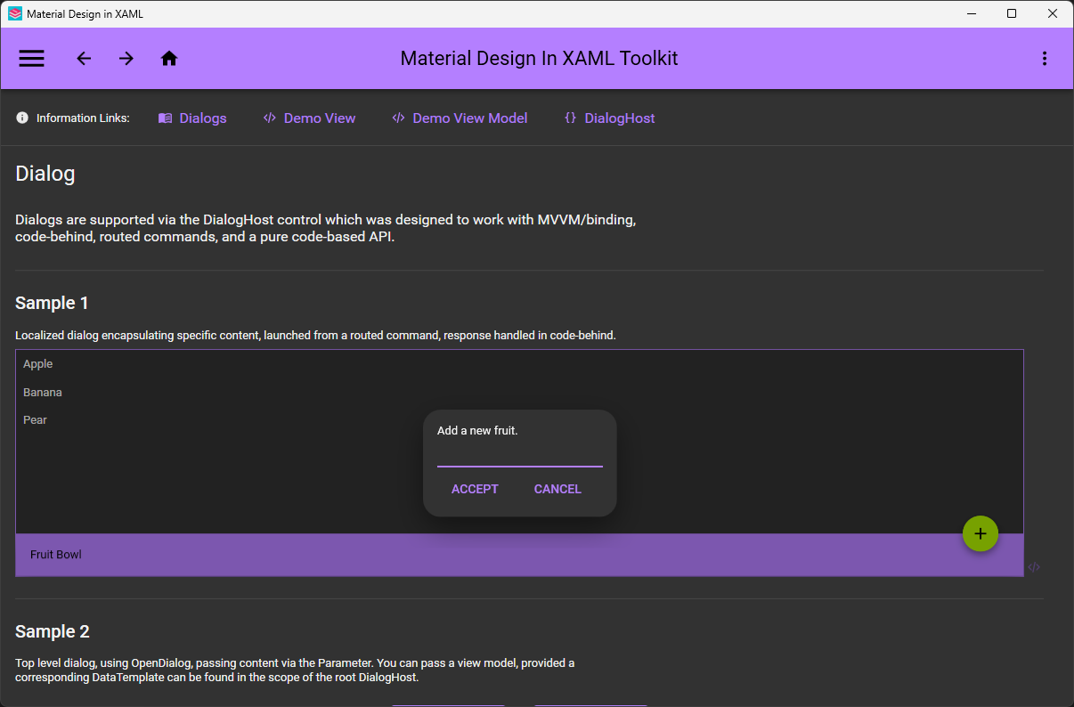
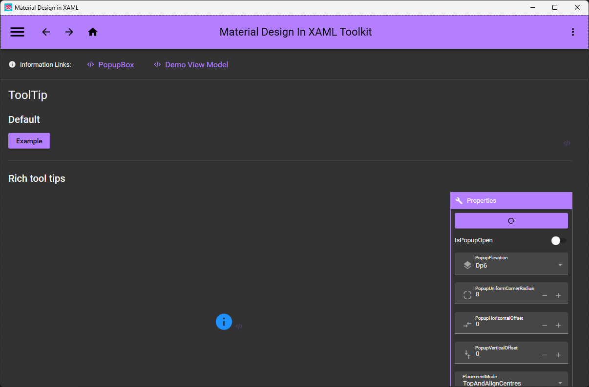
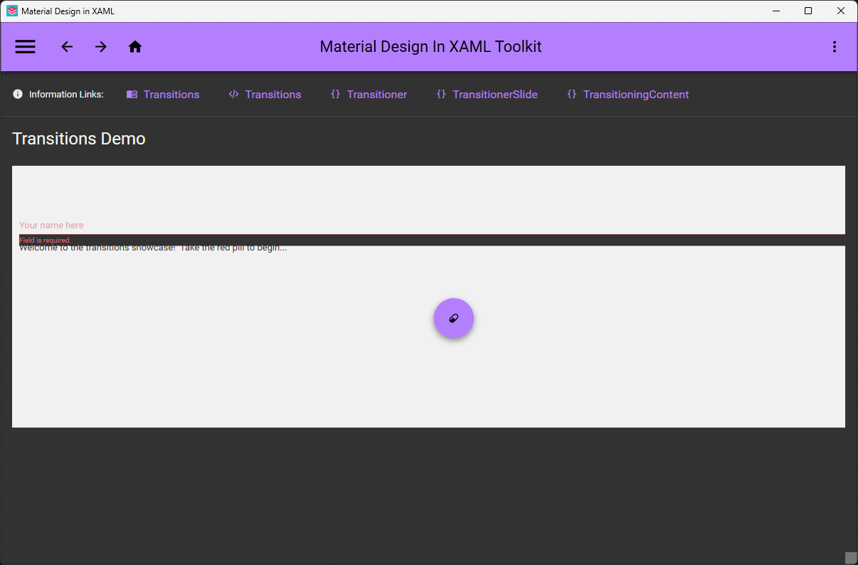
Windows-only — it targets WPF, the Windows desktop framework, so macOS and Linux are out of scope.Which extra controls does it add beyond the styled WPF ones?Cards, Dialogs, a Clock and a Multi Action Button, plus the full Material Design Icons icon pack and easy transition effects.
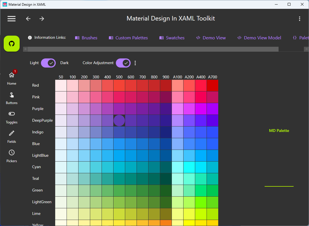
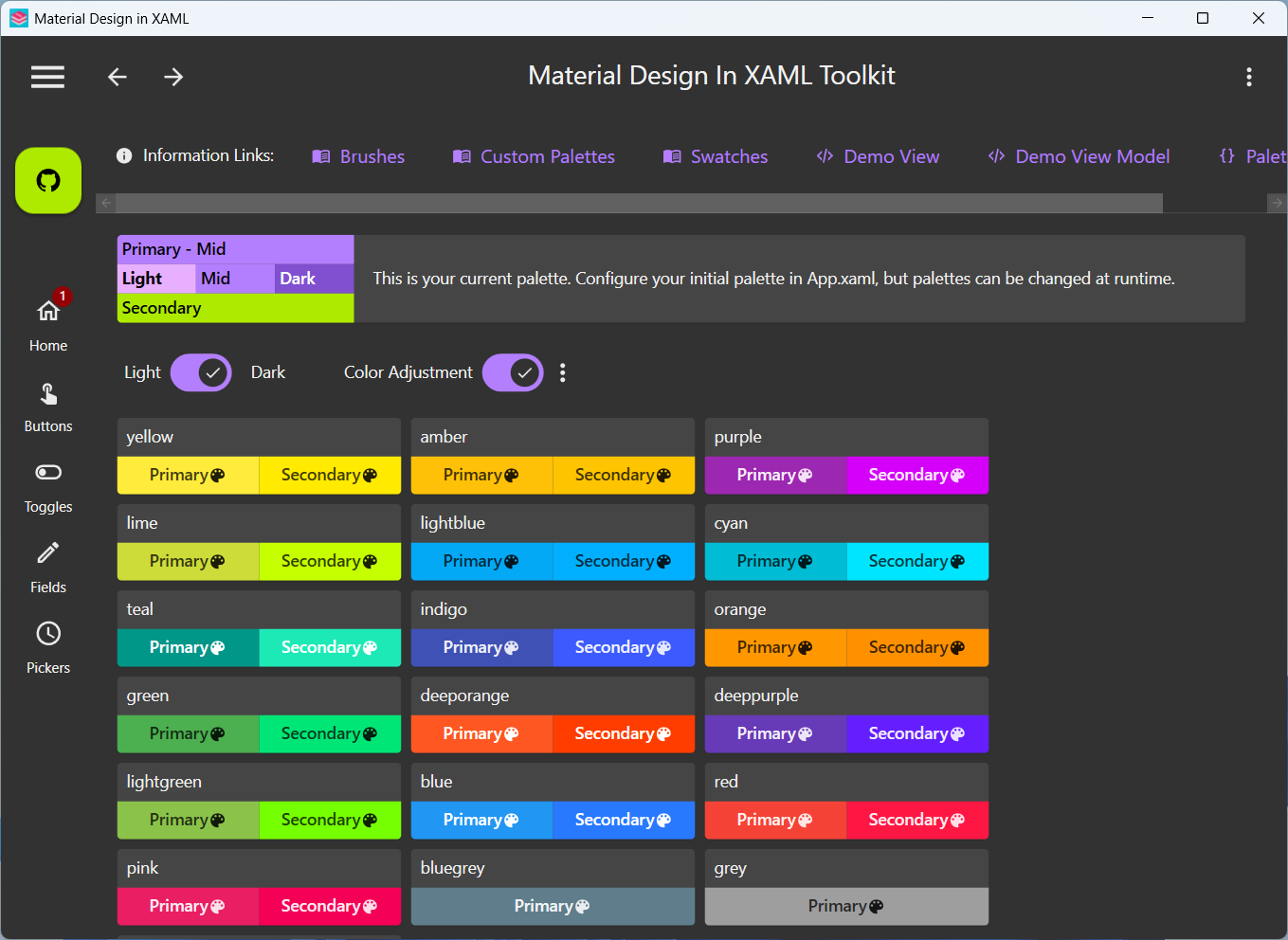
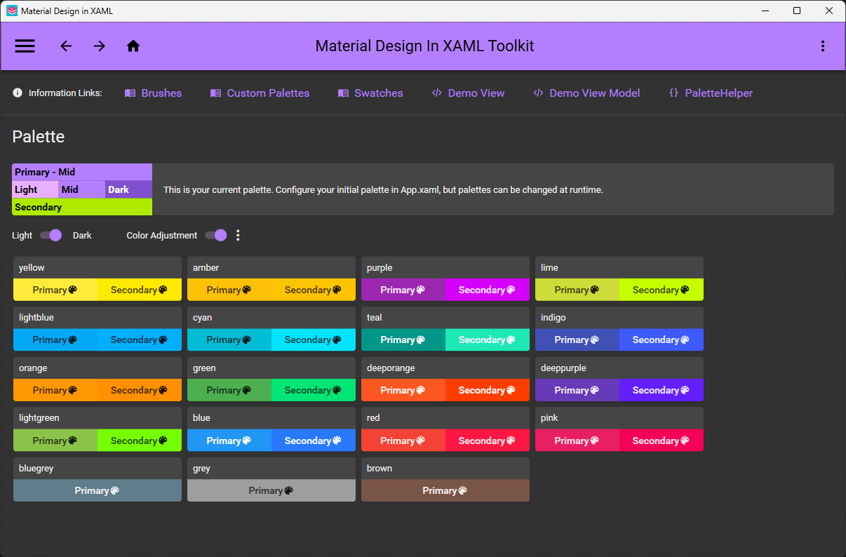
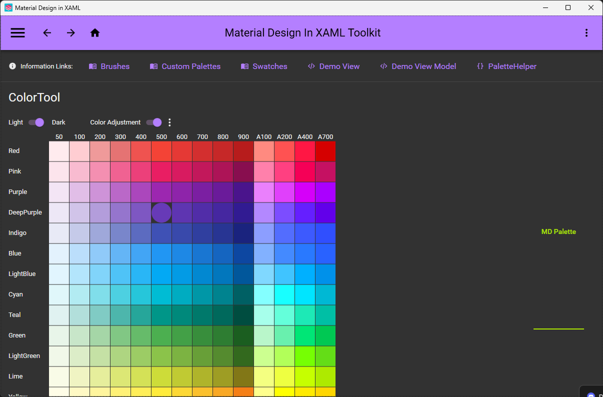
Cards, Dialogs, a Clock and a Multi Action Button, plus the full Material Design Icons icon pack and easy transition effects.Can I change the color scheme while the app is running?Yes — the palette is easy to configure both at design time and at runtime, following Google's Material Design guidelines.
Yes — the palette is easy to configure both at design time and at runtime, following Google's Material Design guidelines.Does it get along with other WPF UI libraries?Yes — it's compatible with Dragablz and MahApps, and the repo even ships a demo combining the three. Under the hood it builds on the ControlzEx library.
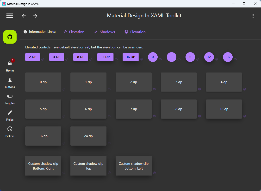
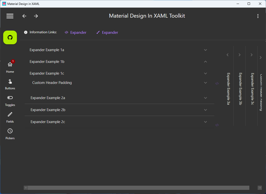
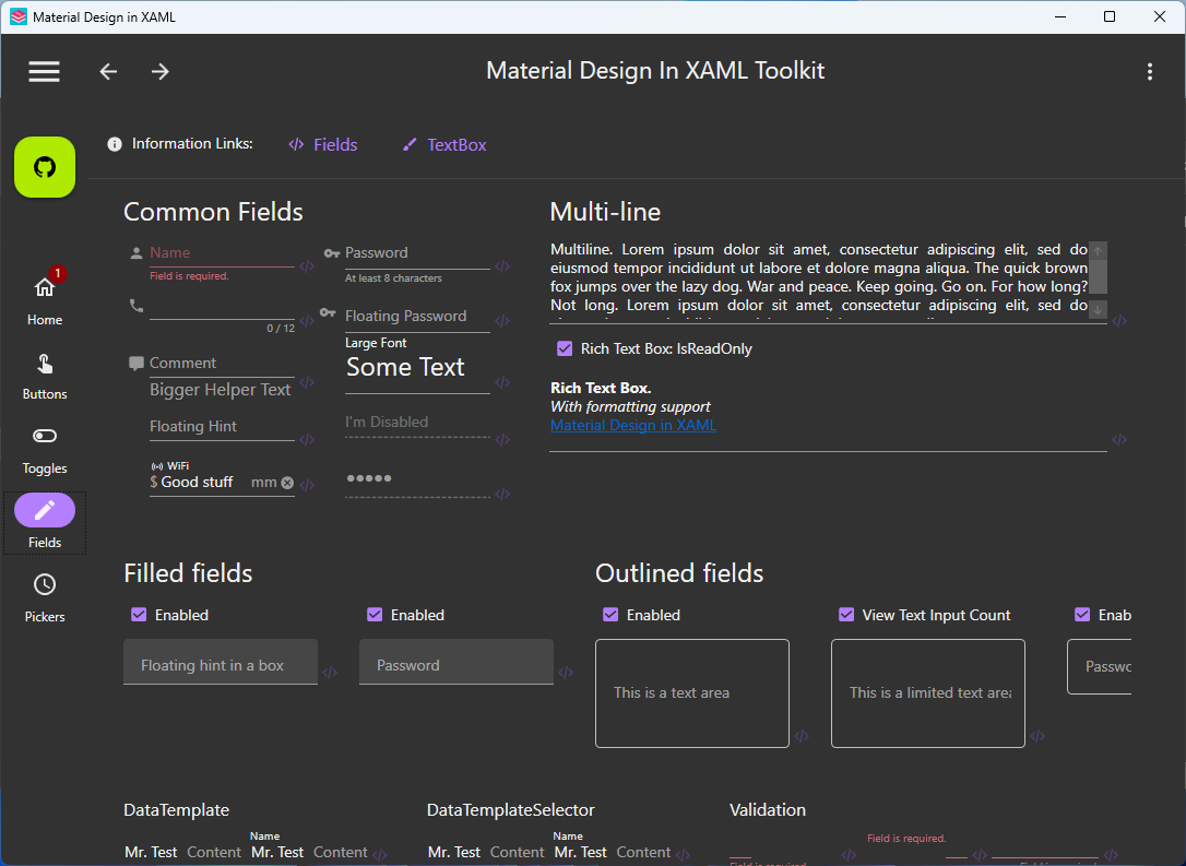
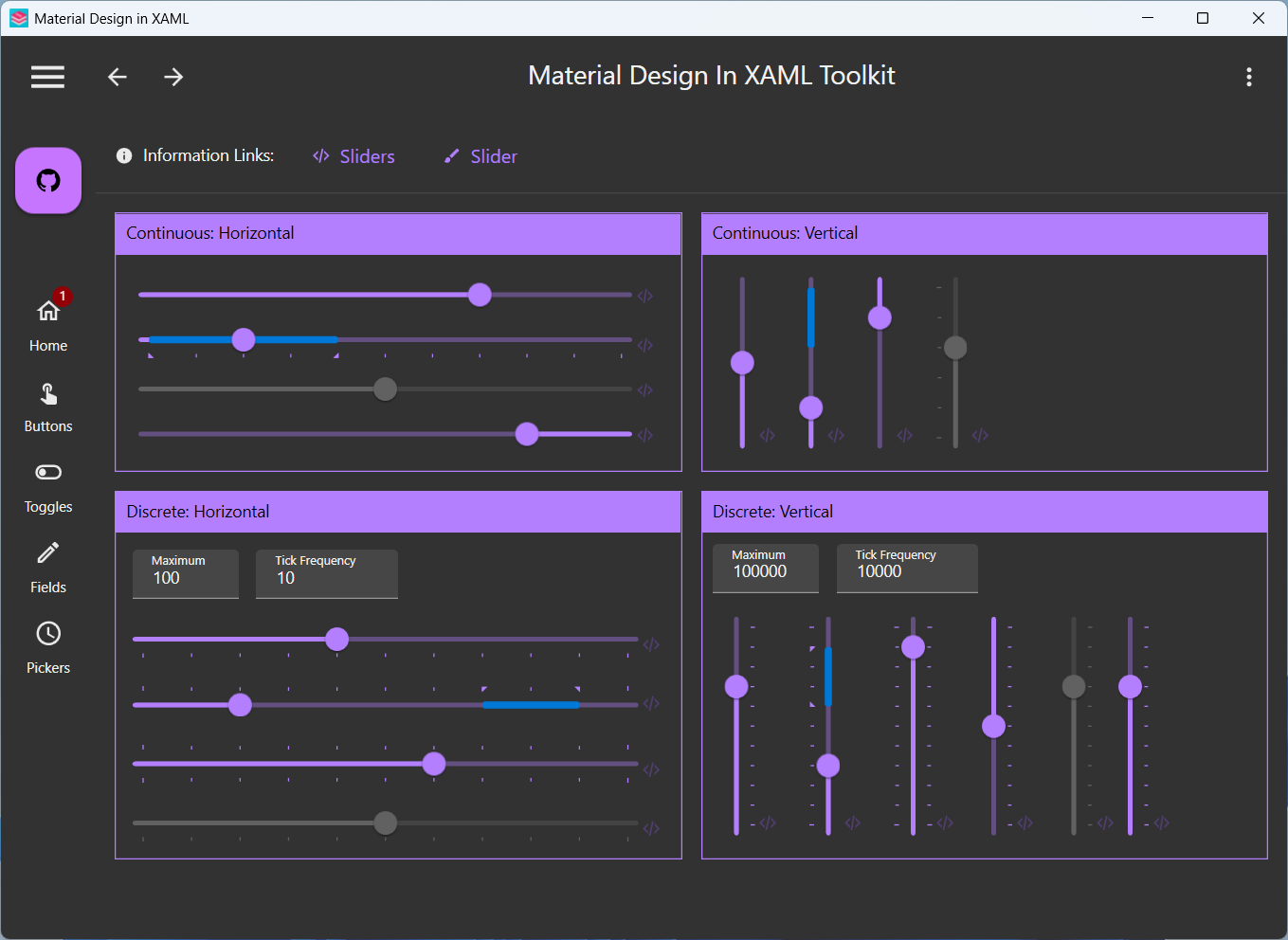
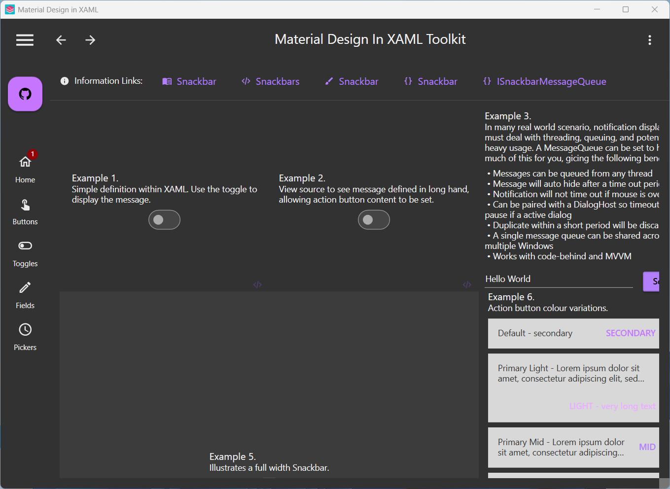
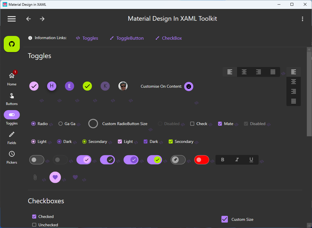
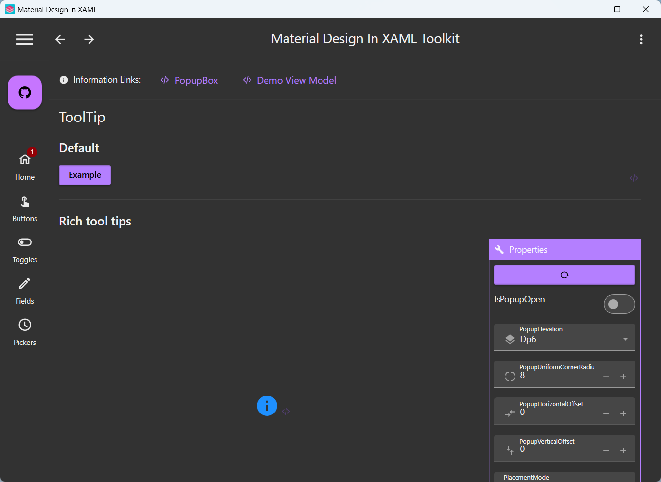
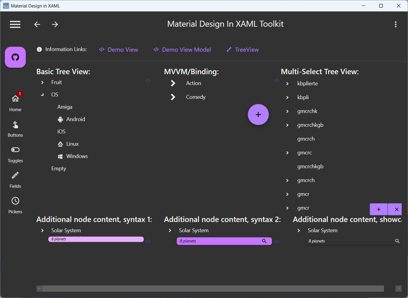
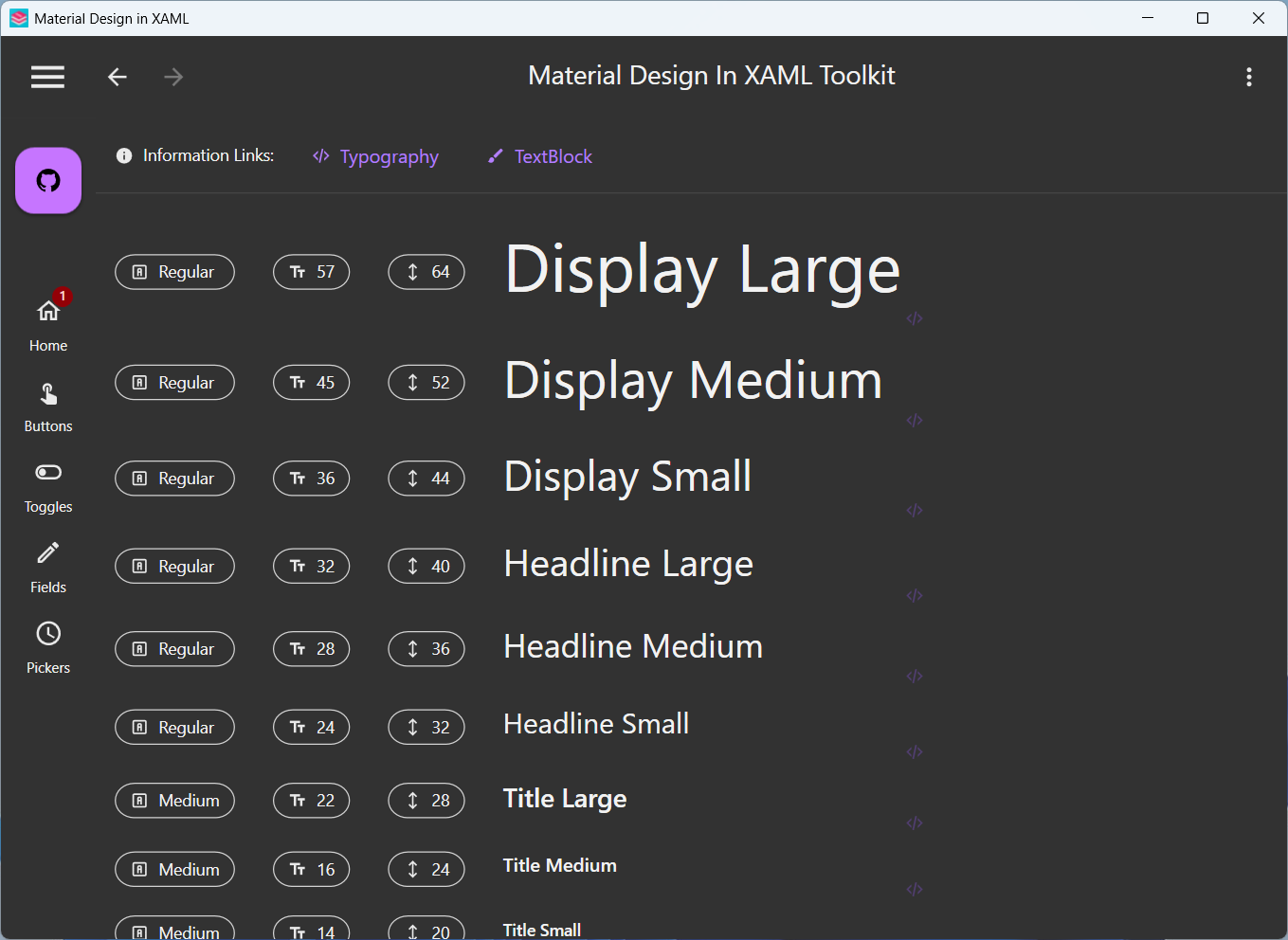
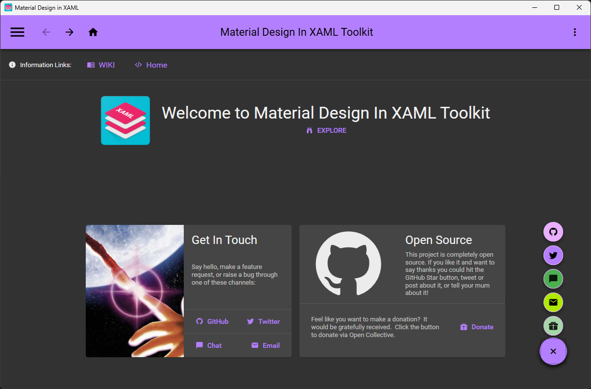
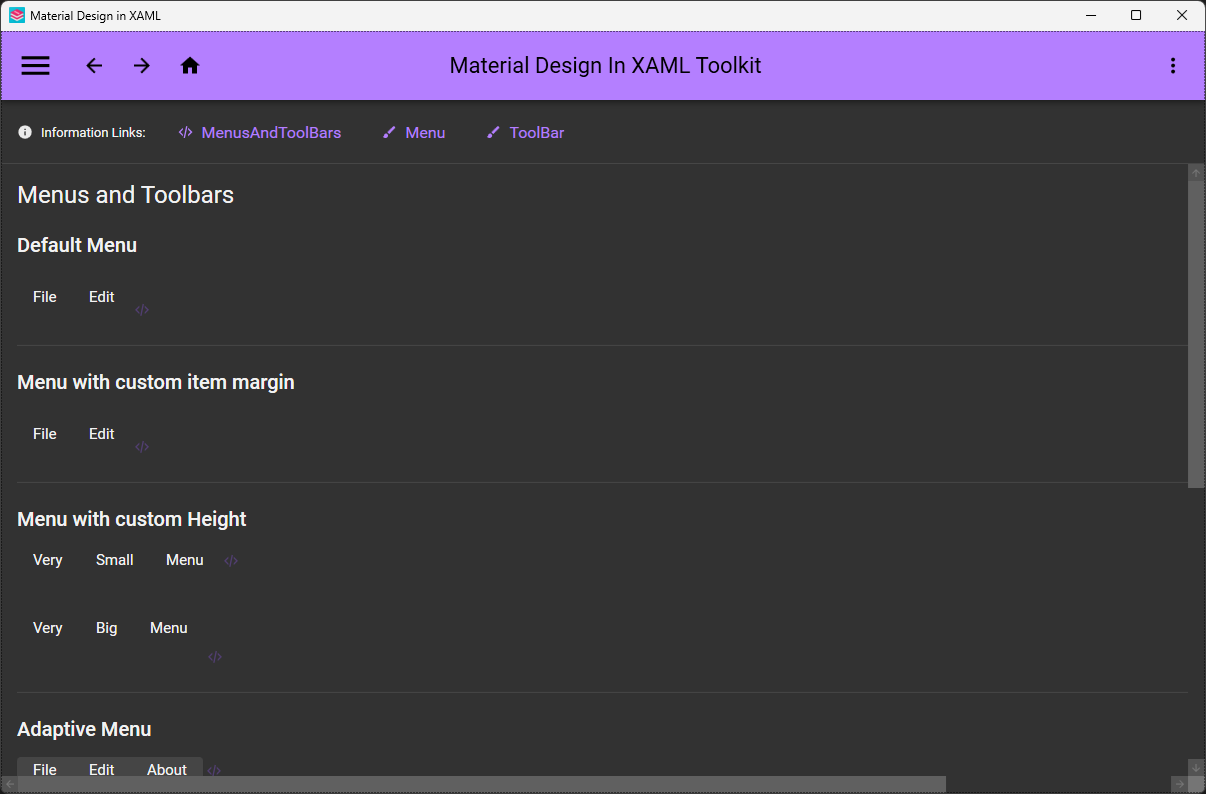
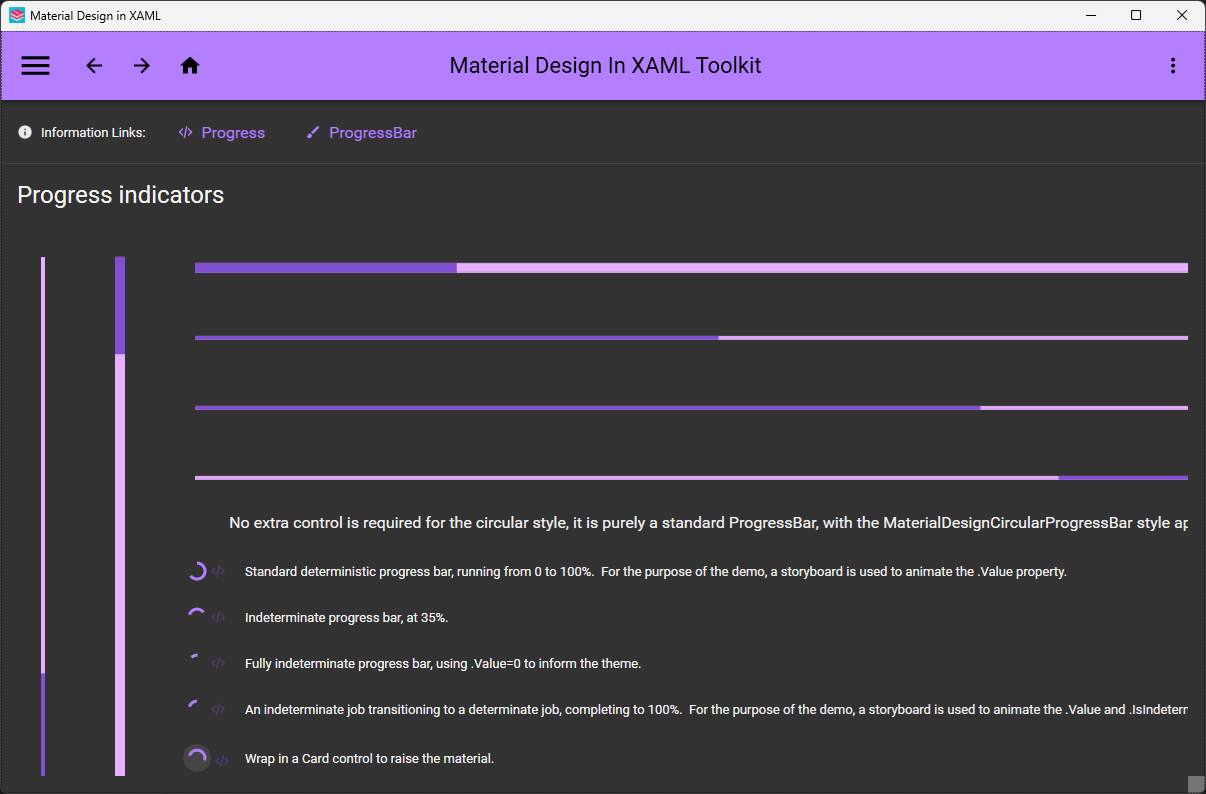
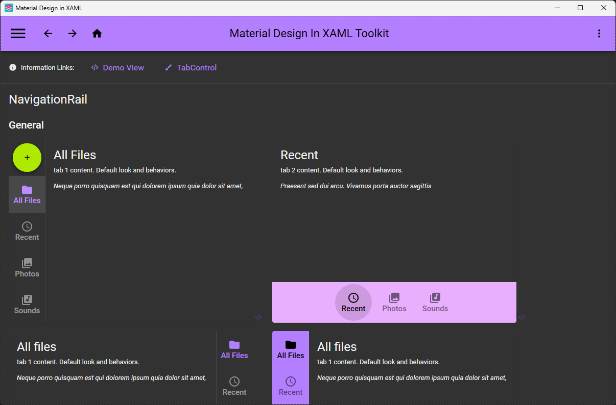
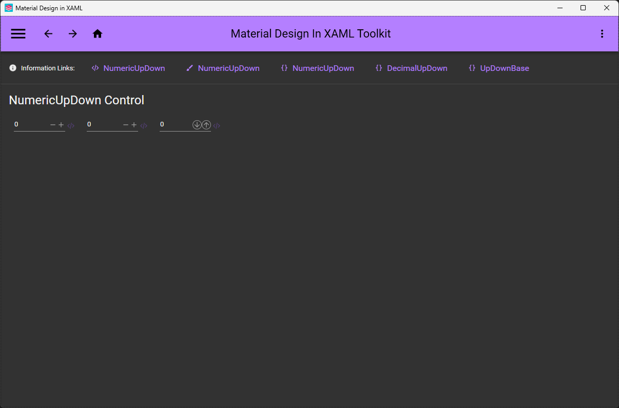
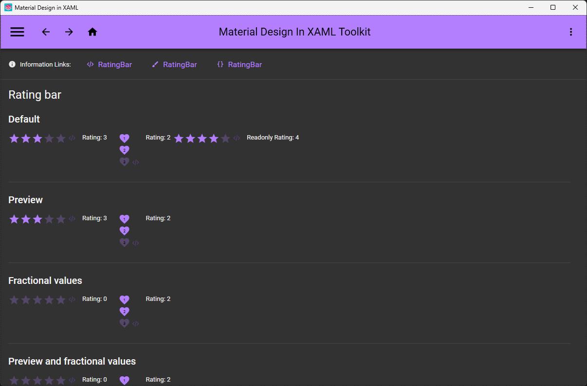
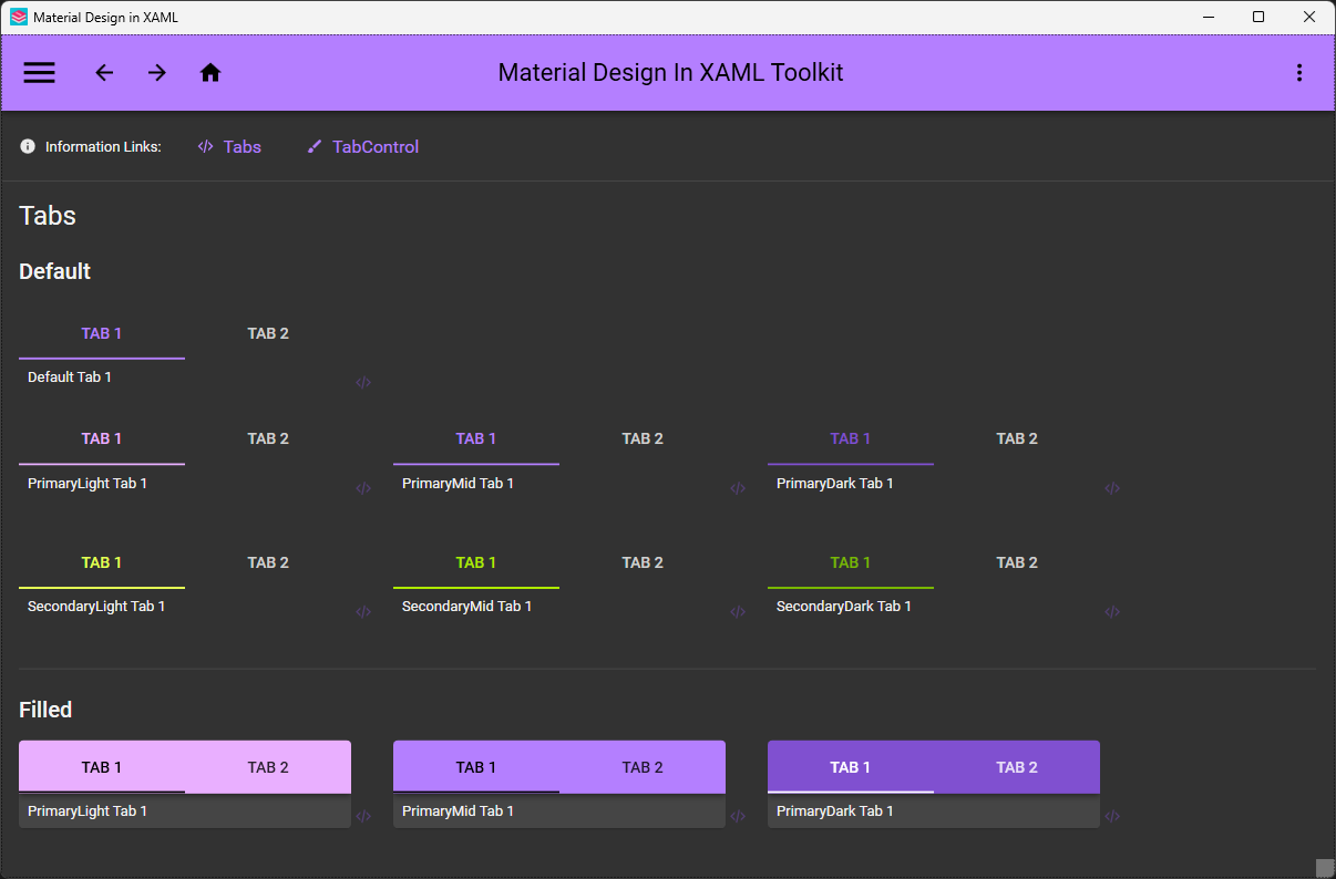
Yes — it's compatible with Dragablz and MahApps, and the repo even ships a demo combining the three. Under the hood it builds on the ControlzEx library.Can I see what the controls look like before adopting it?Yes — the source project includes demo applications: MaterialDesignDemo (Material Design 2 styling, all controls, a recommended tool while developing) and MaterialDesign3Demo for the newer styling.
Yes — the source project includes demo applications: MaterialDesignDemo (Material Design 2 styling, all controls, a recommended tool while developing) and MaterialDesign3Demo for the newer styling.What are similar projects?materialize, MudBlazor, Avalonia, uno, material-components-android, MaterialDrawer, folding-cell, vuetify
materialize, MudBlazor, Avalonia, uno, material-components-android, MaterialDrawer, folding-cell, vuetifyWhich topics is it in?hacktoberfest2020, xaml, visual-studio, material, wpf, c-sharp, icons, ui-library, material-design, theme, dotnet, c#
hacktoberfest2020, xaml, visual-studio, material, wpf, c-sharp, icons, ui-library, material-design, theme, dotnet, c#