
React for CLIs. Build and test your CLI output using components.


Ink provides the same component-based UI building experience that React offers in the browser, but for command-line apps.
It uses Yoga to build Flexbox layouts in the terminal, so most CSS-like properties are available in Ink as well.
If you are already familiar with React, you already know Ink.
Since Ink is a React renderer, all features of React are supported.
Head over to the React website for documentation on how to use it.
Only Ink's methods are documented in this readme.
Fully AI-generated pull requests are not accepted. You can use AI, but should be verified and cleaned up by a human. Only Opus 4.6+ (high-effort) and Codex 5.4+ (extra high) are accepted models. Preferably created with Opus and verified by Codex.
Install
npm install ink react
[!NOTE]
This readme documents the upcoming version of Ink. For the latest stable release, see Ink on npm.
Usage
import React, {useState, useEffect} from 'react';
import {render, Text} from 'ink';

const Counter = () => {
	const [counter, setCounter] = useState(0);

	useEffect(() => {
		const timer = setInterval(() => {
			setCounter(previousCounter => previousCounter + 1);
		}, 100);

		return () => {
			clearInterval(timer);
		};
	}, []);

	return <Text color="green">{counter} tests passed</Text>;
};

render(<Counter />);
Who's Using Ink?
- Claude Code - An agentic coding tool made by Anthropic.
- Gemini CLI - An agentic coding tool made by Google.
- GitHub Copilot CLI - Just say what you want the shell to do.
- Canva CLI - CLI for creating and managing Canva Apps.
- Cloudflare's Wrangler - The CLI for Cloudflare Workers.
- Linear - Linear built an internal CLI for managing deployments, configs, and other housekeeping tasks.
- Gatsby - Gatsby is a modern web framework for blazing-fast websites.
- tap - A Test-Anything-Protocol library for JavaScript.
- Terraform CDK - Cloud Development Kit (CDK) for HashiCorp Terraform.
- Specify CLI - Automate the distribution of your design tokens.
- Twilio's SIGNAL - CLI for Twilio's SIGNAL conference. Blog post.
- Typewriter - Generates strongly-typed Segment analytics clients from arbitrary JSON Schema.
- Prisma - The unified data layer for modern applications.
- Blitz - The Fullstack React Framework.
- New York Times - NYT uses Ink's
kyt - a toolkit that encapsulates and manages the configuration for web apps.
- tink - A next-generation runtime and package manager.
- Inkle - A Wordle game.
- loki - Visual regression testing tool for Storybook.
- Bit - Build, distribute, and collaborate on components.
- Remirror - Your friendly, world-class editor toolkit.
- Prime - Open-source GraphQL CMS.
- emoj - Find relevant emojis.
- emma - Find and install npm packages easily.
- npm-check-extras - Check for outdated and unused dependencies, and run update/delete actions on selected ones.
- swiff - Multi-environment command-line tools for time-saving web developers.
- share - Share files quickly.
- Kubelive - A CLI for Kubernetes that provides live data about the cluster and its resources.
- changelog-view - View changelogs.
- cfpush - Interactive Cloud Foundry tutorial.
- startd - Turn your React component into a web app.
- wiki-cli - Search Wikipedia and read article summaries.
- garson - Build interactive, config-based command-line interfaces.
- git-contrib-calendar - Display a contributions calendar for any Git repository.
- gitgud - Interactive command-line GUI for Git.
- Autarky - Find and delete old
node_modules directories to free up disk space.
- fast-cli - Test your download and upload speeds.
- tasuku - Minimal task runner.
- mnswpr - A Minesweeper game.
- lrn - Learning by repetition.
- turdle - A Wordle game.
- Shopify CLI - Build apps, themes, and storefronts for the Shopify platform.
- ToDesktop CLI - All-in-one platform for building Electron apps.
- Walle - A full-featured crypto wallet for EVM networks.
- Sudoku - A Sudoku game.
- Sea Trader - A Taipan!-inspired trading simulator game.
- srtd - Live-reloading SQL templates for Supabase projects.
- tweakcc - Customize your Claude Code styling.
- argonaut - Manage Argo CD resources.
- Qodo Command - Build, run, and manage AI agents.
- Nanocoder - A community-built, local-first AI coding agent with multi-provider support.
- dev3000 - An AI agent MCP orchestrator and developer browser.
- Neovate Code - An agentic coding tool made by AntGroup.
- instagram-cli - Instagram client.
- ElevenLabs CLI - ElevenLabs agents client.
- SSH AI Chat - Chat with AI over SSH.
- Deep Code CLI - AI coding assistant optimized for the DeepSeek model.
(PRs welcome. Append new entries at the end. Repos must have 100+ stars and showcase Ink beyond a basic list picker.)
Contents
Getting Started
Use create-ink-app to quickly scaffold a new Ink-based CLI.
npx create-ink-app my-ink-cli
Alternatively, create a TypeScript project:
npx create-ink-app --typescript my-ink-cli
Manual JavaScript setup
Ink requires the same Babel setup as you would do for regular React-based apps in the browser.
Set up Babel with a React preset to ensure all examples in this readme work as expected.
After installing Babel, install @babel/preset-react and insert the following configuration in babel.config.json:
npm install --save-dev @babel/preset-react
{
	"presets": ["@babel/preset-react"]
}
Next, create a file source.js, where you'll type code that uses Ink:
import React from 'react';
import {render, Text} from 'ink';

const Demo = () => <Text>Hello World</Text>;

render(<Demo />);
Then, transpile this file with Babel:
npx babel source.js -o cli.js
Now you can run cli.js with Node.js:
node cli
If you don't like transpiling files during development, you can use import-jsx or @esbuild-kit/esm-loader to import a JSX file and transpile it on the fly.
Ink uses Yoga, a Flexbox layout engine, to build great user interfaces for your CLIs using familiar CSS-like properties you've used when building apps for the browser.
It's important to remember that each element is a Flexbox container.
Think of it as if every <div> in the browser had display: flex.
See <Box> built-in component below for documentation on how to use Flexbox layouts in Ink.
Note that all text must be wrapped in a <Text> component.
App Lifecycle
An Ink app is a Node.js process, so it stays alive only while there is active work in the event loop (timers, pending promises, useInput listening on stdin, etc.). If your component tree has no async work, the app will render once and exit immediately.
To exit the app, press Ctrl+C (enabled by default via exitOnCtrlC), call exit() from useApp inside a component, or call unmount() on the object returned by render().
Use waitUntilExit() to run code after the app is unmounted:
const {waitUntilExit} = render(<MyApp />);

await waitUntilExit();

console.log('App exited');
Components
<Text>
This component can display text and change its style to make it bold, underlined, italic, or strikethrough.
import {render, Text} from 'ink';

const Example = () => (
	<>
		<Text color="green">I am green</Text>
		<Text color="black" backgroundColor="white">
			I am black on white
		</Text>
		<Text color="#ffffff">I am white</Text>
		<Text bold>I am bold</Text>
		<Text italic>I am italic</Text>
		<Text underline>I am underline</Text>
		<Text strikethrough>I am strikethrough</Text>
		<Text inverse>I am inversed</Text>
	</>
);

render(<Example />);
[!NOTE]
<Text> allows only text nodes and nested <Text> components inside of it. For example, <Box> component can't be used inside <Text>.
color
Type: string
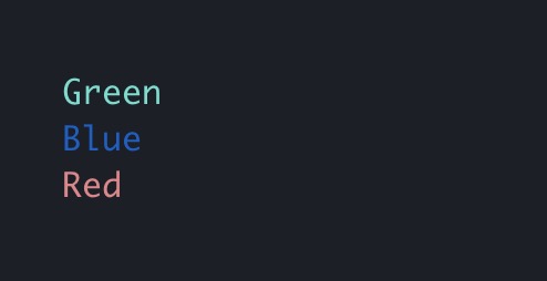
Change text color.
Ink uses chalk under the hood, so all its functionality is supported.
<Text color="green">Green</Text>
<Text color="#005cc5">Blue</Text>
<Text color="rgb(232, 131, 136)">Red</Text>
backgroundColor
Type: string
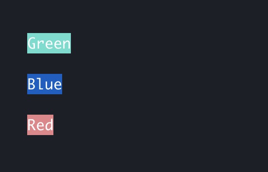
Same as color above, but for background.
<Text backgroundColor="green" color="white">Green</Text>
<Text backgroundColor="#005cc5" color="white">Blue</Text>
<Text backgroundColor="rgb(232, 131, 136)" color="white">Red</Text>
dimColor
Type: boolean
Default: false
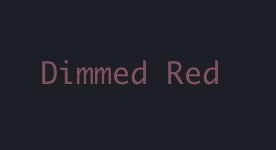
Dim the color (make it less bright).
<Text color="red" dimColor>
	Dimmed Red
</Text>
bold
Type: boolean
Default: false
Make the text bold.
italic
Type: boolean
Default: false
Make the text italic.
underline
Type: boolean
Default: false
Make the text underlined.
strikethrough
Type: boolean
Default: false
Make the text crossed with a line.
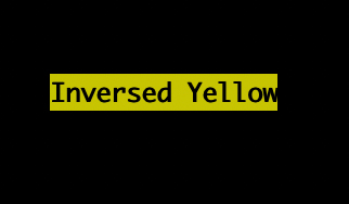
inverse
Type: boolean
Default: false
Invert background and foreground colors.
<Text inverse color="yellow">
	Inversed Yellow
</Text>
wrap
Type: string
Allowed values: wrap hard truncate truncate-start truncate-middle truncate-end
Default: wrap
This property tells Ink to wrap or truncate text if its width is larger than the container.
If wrap is passed (the default), Ink will wrap text and split it into multiple lines.
If hard is passed, Ink will fill each line to the full column width, breaking words as necessary.
If truncate-* is passed, Ink will truncate text instead, resulting in one line of text with the rest cut off.
<Box width={7}>
	<Text>Hello World</Text>
</Box>
//=> 'Hello\nWorld'

<Box width={7}>
	<Text wrap="hard">Hello World</Text>
</Box>
//=> 'Hello W\norld'

// `truncate` is an alias to `truncate-end`
<Box width={7}>
	<Text wrap="truncate">Hello World</Text>
</Box>
//=> 'Hello…'

<Box width={7}>
	<Text wrap="truncate-middle">Hello World</Text>
</Box>
//=> 'He…ld'

<Box width={7}>
	<Text wrap="truncate-start">Hello World</Text>
</Box>
//=> '…World'
<Box>
<Box> is an essential Ink component to build your layout.
It's like <div style="display: flex"> in the browser.
import {render, Box, Text} from 'ink';

const Example = () => (
	<Box margin={2}>
		<Text>This is a box with margin</Text>
	</Box>
);

render(<Example />);
Dimensions
width
Type: number string
Width of the element in spaces.
You can also set it as a percentage, which will calculate the width based on the width of the parent element.
<Box width={4}>
	<Text>X</Text>
</Box>
//=> 'X   '
<Box width={10}>
	<Box width="50%">
		<Text>X</Text>
	</Box>
	<Text>Y</Text>
</Box>
//=> 'X    Y'
height
Type: number string
Height of the element in lines (rows).
You can also set it as a percentage, which will calculate the height based on the height of the parent element.
<Box height={4}>
	<Text>X</Text>
</Box>
//=> 'X\n\n\n'
<Box height={6} flexDirection="column">
	<Box height="50%">
		<Text>X</Text>
	</Box>
	<Text>Y</Text>
</Box>
//=> 'X\n\n\nY\n\n'
minWidth
Type: number
Sets a minimum width of the element.
Percentages aren't supported yet; see https://github.com/facebook/yoga/issues/872.
minHeight
Type: number string
Sets a minimum height of the element in lines (rows).
You can also set it as a percentage, which will calculate the minimum height based on the height of the parent element.
maxWidth
Type: number
Sets a maximum width of the element.
Percentages aren't supported yet; see https://github.com/facebook/yoga/issues/872.
maxHeight
Type: number string
Sets a maximum height of the element in lines (rows).
You can also set it as a percentage, which will calculate the maximum height based on the height of the parent element.
aspectRatio
Type: number
Defines the aspect ratio (width/height) for the element.
Use it with at least one size constraint (width, height, minHeight, or maxHeight) so Ink can derive the missing dimension.
Padding
paddingTop
Type: number
Default: 0
Top padding.
paddingBottom
Type: number
Default: 0
Bottom padding.
paddingLeft
Type: number
Default: 0
Left padding.
paddingRight
Type: number
Default: 0
Right padding.
paddingX
Type: number
Default: 0
Horizontal padding. Equivalent to setting paddingLeft and paddingRight.
paddingY
Type: number
Default: 0
Vertical padding. Equivalent to setting paddingTop and paddingBottom.
padding
Type: number
Default: 0
Padding on all sides. Equivalent to setting paddingTop, paddingBottom, paddingLeft and paddingRight.
<Box paddingTop={2}><Text>Top</Text></Box>
<Box paddingBottom={2}><Text>Bottom</Text></Box>
<Box paddingLeft={2}><Text>Left</Text></Box>
<Box paddingRight={2}><Text>Right</Text></Box>
<Box paddingX={2}><Text>Left and right</Text></Box>
<Box paddingY={2}><Text>Top and bottom</Text></Box>
<Box padding={2}><Text>Top, bottom, left and right</Text></Box>
Margin
marginTop
Type: number
Default: 0
Top margin.
marginBottom
Type: number
Default: 0
Bottom margin.
marginLeft
Type: number
Default: 0
Left margin.
marginRight
Type: number
Default: 0
Right margin.
marginX
Type: number
Default: 0
Horizontal margin. Equivalent to setting marginLeft and marginRight.
marginY
Type: number
Default: 0
Vertical margin. Equivalent to setting marginTop and marginBottom.
margin
Type: number
Default: 0
Margin on all sides. Equivalent to setting marginTop, marginBottom, marginLeft and marginRight.
<Box marginTop={2}><Text>Top</Text></Box>
<Box marginBottom={2}><Text>Bottom</Text></Box>
<Box marginLeft={2}><Text>Left</Text></Box>
<Box marginRight={2}><Text>Right</Text></Box>
<Box marginX={2}><Text>Left and right</Text></Box>
<Box marginY={2}><Text>Top and bottom</Text></Box>
<Box margin={2}><Text>Top, bottom, left and right</Text></Box>
Gap
gap
Type: number
Default: 0
Size of the gap between an element's columns and rows. A shorthand for columnGap and rowGap.
<Box gap={1} width={3} flexWrap="wrap">
	<Text>A</Text>
	<Text>B</Text>
	<Text>C</Text>
</Box>
// A B
//
// C
columnGap
Type: number
Default: 0
Size of the gap between an element's columns.
<Box columnGap={1}>
	<Text>A</Text>
	<Text>B</Text>
</Box>
// A B
rowGap
Type: number
Default: 0
Size of the gap between an element's rows.
<Box flexDirection="column" rowGap={1}>
	<Text>A</Text>
	<Text>B</Text>
</Box>
// A
//
// B
Flex
flexGrow
Type: number
Default: 0
See flex-grow.
<Box>
	<Text>Label:</Text>
	<Box flexGrow={1}>
		<Text>Fills all remaining space</Text>
	</Box>
</Box>
flexShrink
Type: number
Default: 1
See flex-shrink.
<Box width={20}>
	<Box flexShrink={2} width={10}>
		<Text>Will be 1/4</Text>
	</Box>
	<Box width={10}>
		<Text>Will be 3/4</Text>
	</Box>
</Box>
flexBasis
Type: number string
See


 Ink 是终端里的 React:一个用组件来构建交互式命令行应用的库,带来和 React 在浏览器中一样的组件化 UI 开发体验。