


bolt-slides README

The project's README from github.com/stackblitz/bolt-slides. As one markdown file: README.md.

⚡ Bolt Slides

Presentation decks that are working web apps.

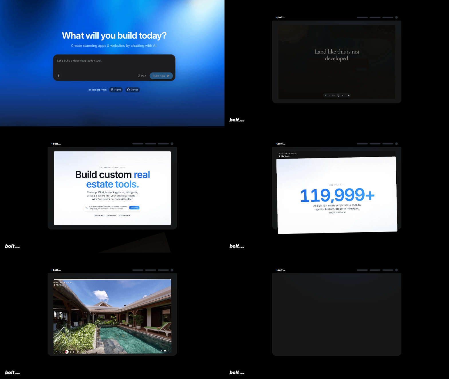
One prompt in — your agent builds a deck where every slide is a live, responsive web page. 3D, live data, working prototypes, and whatever you can prompt.

Open in Bolt Open in StackBlitz License: MIT

Bolt Slides — from one prompt in Bolt to a finished interactive deck

Why we made this

AI for slides is awesome, but the outputs tend to be slop: generic layouts, walls of bullets, nothing you'd be proud to present.

And also: why are slides still static? Agents can build anything. What would it look like if you (tastefully) turned them loose on slides?

Bolt Slides is what we built to find out: building blocks any agent (Claude Code, Codex, Cursor, Bolt) can compose stunning, compelling presentations with. Bespoke layouts, real typography, considered animations, interactive anything. Every deck is a real web app, responsive on any screen, shared as a link.

Taste comes standard.

See what that looks like →

Under the hood it's a classic paged deck — Slidev-style dock, thumbnail sidebar, grid overview, click-builds, annotations, synced presenter mode — where each slide is a plain React component. If you can build it for the web, you can present it.

Quick start

With an agent (the fun way). Open the repo in Bolt and prompt it:

Build me a deck pitching «your thing» to «your audience».

The bundled skill (.bolt/skills/slides/SKILL.md) teaches the agent how to theme, compose, and write the deck — including setting the tab title and favicon — so a single prompt returns a finished, presentable app.

By hand.

git clone https://github.com/stackblitz/bolt-slides
cd bolt-slides
npm install
npm run dev

The dev server opens a 26-slide demo that exercises every component. Delete the demo slides in src/App.tsx and author your own.

Authoring

Each top-level child of <Deck> is one slide. Compose them from the component library, or write plain JSX:

<Deck>
  <Cover
    kicker="Acme · Series A"
    title={<span className="accent-text">Acme</span>}
    subtitle="Answers, not dashboards."
    notes="Welcome — set up the problem, then hold a beat."
  />

  <Slide center nav="Thesis">
    <h2 className="headline">
      Dashboards are everywhere. <span className="accent-text">Insight isn't.</span>
    </h2>
    <Build at={1}>
      <p className="subhead">Acme turns raw events into answers — automatically.</p>
    </Build>
  </Slide>

  <Agenda
    kicker="Agenda"
    title="What we'll cover."
    items={['The problem', 'How it works', { title: 'Pricing & the ask', hint: '5 min' }]}
  />
</Deck>

Presenting

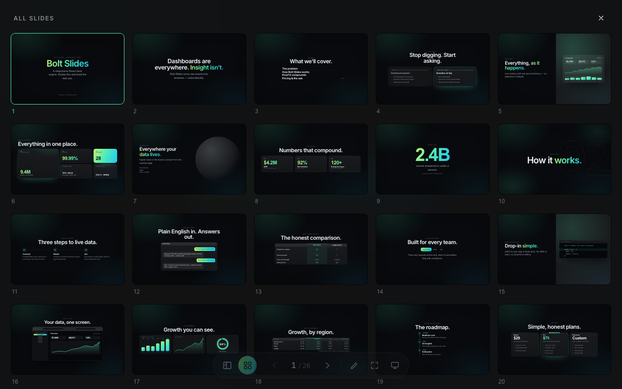
Grid view of every slide
Key Action
→ ↓ Space Next (reveals builds first)
← ↑ Previous (rewinds builds)
Home / End First / last slide
S Sidebar — thumbnail rail
G Grid view — every slide at once
A Annotate — pen, highlighter, shapes, eraser
F Fullscreen
P Presenter mode — synced new tab
H Hide the UI
Esc Close overlays

Component library

Components
Structure Cover Agenda Section Split Bento Slide
Data Charts (bar · line · donut) Table StatGrid BigNumber CountUp VisualDashboard
Story Quote Contrast Comparison Timeline Steps Chat
Product CodeWindow BrowserFrame Pricing Team
Flair Globe TiltCard SpotlightCard Marquee Accordion Tabs

All of them are demoed in the bundled starter deck, and all of them are responsive.

Theming

Every color, font, radius, and shadow lives in the :root block of src/styles/tokens.css. Change --primary and the entire deck — chrome included — recolors. Nine ready-made theme directions are documented in the skill, from editorial luxury to dark technical.

Project structure

.bolt/skills/slides/   the agent-facing authoring guide (the skill)
src/deck/              engine + chrome — Deck, Slide, Build, Reveal, Annotator
src/components/        the slide component library
src/styles/            tokens.css (theme) + base.css (system styles)
src/App.tsx            your deck (ships with the component demo)

Contributing

Issues and PRs welcome — see CONTRIBUTING.md. npm run dev to hack, npx tsc --noEmit && npm run build before you push.

License

MIT © StackBlitz

bolt-slides (stackblitz/bolt-slides)

Searching Database…

这是什么?Bolt Slides 把一句提示词变成一套演示文稿,其中每一页幻灯片都是一个真实的、响应式的 React 网页应用,而不是静态的幻灯片——由任意 AI 编码智能体构建。
这是幻灯片应用还是代码框架?它是一个基于 React 的演示框架/模板:底层是经典的分页幻灯片(缩略图侧边栏、网格总览、点击逐步呈现、演讲者模式),而每一页幻灯片实际上就是一个普通的 React 组件。
怎么用它做一套幻灯片?在 Bolt 中打开仓库并对智能体下指令,例如「帮我做一套向你的受众推销你自己的幻灯片」,自带的技能会教它一次性完成整套幻灯片的主题设计、排版和文案。也可以手工来:运行开发服务器查看 26 页的演示,然后删除 'src/App.tsx' 里的演示页,自己动手写。
哪些编码智能体可以帮我做幻灯片?任何能读取自带技能文件并编写 React/JSX 的智能体都行——README 特别点名了 Claude Code、Codex、Cursor 和 Bolt。
如果我不想用智能体呢?你也可以手工编写幻灯片,但没有可视化编辑器——幻灯片就是普通的 React 组件,所以你得能熟练地写 JSX、取数据,或直接在代码里挂载 3D 场景这类东西。
库里自带哪些组件?它自带结构组件(Cover、Agenda、Section、Split、Bento、Slide)、数据组件(Charts、Table、StatGrid、BigNumber、CountUp、VisualDashboard)、叙事组件(Quote、Contrast、Timeline、Steps、Chat)、产品组件(CodeWindow、BrowserFrame、Pricing、Team),以及 Globe、TiltCard、Marquee、Accordion 等装饰组件——全部都在入门幻灯片中有演示。
怎么改变整套幻灯片的外观?所有颜色、字体、圆角和阴影都定义在 src/styles/tokens.css 的 :root 块里,所以改一个像 --primary 这样的变量就能让整套幻灯片(包括界面框架)整体换色。技能文档里还记录了九个现成的主题方向,从杂志奢华风到深色科技风都有。
演讲者模式能做什么?演讲者模式会在第二个浏览器标签页中打开,通过 BroadcastChannel 与观众标签页保持同步,显示计时器、下一页幻灯片的预览,以及演讲期间可在本地持久保存的可编辑备注。
可以直接链接到某一页吗?可以——URL 哈希会跟踪当前幻灯片(例如 '/#7'),所以你可以分享一个直达该页的深链接。
Creator
stackblitz
Size
9 MB
Stars
1.1K
Updated
CommitJul 30
Age
3mo
Commits · 90 Days