MaterialDrawer
... the flexible, easy to use, all in one drawer library for your Android project.
What's included 🚀 •
Setup 🛠️ •
Migration Guide 🧬 •
WIKI / FAQ 📖 •
Used by •
Sample App
What's included 🚀
- the easiest possible integration
- uses the androidX support libraries
- compatible down to API Level 16
- includes an AccountSwitcher
- quick and simple api
- follows the NEW Google Material Design Guidelines
- use vector (.svg) icons and icon fonts via the Android-Iconics integration
- Google Material Design Icons, Google Material Community Design Icons, FontAwesome and more
- comes with various themes which help to get your own themes clean
- modify the colors on the go
- comes with multiple default drawer items
- based on a RecyclerView
- RTL support
- Gmail like MiniDrawer
- expandable items
- badge support
- define custom drawer items
- tested and stable
- sticky footer or headers
- absolutely NO limits
- NavController support by @petretiandrea
If you upgrade from < 8.0.0 follow the MIGRATION GUIDE
Preview
Screenshots 🎉
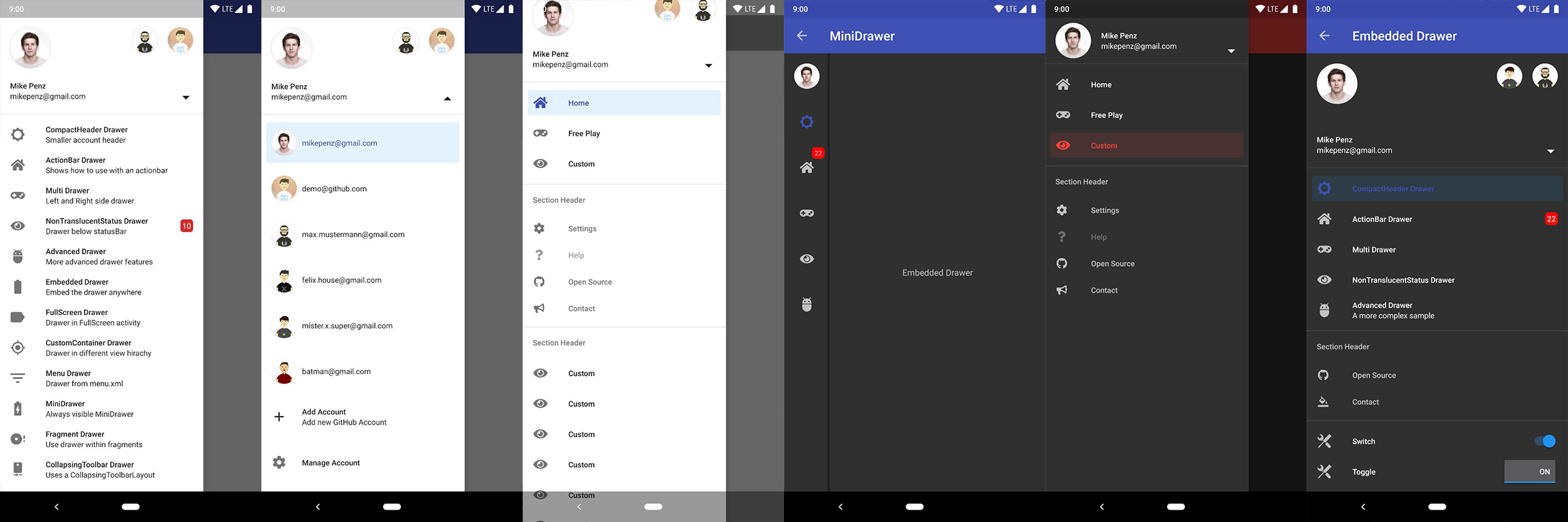
Setup
Latest releases 🛠
- Kotlin && M3 && JVM
17 | v10.0.0-b01
- Kotlin && Material 3 | v9.0.2
- Kotlin | v8.4.5 (Provided as-is only)
- Java && AndroidX | v6.1.2 (Provided as-is only)
- Java && AppCompat | v6.0.9 (Provided as-is only)
1. Provide the gradle dependency
The latest release is available
on Maven Central.
implementation("com.mikepenz:materialdrawer:${latestRelease}")
//required support lib modules
implementation "androidx.appcompat:appcompat:${versions.appcompat}"
implementation "androidx.recyclerview:recyclerview:${versions.recyclerView}"
implementation "androidx.annotation:annotation:${versions.annotation}"
implementation "com.google.android.material:material:1.5.0-alpha05" // requires at least 1.5.0-x
implementation "androidx.constraintlayout:constraintlayout:${versions.constraintLayout}"
NavController Support @ Maven Central.
// Add for NavController support
implementation "com.mikepenz:materialdrawer-nav:${lastestMaterialDrawerRelease}"
Android-Iconics Support @ Maven Central
.
// Add for Android-Iconics support
implementation "com.mikepenz:materialdrawer-iconics:${lastestMaterialDrawerRelease}"
2. Add the Drawer into the XML
The MaterialDrawerSliderView has to be provided as child of the DrawerLayout and will as such act as the slider
<androidx.drawerlayout.widget.DrawerLayout xmlns : android ="http://schemas.android.com/apk/res/android"
xmlns:app = "http://schemas.android.com/apk/res-auto"
android:id = "@+id/root"
    android:layout_width="match_parent"
    android:layout_height="match_parent"
    android:fitsSystemWindows="true">

    ... your content ...

    <com.mikepenz.materialdrawer.widget.MaterialDrawerSliderView
        android:id="@+id/slider"
        android:layout_width="wrap_content"
        android:layout_height="match_parent"
        android:layout_gravity="start"
        android:fitsSystemWindows="true" />
</androidx.drawerlayout.widget.DrawerLayout>
3. Add the DrawerStyle to your theme
<style name="SampleApp.DayNight" parent="Theme.Material3.DayNight.NoActionBar">
    ...
    <item name="materialDrawerStyle">@style/Widget.MaterialDrawerStyle</item>
    <item name="materialDrawerHeaderStyle">@style/Widget.MaterialDrawerHeaderStyle</item>
    ...
</style>
Great. Your drawer is now ready to use.
Note
Using v9.x with Material 3 theming requires a Material3 theme as base for the activity.
Additional Setup
Add items and adding some functionality
//if you want to update the items at a later time it is recommended to keep it in a variable
val item1 = PrimaryDrawerItem().apply { nameRes = R.string.drawer_item_home; identifier = 1 }
val item2 = SecondaryDrawerItem().apply { nameRes = R.string.drawer_item_settings; identifier = 2 }

// get the reference to the slider and add the items
slider.itemAdapter.add(
	    item1,
	    DividerDrawerItem(),
	    item2,
	    SecondaryDrawerItem().apply { nameRes = R.string.drawer_item_settings }
)

// specify a click listener
slider.onDrawerItemClickListener = { v, drawerItem, position ->
    // do something with the clicked item :D
    false
}
Selecting an item
//set the selection to the item with the identifier 1
slider.setSelection(1)
//set the selection to the item with the identifier 2
slider.setSelection(item2)
//set the selection and also fire the `onItemClick`-listener
slider.setSelection(1, true)
By default, when a drawer item is clicked, it becomes the new selected item. If this isn't the expected behavior,
you can disable it for this item using isSelectable = false:
SecondaryDrawerItem().apply { nameRes = R.string.drawer_item_dialog; isSelectable = false }
Modify items or the drawer
//modify an item of the drawer
item1.apply {
  nameText = "A new name for this drawerItem"; badge = StringHolder("19")
  badgeStyle = BadgeStyle().apply { textColor = ColorHolder.fromColor(Color.WHITE); color = ColorHolder.fromColorRes(R.color.md_red_700) }
}
//notify the drawer about the updated element. it will take care about everything else
slider.updateItem(item1)

//to update only the name, badge, icon you can also use one of the quick methods
slider.updateName(1, "A new name")

//the result object also allows you to add new items, remove items, add footer, sticky footer, ..
slider.addItem(DividerDrawerItem())
slider.addStickyFooterItem(PrimaryDrawerItem().apply { nameTest = "StickyFooter" })

//remove items with an identifier
slider.removeItem(2)

//open / close the drawer
slider.drawerLayout?.openDrawer(slider)
slider.drawerLayout?.closeDrawer(slider)

//get the reference to the `DrawerLayout` itself
slider.drawerLayout
Add profiles and an AccountHeader
// Create the AccountHeader
headerView = AccountHeaderView(this).apply {
    attachToSliderView(slider) // attach to the slider
    addProfiles(
        ProfileDrawerItem().apply { nameText = "Mike Penz"; descriptionText = "[email protected]"; iconRes = R.drawable.profile; identifier = 102 }
    )
    onAccountHeaderListener = { view, profile, current ->
        // react to profile changes
        false
    }
    withSavedInstance(savedInstanceState)
}
Android-Iconics support
The MaterialDrawer provides an extension for the Android-Iconics library. This allows you to create your DrawerItems with an icon from any font.
Choose the fonts you need. Available Fonts
// Add for Android-Iconics support
implementation "com.mikepenz:materialdrawer-iconics:${lastestMaterialDrawerRelease}"

// fonts
implementation 'com.mikepenz:google-material-typeface:x.y.z@aar' //Google Material Icons
implementation 'com.mikepenz:fontawesome-typeface:x.y.z@aar'     //FontAwesome
//now you can simply use any icon of the Google Material Icons font
PrimaryDrawerItem().apply { iconicsIcon = GoogleMaterial.Icon.gmd_wb_sunny }
//Or an icon from FontAwesome
SecondaryDrawerItem().apply { iconicsIcon = FontAwesomeBrand.Icon.fab_github }
Advanced Setup
For advanced usecases. Please have a look at the provided sample activities.
Load images via url
The MaterialDrawer supports fetching images from URLs and setting them for the Profile icons. As the MaterialDrawer does not contain an ImageLoading library
the dev can choose his own implementation (Picasso, Glide, ...). This has to be done, before the first image should be loaded via URL. (Should be done in the Application, but any other spot before loading the first image is working too)
//initialize and create the image loader logic
DrawerImageLoader.init(object : AbstractDrawerImageLoader() {
    override fun set(imageView: ImageView, uri: Uri, placeholder: Drawable) {
        Picasso.get().load(uri).placeholder(placeholder).into(imageView)
    }

    override fun cancel(imageView: ImageView) {
        Picasso.get().cancelRequest(imageView)
    }

    /*
    override fun set(imageView: ImageView, uri: Uri, placeholder: Drawable, tag: String?) {
        super.set(imageView, uri, placeholder, tag)
    }

    override fun placeholder(ctx: Context): Drawable {
        return super.placeholder(ctx)
    }

    override fun placeholder(ctx: Context, tag: String?): Drawable {
        return super.placeholder(ctx, tag)
    }
    */
})
An implementation with GLIDE v4 (See tag v6.1.1 for glide v3 sample) can be found in the sample application
JVM Target 1.8
// Since 8.1.0 the drawer includes core ktx 1.3.0 which requires jvm 1.8
kotlinOptions {
    jvmTarget = "1.8"
}
Style the drawer 🖌️
Custom style - styles.xml
Create your custom style. If you don't need a custom theme see the next section, how you can set the colors just by overwriting the original colors.
// define a custom drawer style
<style name="Widget.MaterialDrawerStyleCustom" parent="Widget.MaterialDrawerStyle">
    <item name="materialDrawerInsetForeground">#4000</item>
    <!-- MaterialDrawer specific values -->
    <item name="materialDrawerBackground">?colorSurface</item>
    <item name="materialDrawerPrimaryText">@color/color_drawer_item_text</item>
    <item name="materialDrawerPrimaryIcon">@color/color_drawer_item_text</item>
    <item name="materialDrawerSecondaryText">@color/color_drawer_item_text</item>
    <item name="materialDrawerSecondaryIcon">@color/color_drawer_item_text</item>
    <item name="materialDrawerDividerColor">?colorOutline</item>
    <item name="materialDrawerSelectedBackgroundColor">?colorSecondaryContainer</item>
</style>

// define a custom header style
<style name="Widget.MaterialDrawerHeaderStyleCustom" parent="">
    <item name="materialDrawerCompactStyle">true</item>
    <item name="materialDrawerHeaderSelectionText">?colorOnSurface</item>
    <item name="materialDrawerHeaderSelectionSubtext">?colorOnSurface</item>
</style>

// define the custom styles for the theme
<style name="SampleApp" parent="Theme.Material3.Light.NoActionBar">
    ...
    <item name="materialDrawerStyle">@style/Widget.MaterialDrawerStyleCustom</item>
    <item name="materialDrawerHeaderStyle">@style/Widget.MaterialDrawerHeaderStyleCustom</item>
    ...
</style>
Adjust BezelImageView style
Overwrite the Style of the BezelImageView for the whole MaterialDrawer
<style name="BezelImageView">
    <item name="biv_maskDrawable">@drawable/material_drawer_rectangle_mask</item>
    <item name="biv_drawCircularShadow">false</item>
    <item name="biv_selectorOnPress">@color/material_drawer_primary</item>
    <item name="android:scaleType">centerInside</item>
</style>
Used by
(feel free to send me new projects)
Articles about the MaterialDrawer
Credits
Developed By
License
Copyright 2021 Mike Penz

Licensed under the Apache License, Version 2.0 (the "License");
you may not use this file except in compliance with the License.
You may obtain a copy of the License at

   http://www.apache.org/licenses/LICENSE-2.0

Unless required by applicable law or agreed to in writing, software
distributed under the License is distributed on an "AS IS" BASIS,
WITHOUT WARRANTIES OR CONDITIONS OF ANY KIND, either express or implied.
See the License for the specific language governing permissions and
limitations under the License.

 MaterialDrawer 是一个开源的 Android 库,可以为你的应用添加灵活的导航抽屉——这是一套遵循 Google Material Design 规范的一站式抽屉解决方案,在 GitHub 上获得了超过 11000 颗星。