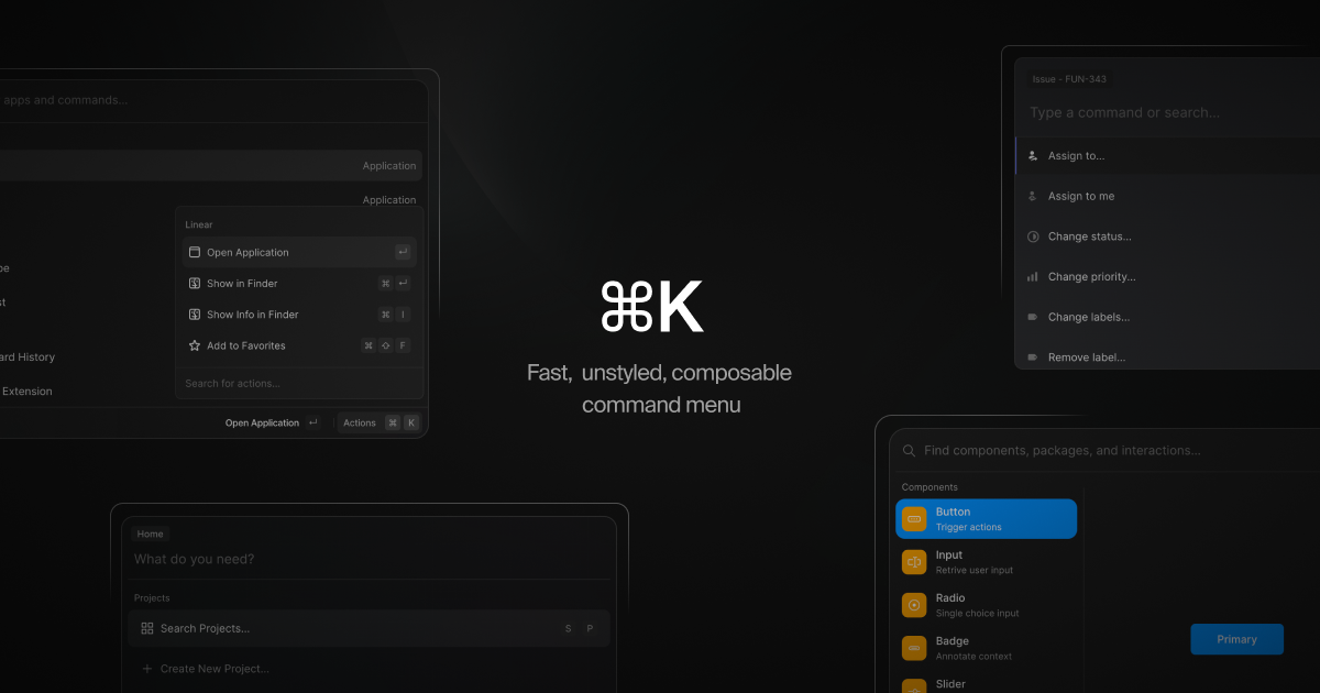
⌘K 

⌘K is a command menu React component that can also be used as an accessible combobox. You render items, it filters and sorts them automatically. ⌘K supports a fully composable API How?, so you can wrap items in other components or even as static JSX.
Install
pnpm install cmdk
Use
import { Command } from 'cmdk'

const CommandMenu = () => {
  return (
    <Command label="Command Menu">
      <Command.Input />
      <Command.List>
        <Command.Empty>No results found.</Command.Empty>

        <Command.Group heading="Letters">
          <Command.Item>a</Command.Item>
          <Command.Item>b</Command.Item>
          <Command.Separator />
          <Command.Item>c</Command.Item>
        </Command.Group>

        <Command.Item>Apple</Command.Item>
      </Command.List>
    </Command>
  )
}
Or in a dialog:
import { Command } from 'cmdk'

const CommandMenu = () => {
  const [open, setOpen] = React.useState(false)

  // Toggle the menu when ⌘K is pressed
  React.useEffect(() => {
    const down = (e) => {
      if (e.key === 'k' && (e.metaKey || e.ctrlKey)) {
        e.preventDefault()
        setOpen((open) => !open)
      }
    }

    document.addEventListener('keydown', down)
    return () => document.removeEventListener('keydown', down)
  }, [])

  return (
    <Command.Dialog open={open} onOpenChange={setOpen} label="Global Command Menu">
      <Command.Input />
      <Command.List>
        <Command.Empty>No results found.</Command.Empty>

        <Command.Group heading="Letters">
          <Command.Item>a</Command.Item>
          <Command.Item>b</Command.Item>
          <Command.Separator />
          <Command.Item>c</Command.Item>
        </Command.Group>

        <Command.Item>Apple</Command.Item>
      </Command.List>
    </Command.Dialog>
  )
}
Parts and styling
All parts forward props, including ref, to an appropriate element. Each part has a specific data-attribute (starting with cmdk-) that can be used for styling.
Command [cmdk-root]
Render this to show the command menu inline, or use Dialog to render in a elevated context. Can be controlled with the value and onValueChange props.
Note
Values are always trimmed with the trim() method.
const [value, setValue] = React.useState('apple')

return (
  <Command value={value} onValueChange={setValue}>
    <Command.Input />
    <Command.List>
      <Command.Item>Orange</Command.Item>
      <Command.Item>Apple</Command.Item>
    </Command.List>
  </Command>
)
You can provide a custom filter function that is called to rank each item. Note that the value will be trimmed.
<Command
  filter={(value, search) => {
    if (value.includes(search)) return 1
    return 0
  }}
/>
A third argument, keywords, can also be provided to the filter function. Keywords act as aliases for the item value, and can also affect the rank of the item. Keywords are trimmed.
<Command
  filter={(value, search, keywords) => {
    const extendValue = value + ' ' + keywords.join(' ')
    if (extendValue.includes(search)) return 1
    return 0
  }}
/>
Or disable filtering and sorting entirely:
<Command shouldFilter={false}>
  <Command.List>
    {filteredItems.map((item) => {
      return (
        <Command.Item key={item} value={item}>
          {item}
        </Command.Item>
      )
    })}
  </Command.List>
</Command>
You can make the arrow keys wrap around the list (when you reach the end, it goes back to the first item) by setting the loop prop:
<Command loop />
Dialog [cmdk-dialog] [cmdk-overlay]
Props are forwarded to Command. Composes Radix UI's Dialog component. The overlay is always rendered. See the Radix Documentation for more information. Can be controlled with the open and onOpenChange props.
const [open, setOpen] = React.useState(false)

return (
  <Command.Dialog open={open} onOpenChange={setOpen}>
    ...
  </Command.Dialog>
)
You can provide a container prop that accepts an HTML element that is forwarded to Radix UI's Dialog Portal component to specify which element the Dialog should portal into (defaults to body). See the Radix Documentation for more information.
const containerElement = React.useRef(null)

return (
  <>
    <Command.Dialog container={containerElement.current} />
    <div ref={containerElement} />
  </>
)
All props are forwarded to the underlying input element. Can be controlled with the value and onValueChange props.
const [search, setSearch] = React.useState('')

return <Command.Input value={search} onValueChange={setSearch} />
List [cmdk-list]
Contains items and groups. Animate height using the --cmdk-list-height CSS variable.
[cmdk-list] {
  min-height: 300px;
  height: var(--cmdk-list-height);
  max-height: 500px;
  transition: height 100ms ease;
}
To scroll item into view earlier near the edges of the viewport, use scroll-padding:
[cmdk-list] {
  scroll-padding-block-start: 8px;
  scroll-padding-block-end: 8px;
}
Item [cmdk-item] [data-disabled?] [data-selected?]
Item that becomes active on pointer enter. You should provide a unique value for each item, but it will be automatically inferred from the .textContent.
<Command.Item
  onSelect={(value) => console.log('Selected', value)}
  // Value is implicity "apple" because of the provided text content
>
  Apple
</Command.Item>
You can also provide a keywords prop to help with filtering. Keywords are trimmed.
<Command.Item keywords={['fruit', 'apple']}>Apple</Command.Item>
<Command.Item
  onSelect={(value) => console.log('Selected', value)}
  // Value is implicity "apple" because of the provided text content
>
  Apple
</Command.Item>
You can force an item to always render, regardless of filtering, by passing the forceMount prop.
Group [cmdk-group] [hidden?]
Groups items together with the given heading ([cmdk-group-heading]).
<Command.Group heading="Fruit">
  <Command.Item>Apple</Command.Item>
</Command.Group>
Groups will not unmount from the DOM, rather the hidden attribute is applied to hide it from view. This may be relevant in your styling.
You can force a group to always render, regardless of filtering, by passing the forceMount prop.
Separator [cmdk-separator]
Visible when the search query is empty or alwaysRender is true, hidden otherwise.
Empty [cmdk-empty]
Automatically renders when there are no results for the search query.
Loading [cmdk-loading]
You should conditionally render this with progress while loading asynchronous items.
const [loading, setLoading] = React.useState(false)

return <Command.List>{loading && <Command.Loading>Hang on…</Command.Loading>}</Command.List>
useCommandState(state => state.selectedField)
Hook that composes useSyncExternalStore. Pass a function that returns a slice of the command menu state to re-render when that slice changes. This hook is provided for advanced use cases and should not be commonly used.
A good use case would be to render a more detailed empty state, like so:
const search = useCommandState((state) => state.search)
return <Command.Empty>No results found for "{search}".</Command.Empty>
Examples
Code snippets for common use cases.
Nested items
Often selecting one item should navigate deeper, with a more refined set of items. For example selecting "Change theme…" should show new items "Dark theme" and "Light theme". We call these sets of items "pages", and they can be implemented with simple state:
const ref = React.useRef(null)
const [open, setOpen] = React.useState(false)
const [search, setSearch] = React.useState('')
const [pages, setPages] = React.useState([])
const page = pages[pages.length - 1]

return (
  <Command
    onKeyDown={(e) => {
      // Escape goes to previous page
      // Backspace goes to previous page when search is empty
      if (e.key === 'Escape' || (e.key === 'Backspace' && !search)) {
        e.preventDefault()
        setPages((pages) => pages.slice(0, -1))
      }
    }}
  >
    <Command.Input value={search} onValueChange={setSearch} />
    <Command.List>
      {!page && (
        <>
          <Command.Item onSelect={() => setPages([...pages, 'projects'])}>Search projects…</Command.Item>
          <Command.Item onSelect={() => setPages([...pages, 'teams'])}>Join a team…</Command.Item>
        </>
      )}

      {page === 'projects' && (
        <>
          <Command.Item>Project A</Command.Item>
          <Command.Item>Project B</Command.Item>
        </>
      )}

      {page === 'teams' && (
        <>
          <Command.Item>Team 1</Command.Item>
          <Command.Item>Team 2</Command.Item>
        </>
      )}
    </Command.List>
  </Command>
)
Show sub-items when searching
If your items have nested sub-items that you only want to reveal when searching, render based on the search state:
const SubItem = (props) => {
  const search = useCommandState((state) => state.search)
  if (!search) return null
  return <Command.Item {...props} />
}

return (
  <Command>
    <Command.Input />
    <Command.List>
      <Command.Item>Change theme…</Command.Item>
      <SubItem>Change theme to dark</SubItem>
      <SubItem>Change theme to light</SubItem>
    </Command.List>
  </Command>
)
Asynchronous results
Render the items as they become available. Filtering and sorting will happen automatically.
const [loading, setLoading] = React.useState(false)
const [items, setItems] = React.useState([])

React.useEffect(() => {
  async function getItems() {
    setLoading(true)
    const res = await api.get('/dictionary')
    setItems(res)
    setLoading(false)
  }

  getItems()
}, [])

return (
  <Command>
    <Command.Input />
    <Command.List>
      {loading && <Command.Loading>Fetching words…</Command.Loading>}
      {items.map((item) => {
        return (
          <Command.Item key={`word-${item}`} value={item}>
            {item}
          </Command.Item>
        )
      })}
    </Command.List>
  </Command>
)
Use inside Popover
We recommend using the Radix UI popover component. ⌘K relies on the Radix UI Dialog component, so this will reduce your bundle size a bit due to shared dependencies.
$ pnpm install @radix-ui/react-popover
Render Command inside of the popover content:
import * as Popover from '@radix-ui/react-popover'

return (
  <Popover.Root>
    <Popover.Trigger>Toggle popover</Popover.Trigger>

    <Popover.Content>
      <Command>
        <Command.Input />
        <Command.List>
          <Command.Item>Apple</Command.Item>
        </Command.List>
      </Command>
    </Popover.Content>
  </Popover.Root>
)
Drop in stylesheets
You can find global stylesheets to drop in as a starting point for styling. See website/styles/cmdk for examples.
FAQ
Accessible? Yes. Labeling, aria attributes, and DOM ordering tested with Voice Over and Chrome DevTools. Dialog composes an accessible Dialog implementation.
Virtualization? No. Good performance up to 2,000-3,000 items, though. Read below to bring your own.
Filter/sort items manually? Yes. Pass shouldFilter={false} to Command. Better memory usage and performance. Bring your own virtualization this way.
React 18 safe? Yes, required. Uses React 18 hooks like useId and useSyncExternalStore.
Unstyled? Yes, use the listed CSS selectors.
Hydration mismatch? No, likely a bug in your code. Ensure the open prop to Command.Dialog is false on the server.
React strict mode safe? Yes. Open an issue if you notice an issue.
Weird/wrong behavior? Make sure your Command.Item has a key and unique value.
Concurrent mode safe? Maybe, but concurrent mode is not yet real. Uses risky approaches like manual DOM ordering.
React server component? No, it's a client component.
Listen for ⌘K automatically? No, do it yourself to have full control over keybind context.
React Native? No, and no plans to support it. If you build a React Native version, let us know and we'll link your repository here.
History
Written in 2019 by Paco (@pacocoursey) to see if a composable combobox API was possible. Used for the Vercel command menu and autocomplete by Rauno (@raunofreiberg) in 2020. Re-written independently in 2022 with a simpler and more performant approach. Ideas and help from Shu (@shuding_).
use-descendants was extracted from the 2019 version.
Testing
First, install dependencies and Playwright browsers:
pnpm install
pnpm playwright install
Then ensure you've built the library:
pnpm build
Then run the tests using your local build against real browser engines:
pnpm test

 cmdk(⌘K)是一个快速、无样式的 React 组件,用于构建命令菜单,也可以作为无障碍组合框(combobox)使用。你把条目交给它,它会自动进行过滤和排序。