
ui README

The project's README from github.com/creativetimofficial/ui. As one markdown file: README.md.

Creative Tim UI

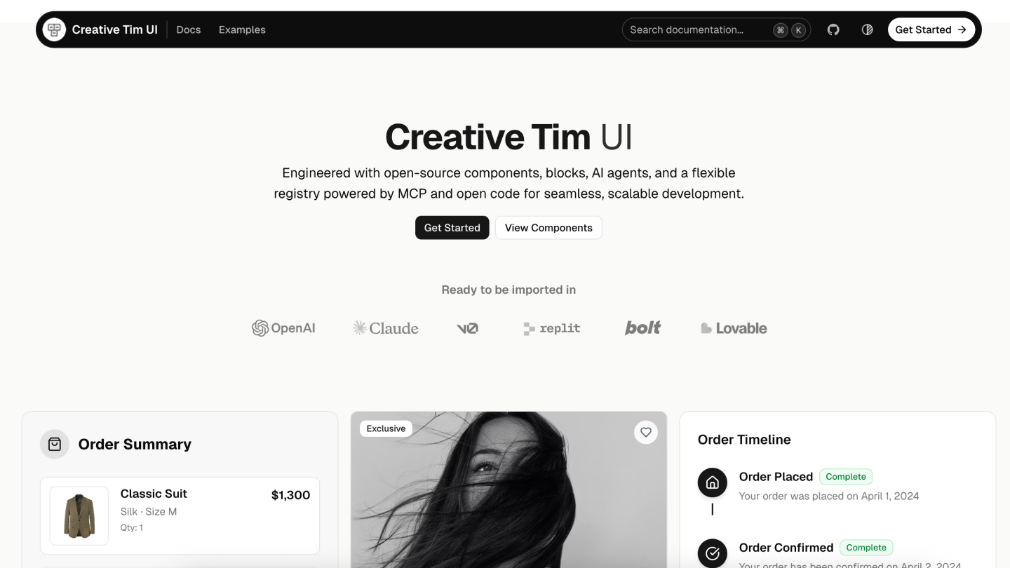
Creative Tim UI

Creative Tim UI is a comprehensive component library built on top of shadcn/ui to help you build modern web applications faster.

Overview

Creative Tim UI provides pre-built, customizable React components and blocks designed for building beautiful, production-ready web applications. The CLI makes it easy to add these components to your Next.js project.

Installation

You can use the Creative Tim UI CLI directly with npx, or install it globally:

# Use directly (recommended)
npx @creative-tim/ui@latest add <component-name>

# Or using shadcn cli
npx shadcn@latest add https://creative-tim.com/ui/r/all.json

Prerequisites

Before using Creative Tim UI, ensure your Next.js project meets these requirements:

Usage

Install All Components

Install all available Creative Tim UI components at once:

npx @creative-tim/ui@latest add all

This command will:

Install Specific Components

Install individual components using the components add command:

npx @creative-tim/ui@latest add <component-name>

Examples:

# Install the orb component
npx @creative-tim/ui@latest add card

Alternative: Use with shadcn CLI

You can also install components using the standard shadcn/ui CLI:

# Install all components
npx shadcn@latest add https://creative-tim.com/ui/r/all.json

# Install a specific component
npx shadcn@latest add https://creative-tim.com/ui/r/button.json

All available components can be found here or explore a list of example blocks here.

Blocks

Explore our collection of ready-to-use blocks organized by category. Each block is fully customizable and can be added to your project with a single command.

Application UI

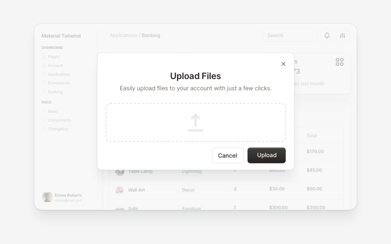
Modals
Modals
5 Blocks
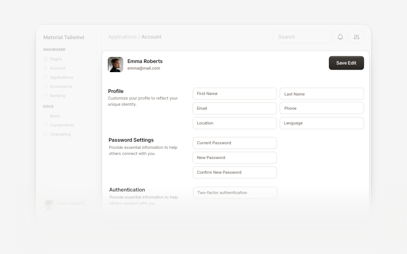
Account
Account
7 Blocks
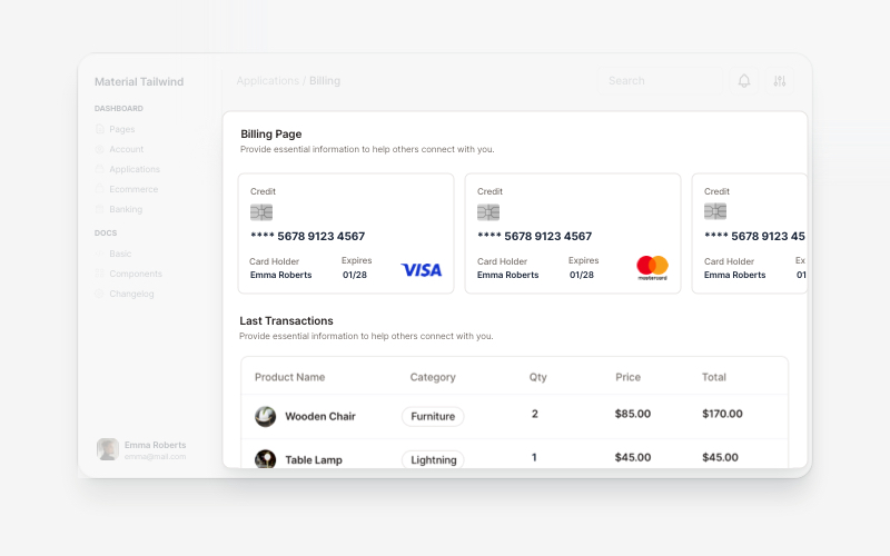
Billing
Billing
5 Blocks

Marketing

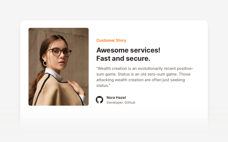
Testimonial Sections
17 Blocks
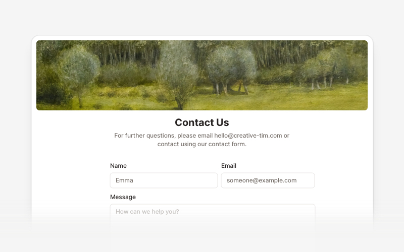
Contact Sections
Contact Sections
15 Blocks
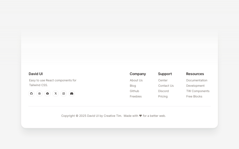
Footers
Footers
16 Blocks
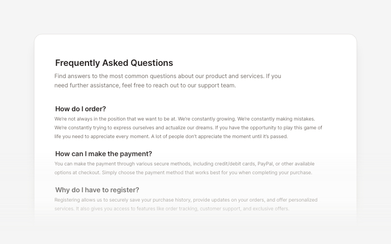
FAQs
FAQs
6 Blocks
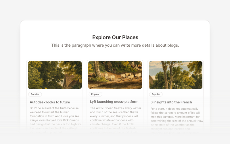
Blog
Blog
15 Blocks

Ecommerce UI

Ready-to-use blocks for product listings, shopping carts, and checkout flows.

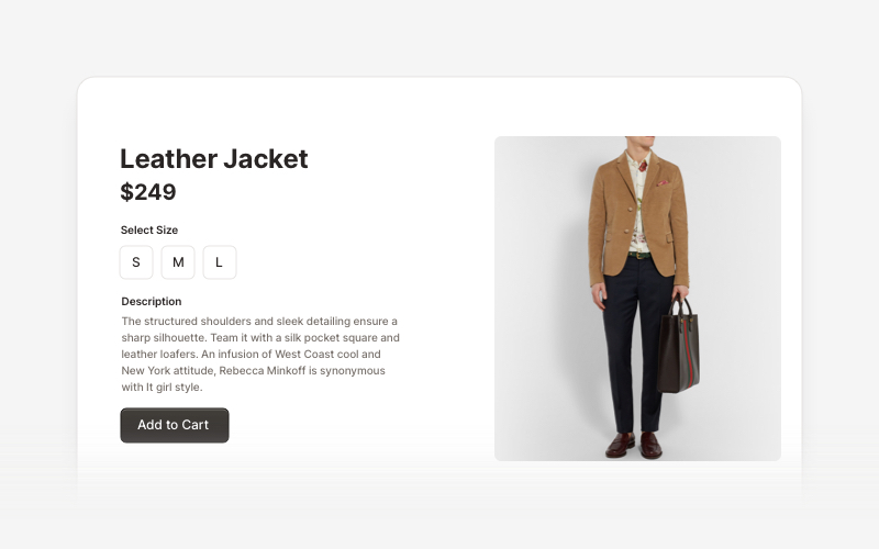
Ecommerce Sections
Ecommerce Sections
14 Blocks

Web 3.0

Innovative sections built for decentralized applications, blockchain projects, and crypto platforms.

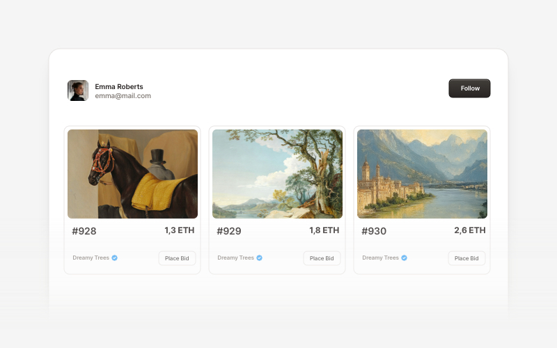
Web 3.0 Cards
Web 3.0 Cards
5 Blocks

Contributing

If you'd like to contribute to Creative Tim UI, please follow these steps:

  1. Fork the repository
  2. Create a new branch
  3. Make your changes to the components in the registry.
  4. Open a PR to the main branch.

Please read the contributing guide.

Copyrights and Licenses

Creative Tim UI is built upon the incredible work of the open source community:

We are grateful to these projects for making their work available under open source licenses.

License

Licensed under the MIT license.

Made with love by Creative Tim.

ui (creativetimofficial/ui)

Searching Database…

12.1K ·GitHub
这是什么?Creative Tim UI 是基于 shadcn/ui 构建的组件库,提供预构建的 React 组件和开箱即用的区块(弹窗、账单、页脚、常见问题、电商板块、Web3 卡片),帮助你更快地开发现代 Web 应用。
它是组件库还是完整的 UI 框架?它是通过 CLI 和注册表分发的组件/区块库,而不是独立的框架。你需要把各个组件或区块添加到已有的 Next.js 项目中。
我该如何把它添加到我的项目中?使用 npx 运行 Creative Tim UI CLI(或先全局安装再运行),一次性安装所有组件;也可以使用 components add 命令单独安装某个组件;你也可以使用标准的 shadcn/ui CLI。
我是否需要事先配置好 shadcn/ui 和 Tailwind?是的。在安装组件之前,你需要 Node.js 18+、在项目中初始化好 shadcn/ui(npx shadcn@latest init),并配置好 Tailwind CSS。
它能用于任何前端技术栈吗?不能。它是专门为使用 shadcn/ui 和 Tailwind 的 Next.js 项目构建的,如果缺少这些前提条件,它无法直接套用到其他技术栈中。
包含哪些类型的区块?区块按类别划分:应用界面(弹窗、账户、账单)、营销(用户评价、联系板块、页脚、常见问题、博客)、电商界面(商品列表、购物车、结账),以及 Web 3.0(面向加密货币和区块链项目的卡片)。
我能只安装一个组件而不是全部吗?可以。你可以使用 components add 命令单独安装某个组件,而无需一次性安装整个库。
这些组件的设计来源是什么?文档结构和基础组件来自 shadcn/ui,而区块设计则受到 Creative Tim 的 Material Tailwind 和 Eleven Labs UI 的启发。
Size
59.3 MB
Stars
12.1K
Age
10y
Commits · 90 Days