Что это?
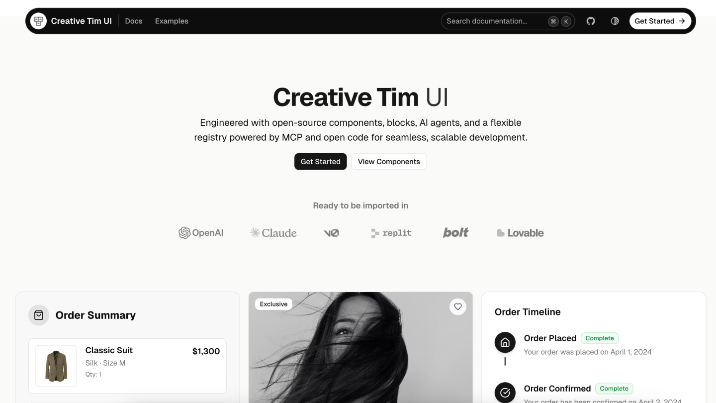
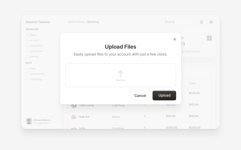
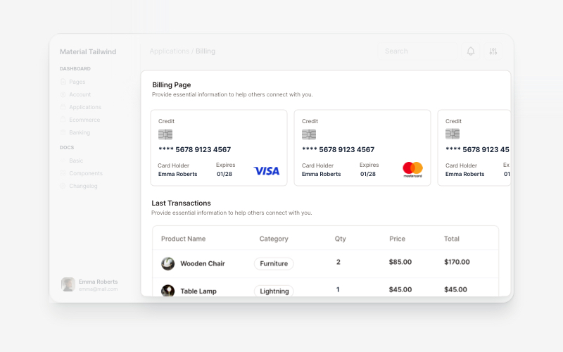
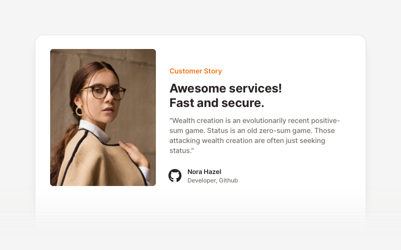
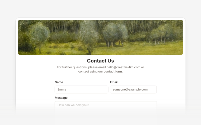
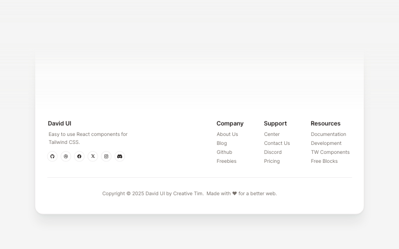
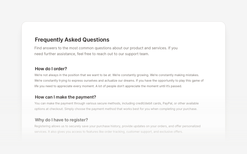
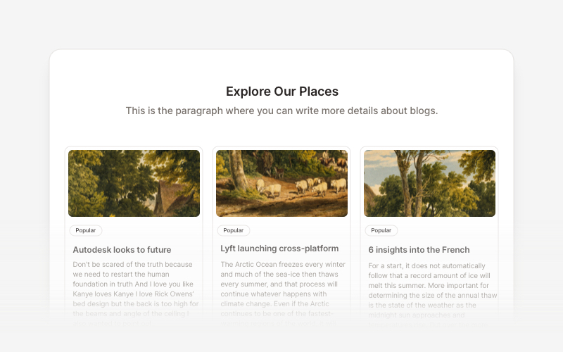
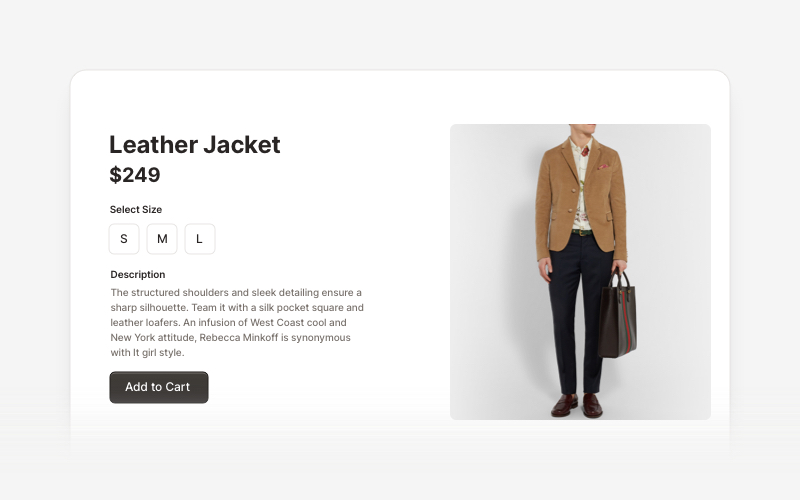
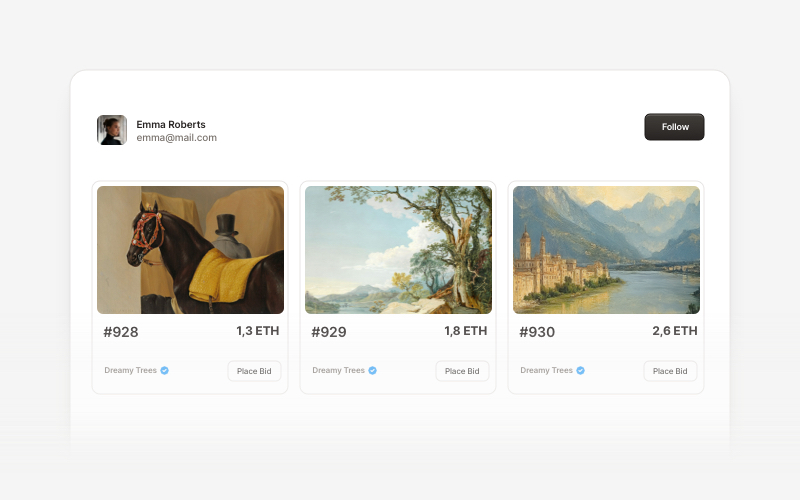
 Creative Tim UI — это библиотека компонентов на основе shadcn/ui, которая предлагает готовые React-компоненты и блоки для использования (модальные окна, биллинг, футеры, FAQ, секции интернет-магазинов, карточки Web3), чтобы быстрее создавать современные веб-приложения.
Creative Tim UI — это библиотека компонентов на основе shadcn/ui, которая предлагает готовые React-компоненты и блоки для использования (модальные окна, биллинг, футеры, FAQ, секции интернет-магазинов, карточки Web3), чтобы быстрее создавать современные веб-приложения.Это библиотека компонентов или полноценный UI-фреймворк?Это библиотека компонентов и блоков, которая распространяется через CLI и реестр, а не самостоятельный фреймворк: вы добавляете отдельные компоненты или блоки в существующий проект Next.js.
Это библиотека компонентов и блоков, которая распространяется через CLI и реестр, а не самостоятельный фреймворк: вы добавляете отдельные компоненты или блоки в существующий проект Next.js.Как добавить это в мой проект?Запустите CLI Creative Tim UI через npx (или установите его глобально), чтобы сразу установить все компоненты, либо используйте команду components add, чтобы установить отдельные компоненты; также можно использовать стандартный CLI shadcn/ui.
Запустите CLI Creative Tim UI через npx (или установите его глобально), чтобы сразу установить все компоненты, либо используйте команду components add, чтобы установить отдельные компоненты; также можно использовать стандартный CLI shadcn/ui.Нужно ли мне заранее настроить shadcn/ui и Tailwind?Да, перед установкой компонентов нужны Node.js 18+, инициализированный в проекте shadcn/ui (npx shadcn@latest init) и настроенный Tailwind CSS.
Да, перед установкой компонентов нужны Node.js 18+, инициализированный в проекте shadcn/ui (npx shadcn@latest init) и настроенный Tailwind CSS.Работает ли это с любым фронтенд-стеком?Нет, это библиотека, созданная специально для проектов на Next.js с shadcn/ui и Tailwind; без этих предварительных условий она не подойдёт для другого стека.
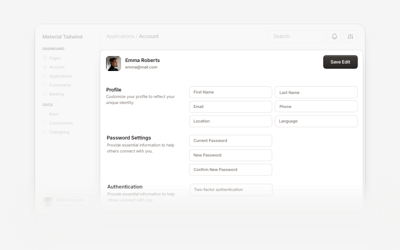
Нет, это библиотека, созданная специально для проектов на Next.js с shadcn/ui и Tailwind; без этих предварительных условий она не подойдёт для другого стека.Какие виды блоков здесь есть?Блоки разделены по категориям: UI приложений (модальные окна, аккаунт, биллинг), маркетинг (отзывы, контактные секции, футеры, FAQ, блог), UI для интернет-магазинов (списки товаров, корзины, оформление заказа) и Web 3.0 (карточки для крипто- и блокчейн-проектов).
Блоки разделены по категориям: UI приложений (модальные окна, аккаунт, биллинг), маркетинг (отзывы, контактные секции, футеры, FAQ, блог), UI для интернет-магазинов (списки товаров, корзины, оформление заказа) и Web 3.0 (карточки для крипто- и блокчейн-проектов).Можно ли установить только один компонент, а не все сразу?Да, отдельные компоненты можно установить командой components add, не устанавливая всю библиотеку целиком.
Да, отдельные компоненты можно установить командой components add, не устанавливая всю библиотеку целиком.Откуда берутся дизайны компонентов?Структура документации и базовые компоненты взяты из shadcn/ui, а дизайн блоков вдохновлён работами Creative Tim (Material Tailwind) и Eleven Labs UI.
Структура документации и базовые компоненты взяты из shadcn/ui, а дизайн блоков вдохновлён работами Creative Tim (Material Tailwind) и Eleven Labs UI.What are similar projects?rare-ui, shapeshift, ui, canvas-ui, Monocharts, lint, awesome-shadcn-ui, react-bits
rare-ui, shapeshift, ui, canvas-ui, Monocharts, lint, awesome-shadcn-ui, react-bits