What is this?
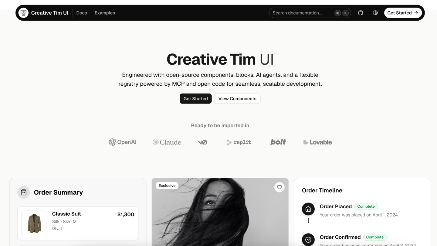
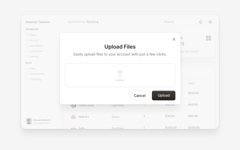
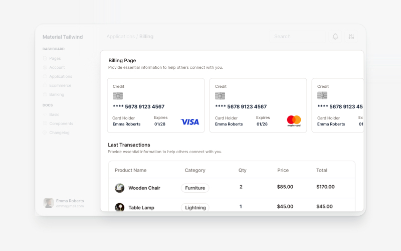
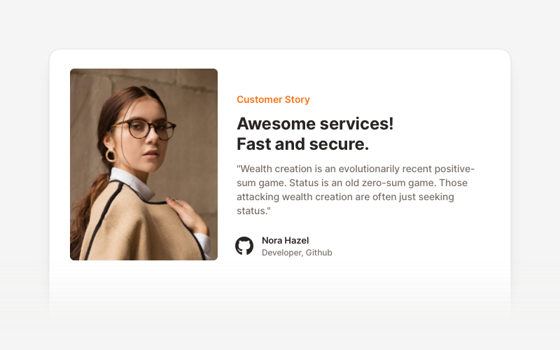
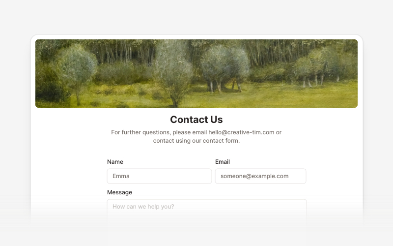
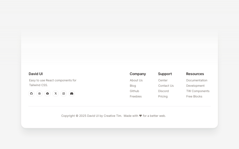
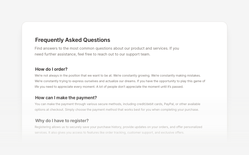
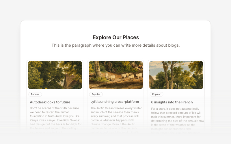
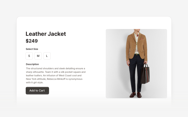
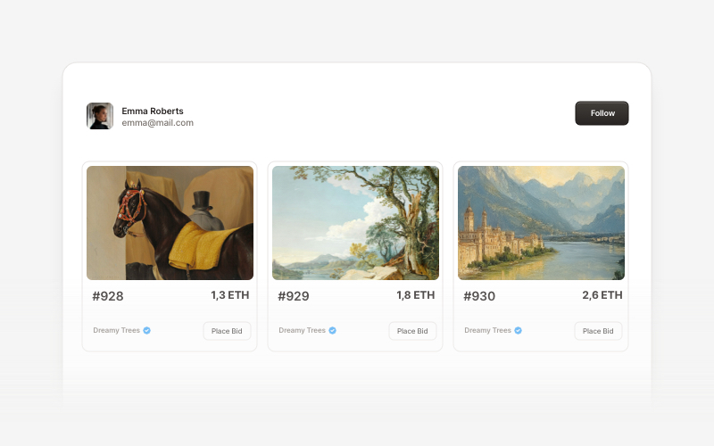
 Creative Tim UI is a component library built on top of shadcn/ui that provides pre-built React components and ready-to-use blocks (modals, billing, footers, FAQs, ecommerce sections, Web3 cards) to speed up building modern web apps.
Creative Tim UI is a component library built on top of shadcn/ui that provides pre-built React components and ready-to-use blocks (modals, billing, footers, FAQs, ecommerce sections, Web3 cards) to speed up building modern web apps.Is it a component library or a full UI framework?It's a component/block library distributed via a CLI and registry, not a standalone framework — you add individual components or blocks into an existing Next.js project.
It's a component/block library distributed via a CLI and registry, not a standalone framework — you add individual components or blocks into an existing Next.js project.How do I add it to my project?Run the Creative Tim UI CLI with npx (or install it globally) to install all components at once, or use the components add command to install individual components; you can also use the standard shadcn/ui CLI.
Run the Creative Tim UI CLI with npx (or install it globally) to install all components at once, or use the components add command to install individual components; you can also use the standard shadcn/ui CLI.Do I need shadcn/ui and Tailwind already set up?Yes — you need Node.js 18+, shadcn/ui initialized in your project (npx shadcn@latest init), and Tailwind CSS configured before installing components.
Yes — you need Node.js 18+, shadcn/ui initialized in your project (npx shadcn@latest init), and Tailwind CSS configured before installing components.Does it work with any frontend stack?No, it's built specifically for Next.js projects using shadcn/ui and Tailwind; it won't drop into a stack without those prerequisites.
No, it's built specifically for Next.js projects using shadcn/ui and Tailwind; it won't drop into a stack without those prerequisites.What kinds of blocks are included?Blocks are organized by category: Application UI (modals, account, billing), Marketing (testimonials, contact sections, footers, FAQs, blog), Ecommerce UI (product listings, carts, checkout), and Web 3.0 (cards for crypto/blockchain projects).
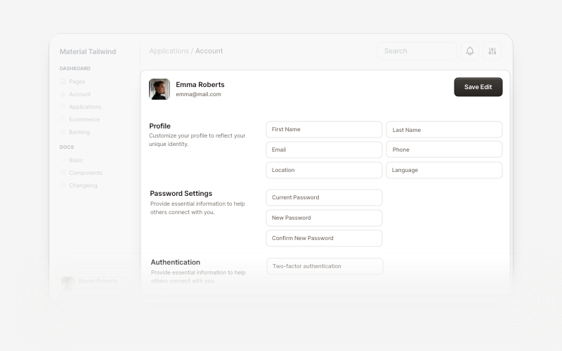
Blocks are organized by category: Application UI (modals, account, billing), Marketing (testimonials, contact sections, footers, FAQs, blog), Ecommerce UI (product listings, carts, checkout), and Web 3.0 (cards for crypto/blockchain projects).Can I install just one component instead of everything?Yes, you can install individual components using the components add command instead of installing the whole library at once.
Yes, you can install individual components using the components add command instead of installing the whole library at once.Where do the component designs come from?The documentation structure and foundational components come from shadcn/ui, while block designs are inspired by Creative Tim's Material Tailwind and Eleven Labs UI.
The documentation structure and foundational components come from shadcn/ui, while block designs are inspired by Creative Tim's Material Tailwind and Eleven Labs UI.What are similar projects?rare-ui, shapeshift, ui, canvas-ui, Monocharts, lint, awesome-shadcn-ui, react-bits
rare-ui, shapeshift, ui, canvas-ui, Monocharts, lint, awesome-shadcn-ui, react-bits