

1.5K ·GitHub
这是什么?
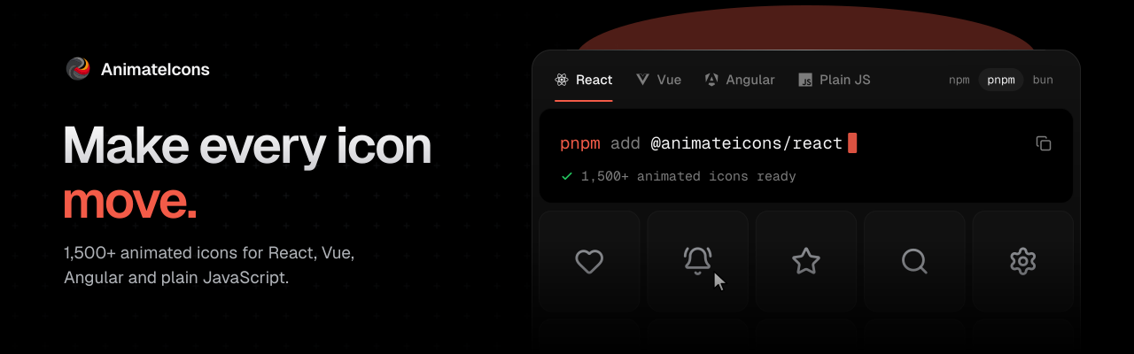
 Animateicons 是一个面向 Web 应用的动画 SVG 图标库,包含 1500 多个图标。它基于 motion 动画库构建,支持悬停和命令式(点击)触发,并可配置尺寸、颜色和动画时长。
这只是一个 React 图标库,还是也支持其他框架?它为不同框架分别提供独立的包:React 使用 @animateicons/react,Vue 3/Nuxt 使用 @animateicons/vue,Angular 20-22 使用 @animateicons/angular,原生 JS、Web Components、Svelte、Solid 和 Astro 则使用 @animateicons/vanilla。
它为不同框架分别提供独立的包:React 使用 @animateicons/react,Vue 3/Nuxt 使用 @animateicons/vue,Angular 20-22 使用 @animateicons/angular,原生 JS、Web Components、Svelte、Solid 和 Astro 则使用 @animateicons/vanilla。我怎么把图标添加到项目里?为你的框架安装对应的包,然后导入图标,例如从 '@animateicons/react/lucide' 或 '@animateicons/react/huge' 导入;也可以运行 'npx animateicons add bell-ring',直接把单个图标的代码复制到你的项目中。
为你的框架安装对应的包,然后导入图标,例如从 '@animateicons/react/lucide' 或 '@animateicons/react/huge' 导入;也可以运行 'npx animateicons add bell-ring',直接把单个图标的代码复制到你的项目中。我需要单独安装 Framer Motion 吗?不需要。动画所用的 motion 动画库已经打包在该包中,你无需自行添加。
不需要。动画所用的 motion 动画库已经打包在该包中,你无需自行添加。我必须使用 CLI 吗,还是可以直接导入现成的组件?两种方式都可以:你可以直接从包中导入现成的图标组件;如果你希望在自己的项目中保留原始代码,则可以使用 'npx animateicons add' CLI。
两种方式都可以:你可以直接从包中导入现成的图标组件;如果你希望在自己的项目中保留原始代码,则可以使用 'npx animateicons add' CLI。图标可以通过点击触发,也能通过悬停触发吗?可以。useIconHover 钩子可以让图标在悬停、点击或两者同时触发时播放动画,文档中也介绍了如何同时处理多个图标。
可以。useIconHover 钩子可以让图标在悬停、点击或两者同时触发时播放动画,文档中也介绍了如何同时处理多个图标。我可以自定义图标的大小、颜色和动画速度吗?可以。每个图标都接受 size、color 和 duration 属性(默认值分别为 24、currentColor 和 1),还有一个 isAnimated 标志,可以完全关闭动画。
可以。每个图标都接受 size、color 和 duration 属性(默认值分别为 24、currentColor 和 1),还有一个 isAnimated 标志,可以完全关闭动画。README 里的 MCP 链接是做什么用的?它指向一个 MCP 服务器,让 AI 编程代理可以直接浏览和使用这套图标,与文档和图标浏览器配合使用。
它指向一个 MCP 服务器,让 AI 编程代理可以直接浏览和使用这套图标,与文档和图标浏览器配合使用。有没有类似 shadcn 的配套工具?完整文档涵盖了如何在 animateicons 中使用 shadcn,此外还包括 CLI、样式选项和 API 参考。
完整文档涵盖了如何在 animateicons 中使用 shadcn,此外还包括 CLI、样式选项和 API 参考。有哪些类似的项目?canvas-ui, tabler-icons, lucide, blobatar, arc-library, kubai-icons, shaders, PulsoIcon-Package
canvas-ui, tabler-icons, lucide, blobatar, arc-library, kubai-icons, shaders, PulsoIcon-Package它属于哪些主题?framer-motion, icon, webcomponents, svg-animation, svg-icons, motion, shadcn, solidjs, astro, icons, shadcn-ui, ui-library
framer-motion, icon, webcomponents, svg-animation, svg-icons, motion, shadcn, solidjs, astro, icons, shadcn-ui, ui-library