

1.5K ·GitHub
Что это такое?
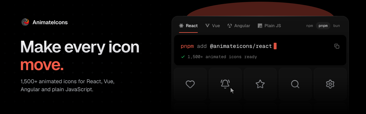
 Animateicons — это библиотека из более чем 1500 анимированных SVG-иконок для веб-приложений. Она построена на основе библиотеки анимаций motion и поддерживает запуск анимации при наведении курсора и по клику (императивно), а также настройку размера, цвета и длительности.
Это библиотека иконок только для React или она работает и с другими фреймворками?Для каждого фреймворка есть отдельный пакет: @animateicons/react для React, @animateicons/vue для Vue 3/Nuxt, @animateicons/angular для Angular 20–22 и @animateicons/vanilla для обычного JS, веб-компонентов, Svelte, Solid и Astro.
Для каждого фреймворка есть отдельный пакет: @animateicons/react для React, @animateicons/vue для Vue 3/Nuxt, @animateicons/angular для Angular 20–22 и @animateicons/vanilla для обычного JS, веб-компонентов, Svelte, Solid и Astro.Как добавить иконку в проект?Установите пакет для своего фреймворка и импортируйте иконку, например, из '@animateicons/react/lucide' или '@animateicons/react/huge'. Также можно выполнить 'npx animateicons add bell-ring', чтобы скопировать код одной иконки прямо в проект.
Установите пакет для своего фреймворка и импортируйте иконку, например, из '@animateicons/react/lucide' или '@animateicons/react/huge'. Также можно выполнить 'npx animateicons add bell-ring', чтобы скопировать код одной иконки прямо в проект.Нужно ли отдельно устанавливать Framer Motion?Нет, библиотека motion, которая используется для анимаций, уже включена в пакет, поэтому добавлять её самостоятельно не нужно.
Нет, библиотека motion, которая используется для анимаций, уже включена в пакет, поэтому добавлять её самостоятельно не нужно.Обязательно ли использовать CLI или можно просто импортировать готовые компоненты?Доступны оба варианта: можно импортировать компоненты иконок прямо из пакета или использовать CLI 'npx animateicons add', если хочется иметь исходный код в своём проекте.
Доступны оба варианта: можно импортировать компоненты иконок прямо из пакета или использовать CLI 'npx animateicons add', если хочется иметь исходный код в своём проекте.Можно ли запускать иконки не только при наведении, но и по клику?Да, хук useIconHover может запускать иконку при наведении, при клике или в обоих случаях. В документации описано, как работать с несколькими иконками одновременно.
Да, хук useIconHover может запускать иконку при наведении, при клике или в обоих случаях. В документации описано, как работать с несколькими иконками одновременно.Можно ли настроить размер, цвет и скорость анимации иконки?Каждая иконка принимает свойства size, color и duration (по умолчанию 24, currentColor и 1), а также флаг isAnimated, с помощью которого анимацию можно полностью отключить.
Каждая иконка принимает свойства size, color и duration (по умолчанию 24, currentColor и 1), а также флаг isAnimated, с помощью которого анимацию можно полностью отключить.Для чего нужна ссылка на MCP в README?Она ведёт на MCP-сервер, чтобы ИИ-агенты для программирования могли напрямую просматривать набор иконок и работать с ним, наряду с документацией и браузером иконок.
Она ведёт на MCP-сервер, чтобы ИИ-агенты для программирования могли напрямую просматривать набор иконок и работать с ним, наряду с документацией и браузером иконок.Есть ли инструменты в стиле shadcn для этого?Полная документация описывает использование animateicons с shadcn, а также CLI, варианты оформления и справочник по API.
Полная документация описывает использование animateicons с shadcn, а также CLI, варианты оформления и справочник по API.Какие есть похожие проекты?canvas-ui, tabler-icons, lucide, blobatar, arc-library, kubai-icons, shaders, PulsoIcon-Package
canvas-ui, tabler-icons, lucide, blobatar, arc-library, kubai-icons, shaders, PulsoIcon-PackageВ каких он темах?framer-motion, icon, webcomponents, svg-animation, svg-icons, motion, shadcn, solidjs, astro, icons, shadcn-ui, ui-library
framer-motion, icon, webcomponents, svg-animation, svg-icons, motion, shadcn, solidjs, astro, icons, shadcn-ui, ui-library