An open-source pair of liquid-glass welcome screens for React Native and Expo: one glass sphere, one gesture, two skies. A UI study inspired by Wabi's create screen.
Showcase artwork uses simulator captures of this implementation. The reference clip that the interaction was calibrated against is not redistributed.
[!IMPORTANT]
Educational reference only. This is an independent, unofficial Appllama project and is not affiliated with or endorsed by Wabi, Apple, or any other referenced company. Every bitmap and clip in this repository was generated for it; the interaction grammar is a study of a publicly visible screen. Do not ship these screens unchanged. Before any public or commercial use, replace the wordmarks, stickers, copy, and backdrops with your own, then make the final composition and motion meaningfully unique. Read the full intellectual-property notice.
2 cookbooks. One Expo project. Copy either.
Liquid Glass Screens is a React Native Expo cookbook for developers studying how a physical, gesture-driven welcome screen is built. Both cookbooks are the same TypeScript component with a different theme, drawn into one React Native Skia canvas and moved entirely on the UI thread with React Native Reanimated and React Native Gesture Handler.
The screen works like this:
a great glass dome sits on the bottom edge of the page, refracting whatever is behind it;
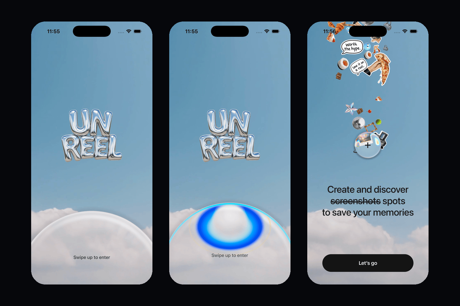
swiping up carries it toward the middle of the screen, and it shrinks as it climbs until it is a "+" button — the size is a function of position, so it follows the finger both ways;
while it is being pushed, a chromatic caustic gathers at its crown and answers the force of the hand;
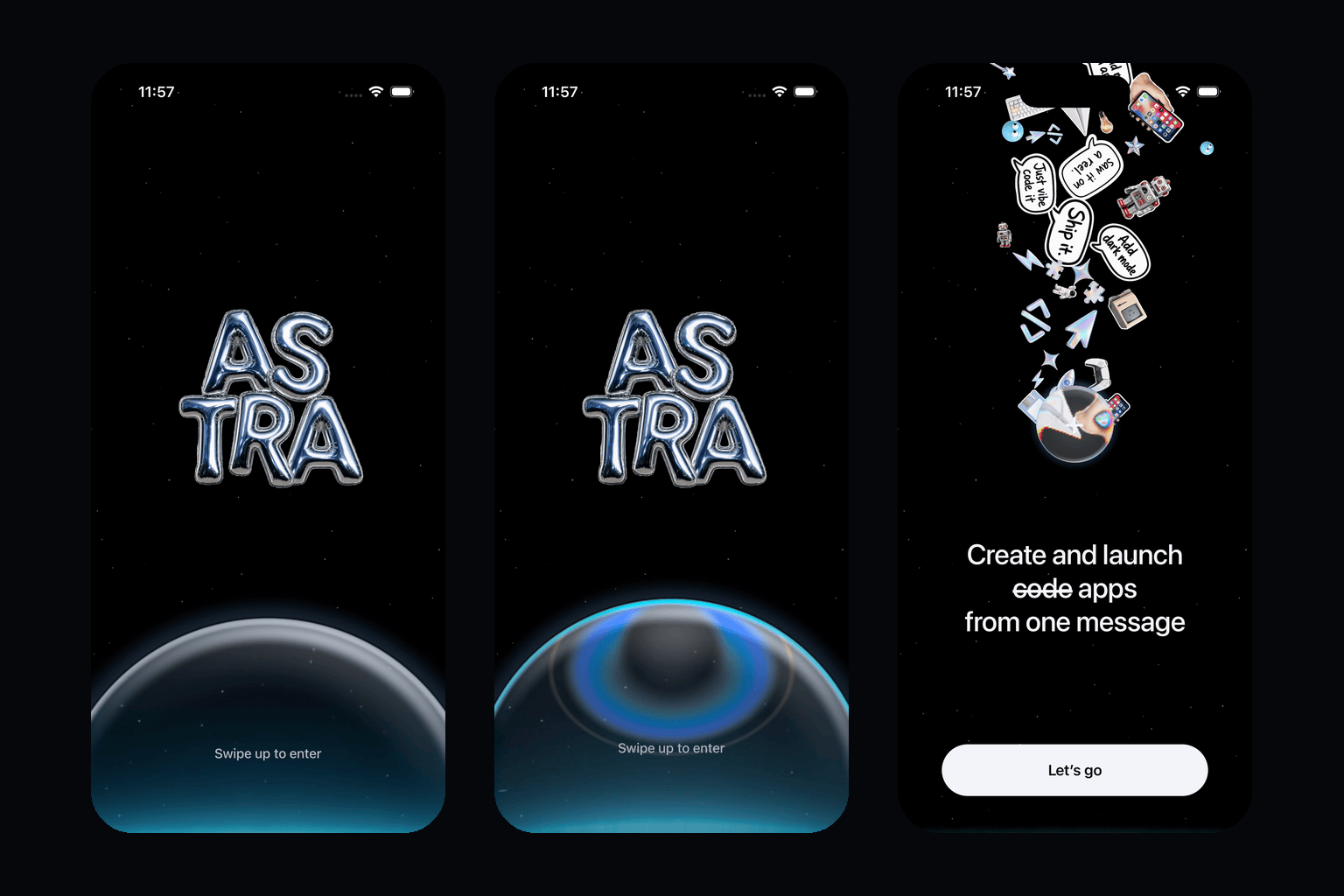
when it lands, the cookbook's stickers surface through the button's own glass, get magnified and split by the lens on the way out, and settle into a plume that keeps breathing above it;
the copy comes in with a positional blur wipe, a rotating third line, and a call to action; and
dragging it back down grows it again and takes the plume away — a short dip followed by an upward fade in Cookbook 1, drawn into a stardust vortex in Cookbook 2.
You can:
run both cookbooks from one Expo Router app;
copy one named component, its theme, and its assets into an existing app;
paste a cookbook-specific prompt into Codex, Claude Code, Cursor, or another coding agent;
regenerate every wordmark, sticker, and backdrop from the prompts in prompts/; and
Both cookbooks render through LiquidGlassScreen. A theme decides the backdrop, the wordmark, the forty sticker slots, the palette, the copy, the blur tint, the lens dispersion, the day-or-night glass tuning, and how the plume leaves.
Copy-paste prompts
Open the matching section, use GitHub's copy button, and paste the complete prompt into a coding agent while it is working inside your existing Expo app. Each prompt tells the agent exactly which repository files, assets, native dependencies, and semantic actions to inspect.
The prompts are intentionally strict about preserving your current app architecture and intentionally strict about replacing the study's identity before release.
You are working inside my existing Expo React Native repository.

Use https://github.com/Appllama/liquid-glass-screens as a read-only technical reference. Integrate only Cookbook 1, the Sky liquid-glass welcome screen, into my app. Do not turn my app into the gallery and do not modify unrelated features.

Reference files:
- src/liquid-glass/liquid-glass-screen.tsx, src/liquid-glass/glass.ts, src/liquid-glass/orb-field.tsx, src/liquid-glass/copy.tsx, src/liquid-glass/types.ts
- src/liquid-glass/cookbooks/sky.ts and src/liquid-glass/sky-glass-welcome.tsx
- assets/cookbooks/sky/ (sky.mp4, sky-poster.png, wordmark.png, stickers/)
- the Sky section of docs/MOTION_SPEC.md
- src/app/_layout.tsx only as an asset preloading reference
- NOTICE.md and docs/ASSET_PROVENANCE.md

Public API:
- Component: SkyGlassWelcome
- Screen ID: sky
- Semantic action: sky.lets-go
- Props: initialState ('gate' | 'open'), onActionPress, onPrimaryPress
- Relevant packages: @shopify/react-native-skia, react-native-reanimated, react-native-worklets, react-native-gesture-handler, expo-blur, expo-image, expo-status-bar, and expo-asset

Requirements:
1. Before editing, inspect my Expo SDK, React Native version, router, package manager, native splash configuration, onboarding routes, and existing dependencies. This screen needs a development build or a native build; it does not run in Expo Go.
2. Copy only this component, its theme, its assets, and the transitive helpers it actually imports (glass.ts, orb-field.tsx, copy.tsx, types.ts). Do not copy the demo router, the gallery home, or Cookbook 2.
3. Preserve my package versions, navigation, state architecture, app configuration, and native projects. Install only missing compatible packages with npx expo install, then rebuild the native app.
4. Preload the video, poster, wordmark, and stickers before revealing the React tree. Adapt the loading pattern to my app instead of replacing my root layout.
5. Mount the component inside a full-height flex: 1 surface with no visible navigation header and no surrounding safe-area padding, inside a GestureHandlerRootView; the component owns its canvas and status bar.
6. Reproduce the reference behavior accurately: keep the 402×874 reference geometry, the position-driven sphere size, the lens backdrop filter and glass shader, the force-driven caustic, the sticker plume and its fall, the blur-wipe copy with the rotating third line, the reduced-motion behavior, and the accessibility labels. Do not replace the gesture with a button or the motion with a generic fade.
7. Wire the semantic action through onActionPress to my existing onboarding route.
8. Treat this as an educational prototype. Before any public or commercial release, replace the wordmark, stickers, copy, and backdrop with authorized original artwork, then make the final composition and motion meaningfully unique.
9. Validate the swipe up, a partial drag that springs back, the swipe down, the "Let's go" action, reduced motion, TypeScript, lint, an iPhone simulator, and one Android viewport, in a native or development build.
10. Finish by summarizing every file and dependency changed.
You are working inside my existing Expo React Native repository.

Use https://github.com/Appllama/liquid-glass-screens as a read-only technical reference. Integrate only Cookbook 2, the Astro liquid-glass welcome screen, into my app. Do not turn my app into the gallery and do not modify unrelated features.

Reference files:
- src/liquid-glass/liquid-glass-screen.tsx, src/liquid-glass/glass.ts, src/liquid-glass/orb-field.tsx, src/liquid-glass/copy.tsx, src/liquid-glass/types.ts
- src/liquid-glass/cookbooks/astro.ts and src/liquid-glass/astro-glass-welcome.tsx
- assets/cookbooks/astro/ (stars.png, glow.png, wordmark.png, stickers/)
- the Astro section of docs/MOTION_SPEC.md
- src/app/_layout.tsx only as an asset preloading reference
- NOTICE.md and docs/ASSET_PROVENANCE.md

Public API:
- Component: AstroGlassWelcome
- Screen ID: astro
- Semantic action: astro.lets-go
- Props: initialState ('gate' | 'open'), onActionPress, onPrimaryPress
- Relevant packages: @shopify/react-native-skia, react-native-reanimated, react-native-worklets, react-native-gesture-handler, expo-blur, expo-image, expo-status-bar, and expo-asset

Requirements:
1. Before editing, inspect my Expo SDK, React Native version, router, package manager, native splash configuration, onboarding routes, and existing dependencies. This screen needs a development build or a native build; it does not run in Expo Go.
2. Copy only this component, its theme, its assets, and the transitive helpers it actually imports (glass.ts, orb-field.tsx, copy.tsx, types.ts). Do not copy the demo router, the gallery home, or Cookbook 1.
3. Preserve my package versions, navigation, state architecture, app configuration, and native projects. Install only missing compatible packages with npx expo install, then rebuild the native app.
4. Preload the star layer, the glow layer, the wordmark, and the stickers before revealing the React tree. Adapt the loading pattern to my app instead of replacing my root layout.
5. Mount the component inside a full-height flex: 1 surface with no visible navigation header and no surrounding safe-area padding, inside a GestureHandlerRootView; the component owns its canvas and the light status bar.
6. Reproduce the reference behavior accurately: keep the 402×874 reference geometry, the position-driven sphere size, the two-layer backdrop with the glow that dissipates through the glass, the night glass tuning, the zero-dispersion dome, the force-driven caustic, the sticker plume, the stardust vortex on the way down with its glow flare, the blur-wipe copy with the rotating third line, the reduced-motion behavior, and the accessibility labels. Do not replace the gesture with a button or the motion with a generic fade.
7. Wire the semantic action through onActionPress to my existing onboarding route.
8. Treat this as an educational prototype. Before any public or commercial release, replace the wordmark, stickers, copy, and backdrop with authorized original artwork, then make the final composition and motion meaningfully unique.
9. Validate the swipe up, a partial drag that springs back mid-vortex, the swipe down, the "Let's go" action, reduced motion, TypeScript, lint, an iPhone simulator, and one Android viewport, in a native or development build.
10. Finish by summarizing every file and dependency changed.
Replicate the artwork
Every wordmark, sticker, backdrop, and clip in this repository was generated, and the exact prompts and post-processing steps are published so you can make your own set in the same visual language, in your own identity:
prompts/sky-cookbook.md — the chrome-balloon wordmark, the die-cut photographic stickers, the holographic icons, the marker speech bubbles, and the seamless cloud loop.
prompts/astro-cookbook.md — the night wordmark, the app-building sticker set, the horizon-glow starfield, and the star/glow layer split that lets the glow dissipate through the glass.
The prompts were run with GPT Image 2 at high quality and 1K, Seedance 2.0 for the cloud loop, and a background-removal pass for the die-cuts. Any comparable image model will do; keep the style sentences and the "no text, no watermark" tail.
Run the Expo gallery
Requirements: Node.js 22.13 or newer, Xcode for iOS, or Android Studio for Android. The screens use React Native Skia's runtime shaders and video decoding, so they run in a native build, not in Expo Go.
git clone https://github.com/Appllama/liquid-glass-screens.git
cd liquid-glass-screens
npm ci
npm run ios
The default route is the gallery home with two buttons, Cookbook 1 and Cookbook 2. Each cookbook also has a direct route:
/sky
/astro
Open one directly, or land with the sphere already up and the plume out:
npx uri-scheme open "liquid-glass://astro" --ios
npx uri-scheme open "liquid-glass://sky?state=open" --ios
How the glass works
Each cookbook is one Skia Canvas with five layers, bottom to top:
Layer
What it is
Scene
The cloud video (Sky) or the star layer plus an additive glow layer (Astro), drawn inside the canvas so the lens can bend it.
Stickers
Forty die-cut sprites moved by a UI-thread frame callback: buoyancy, wander, a home in the plume, neighbour repulsion, and the finger's push. Astro adds a 260-mote stardust ring buffer.
Lens
A BackdropFilter running LENS_SKSL: thick-glass magnification, a bevelled rim that shears, per-channel dispersion, and a "slosh" offset that drags the picture inside with the motion.
Glass
GLASS_SKSL: the body, rim light, sheen, halo, and the motion caustic that focuses from a lavender bloom into a bowl of cyan-to-blue light with a gold thread. A night uniform blends the daylight and night tunings.
Copy
React Native Text above the canvas — the wordmark, the hint, the headline with its struck word, the rotating third line with a per-word blur wipe, and the pill.
The sphere's radius is a pure function of its position, and its caustic answers force rather than speed, so shrinking toward the button and growing back read identically in both directions.
React Native liquid glass API
Import one component
import { AstroGlassWelcome, type LiquidGlassActionId } from './src/liquid-glass';

function handleAction(actionId: LiquidGlassActionId) {
  if (actionId === 'astro.lets-go') {
    // Navigate to your original onboarding flow.
  }
}

export function Welcome() {
  return <AstroGlassWelcome onActionPress={handleAction} />;
}
Select from the typed registry
import { CookbookScreen, type CookbookId } from './src/liquid-glass';

export function Preview({ name }: { name: CookbookId }) {
  return <CookbookScreen name={name} initialState="open" onActionPress={(id) => console.log(id)} />;
}
The package exports src/index.ts, so SDK-matched workspaces can consume it directly:
npm install github:Appllama/liquid-glass-screens
import { SkyGlassWelcome } from 'liquid-glass-screens';
The demo currently targets Expo SDK 57, React Native 0.86, React Native Skia 2.6, and Reanimated 4.5. Existing apps on another Expo SDK should prefer the copy-paste prompt workflow so npx expo install can resolve compatible native dependency versions.
Shared props
Prop
Purpose
initialState
'gate' (default) starts with the dome on the bottom edge. 'open' starts with the sphere already up and the plume out — the deterministic state for screenshots.
onActionPress
Receives the typed semantic ID (sky.lets-go or astro.lets-go) when the pill is pressed.
onPrimaryPress
Backward-compatible handler for the pill. onActionPress takes precedence.
LiquidGlassActionId, LiquidGlassActionPressHandler, COOKBOOK_IDS, COOKBOOK_METADATA, CookbookTheme, and STICKER_SIZES are exported for autocomplete and typed tooling.
Motion, responsiveness, and accessibility
Reference geometry: each layout is authored at 402×874 points and scaled by width and height separately, so the dome stays centred on the bottom edge on every iPhone.
Motion: every value is either driven by the finger or by a spring that receives the release velocity. Timings, thresholds, and physics constants are documented in MOTION_SPEC.md.
UI thread only: the gesture, the sphere, the shaders' uniforms, the sticker physics, and the dust all run in worklets; the JavaScript thread is only told when the open state comes and goes.
Reduced motion: the landing spring loses its bounce and the third line fades in place instead of wiping.
Interaction safety: the pill is inert and absent from the accessibility tree until it has appeared; the page itself carries the swipe hint as its accessibility label.
Asset loading: the demo preloads both cookbooks' bitmaps and the clip before the animated React layer is shown.
Status bar: the component sets the status bar style that its backdrop needs (dark on Sky, light on Astro).
Project structure
assets/cookbooks/sky/           Cloud loop, poster, wordmark, 22 stickers
assets/cookbooks/astro/         Star layer, glow layer, wordmark, 24 stickers
docs/MOTION_SPEC.md             Measured geometry, thresholds, springs, and physics
docs/ASSET_PROVENANCE.md        Auditable generated-asset inventory
prompts/                        Prompts to regenerate every asset, per cookbook
scripts/                        Simulator recording and Maestro flows used for verification
src/app/                        Expo Router demo: the gallery home and the two routes
s








 这是一个开源的 React Native/Expo 实战示例,包含两个“液态玻璃”欢迎屏幕——一个玻璃球在滑动时收缩成加号按钮,配有漂浮贴纸和交互手势。它是受 Wabi 创建界面启发的 UI 研究,供开发者学习或复制。