

mdx-deck README

The project's README from github.com/jxnblk/mdx-deck. As one markdown file: README.md.

MDX Deck

Award-winning React MDX-based presentation decks

Build Status Version Downloads

View demo

Getting Started

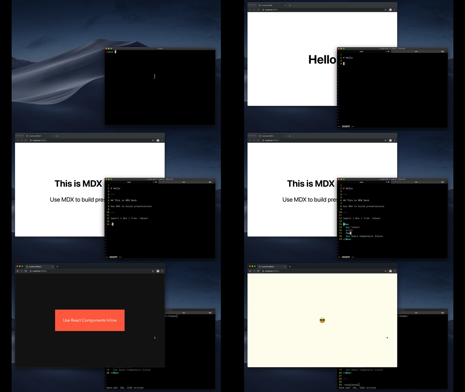
npm i -D mdx-deck

Create an MDX file and separate each slide with ---.


# Hello

---

## This is my deck

---

## The End

Add a run script to your package.json with the MDX Deck CLI pointing to the .mdx file to start the development server:

"scripts": {
  "start": "mdx-deck deck.mdx"
}

Start the development server:

npm start

Use the left and right arrow keys to navigate through the presentation.

Using MDX

MDX uses Markdown syntax and can render React components inline with JSX.

Imports

To import components, use ES import syntax separated with empty lines between any markdown or JSX syntax.

import { Box } from 'theme-ui'

<Box color="tomato">Hello</Box>

Read more about MDX syntax in the MDX Docs.

Theming

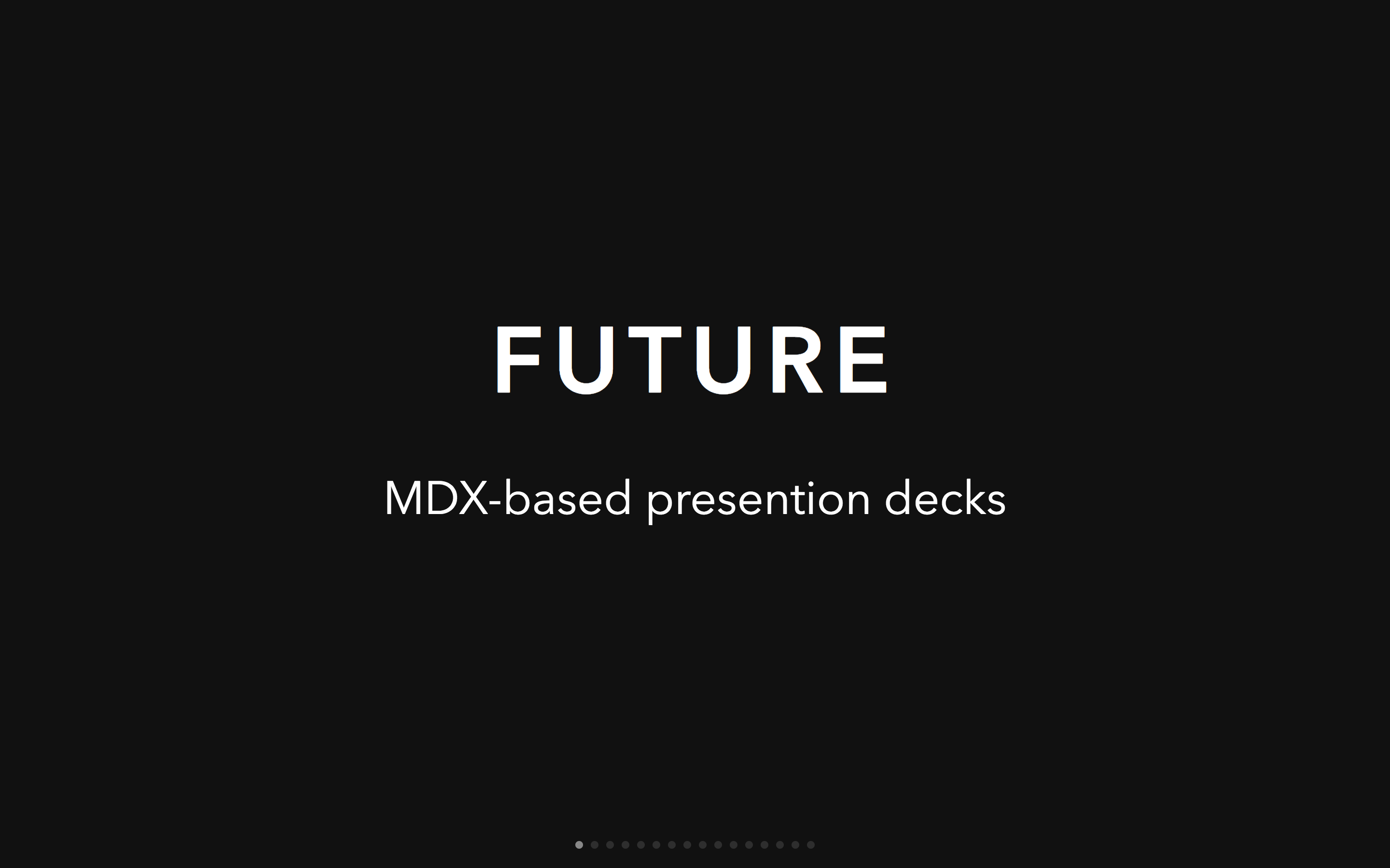
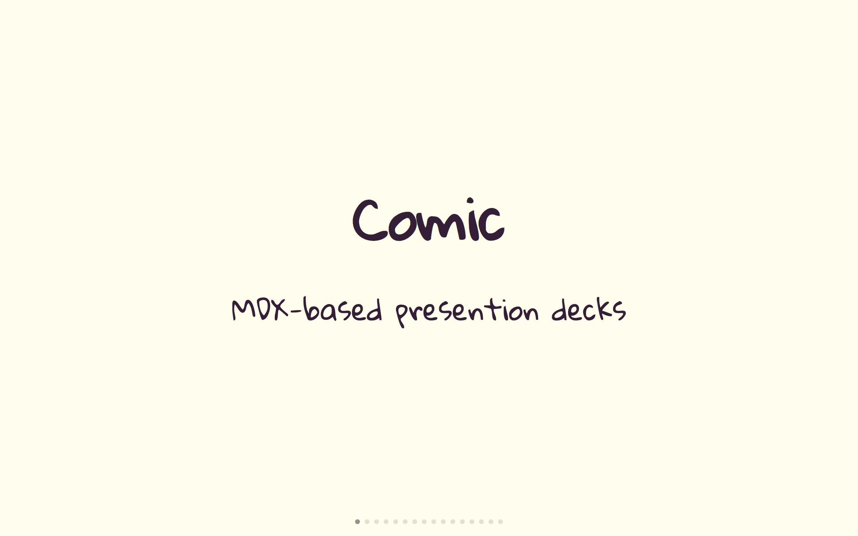
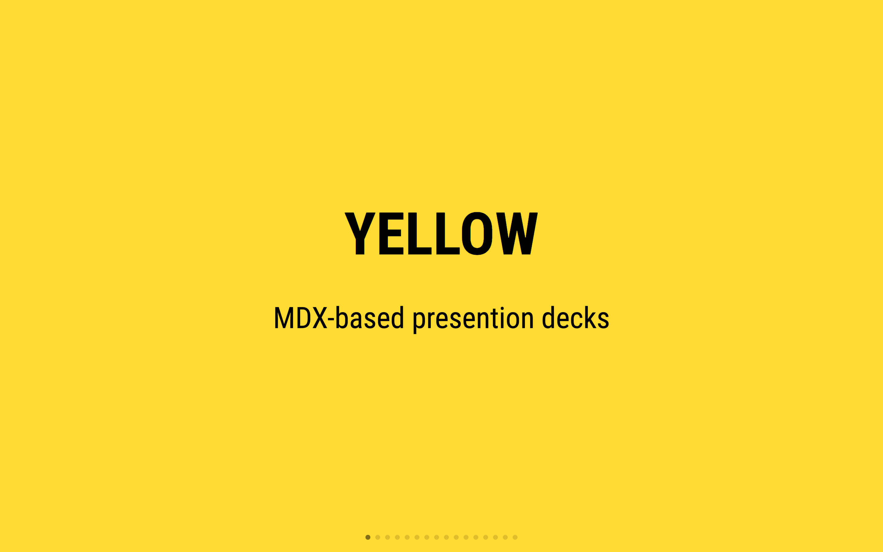
MDX Deck uses Theme UI and Emotion for styling, making practically any part of the presentation themeable. It also includes several built-in themes to change the look and feel of the presentation.

Components

MDX Deck includes built-in components to help with creating presentations, a Notes component for adding speaker notes, a Head component for the document head, Header and Footer components for persistent header and footer content, and a Steps component for adding multiple intermediate steps in a single slide.

Read more in the Components docs.

Third-Party Components

These optional libraries are intended for use with MDX Deck.

Note: please check with version compatibility when using these libraries.

Layouts

Each slide can include a custom layout around its content, which can be used as a template for visually differentiating slides.

// example Layout.js
import React from 'react'

export default ({ children }) => (
  <div
    style={{
      width: '100vw',
      height: '100vh',
      backgroundColor: 'tomato',
    }}>
    {children}
  </div>
)
import Layout from './Layout'

# No Layout

---

<Layout>

# Custom Layout

</Layout>

The layout component will wrap the MDX elements within that slide, which means you can add custom layout styles or style child elements with CSS-in-JS.

Presenter Mode

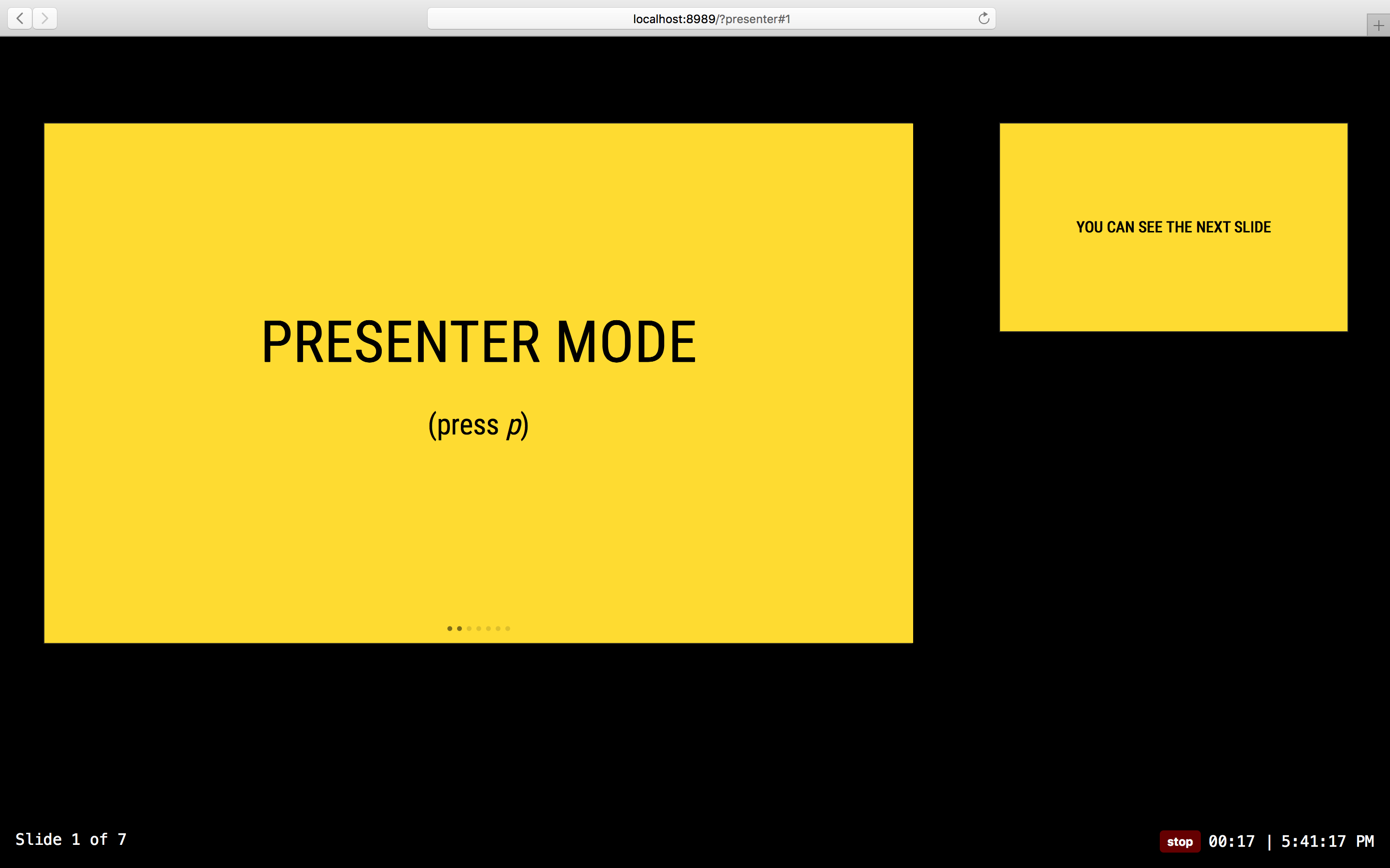
Press Option + P to toggle Presenter Mode, which will show a preview of the next slide, a timer, and speaker notes.

presenter mode screenshot

The presentation can be opened in two separate windows at the same time, and it will stay in sync with the other window.

Keyboard Shortcuts

Key Description
Left Arrow, Page Up, Shift + Space Go to previous slide (or step in Steps)
Right Arrow, Page Down, Space Go to next slide (or step in Steps)
Option + P Toggle Presenter Mode
Option + O Toggle Overview Mode
Option + G Toggle Grid Mode

CLI Options

-p --port     Dev server port
-h --host     Host the dev server listens to
--no-open     Prevent from opening in default browser

Videos & Articles

Examples

See how others have used MDX Deck for their presentations.

Usage Examples

The following examples will open in CodeSandbox.


MIT License

mdx-deck (jxnblk/mdx-deck)

Searching Database…

11.5K ·GitHub
这是什么?MDX Deck 是一个基于 React 的工具,通过把 Markdown 和 JSX 组件混合编写(即 MDX)来制作幻灯片演示,而不是使用传统的幻灯片软件。
这是设计软件,还是要用代码来编写幻灯片?这是一个基于代码的工具:你把幻灯片写成一个 .mdx 文件(Markdown 中嵌入 React 组件),然后通过 CLI 和开发服务器运行,而不是在图形界面里拖拽元素。
我该怎么创建和运行一个幻灯片?创建一个 .mdx 文件,用 '---' 分隔每张幻灯片,在 package.json 中添加一个运行脚本,让 MDX Deck CLI 指向该文件,然后启动开发服务器,并用方向键切换幻灯片。
使用它需要懂 React 或 JSX 吗?需要。MDX Deck 基于 MDX 构建,所以你用 Markdown 编写内容,但也可以用 JSX 语法在行内导入并渲染 React 组件。
幻灯片究竟在哪里运行,是在浏览器里还是原生应用里?它以网页应用的形式通过本地开发服务器运行(基于 Gatsby 构建),幻灯片还可以导出,例如导出为 PDF。
我如何为幻灯片设置主题或重新设计样式?MDX Deck 使用 Theme UI 和 Emotion 来设置样式,因此演示文稿中几乎每个部分都可以设置主题,并且内置了多款主题,可以随时切换。
它为演示提供了哪些内置组件?它包含用于演讲者备注的 Notes 组件、用于文档 head 标签的 Head 组件、用于固定显示内容的 Header 和 Footer 组件,以及用于在幻灯片上逐步显示内容的 Steps 组件。
它有演讲者模式吗?有。按下 Option+P 可以切换演讲者模式,显示下一张幻灯片的预览、计时器和演讲者备注,并且可以同时打开两个同步的窗口。
幻灯片可以使用自定义布局吗?可以。每张幻灯片都可以包含一个自定义布局组件,用来包裹其 MDX 内容,这样你就能用 CSS-in-JS 以不同方式设置幻灯片的样式或模板。
Creator
jxnblk
Size
10.2 MB
Stars
11.5K
Updated
CommitAug 03
Age
8y
Commits · 90 Days