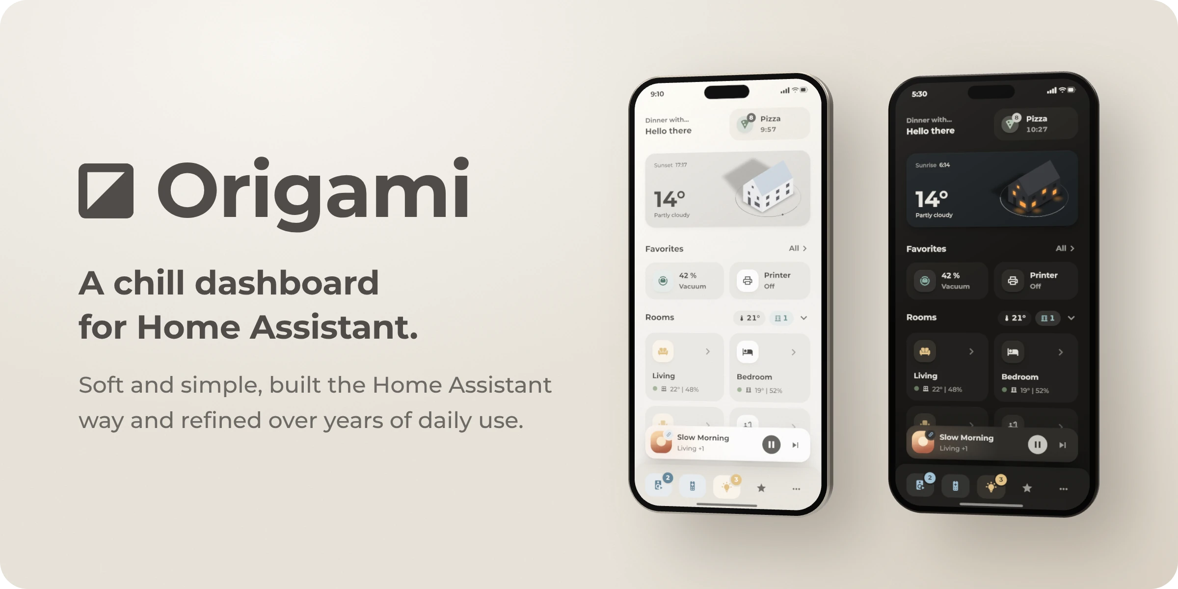


Origami is a Home Assistant theme with a matching phone dashboard. The dashboard is built mainly with Paper Buttons Row and Bubble Card, and everything else uses what Home Assistant already offers, such as themes, template sensors and scripts. The repository also contains modules that give Bubble cards the Origami look.
| Part |
Description |
| Theme |
The theme uses muted, warm colors in light and dark mode. Strong colors are used mainly for devices that are on. It works with any dashboard. |
| Dashboard |
The dashboard shows the weather, favorites, rooms and a navigation bar. You can install all of it or copy single cards. |
| Bubble Card modules |
The modules give Bubble cards the Origami look. They are still a bit experimental. The module reference explains them. |
[!NOTE]
The dashboard comes from a real home, so all entities are examples. Replace them with your own and remove the parts you do not need. Some cards are built in an unusual way so that nothing moves while the page loads. The Techniques section explains how. The desktop layout is not finished yet.
Setup · Dashboard · Pop-ups · Helpers · Techniques · Theme · Troubleshooting
Setup
Theme only
Add these lines to configuration.yaml and restart Home Assistant. If frontend: is already in the file, add only the themes line under it.
frontend:
  themes: !include_dir_merge_named themes
Open Origami in HACS. If HACS asks you to add the repository, select Add. Then select Download.

Run frontend.reload_themes and select Origami in your profile.
To use the font, copy www/fonts to /config/www/fonts. Then add /local/fonts/montserrat.css as a Stylesheet under Resources. If you just created the www folder, restart Home Assistant.
Full dashboard
The dashboard has been tested with Home Assistant 2026.10. You need HACS and access to the /config folder, for example through the Samba share or the Studio Code Server app.
1. Copy three folders
To download this repository, select Code, then Download ZIP. Copy these folders into /config.
| Folder |
Contents |
www/fonts |
The Montserrat font |
bubble_card/modules |
The Bubble Card modules |
packages |
The helpers, with template sensors, toggles, a speaker selection, a timer, scripts and an automation |
2. Edit configuration.yaml
Add these lines and restart Home Assistant. If homeassistant: or frontend: is already in the file, add only the indented line under the existing key.
homeassistant:
  packages: !include_dir_named packages

frontend:
  themes: !include_dir_merge_named themes
3. Install the cards from HACS
Open each repository in HACS. If HACS asks you to add the repository, select Add. Then select Download.
Restart Home Assistant again. Then add Bubble Card Tools as an integration.
4. Select the theme and add the font
- Select Origami as the theme in your profile.
- Add
/local/fonts/montserrat.css as a Stylesheet under Resources.
5. Install Origami Header (optional)
Origami Header removes the Home Assistant header without any flicker while the page loads. In its place, a menu slides in from the top of the screen when you tap More in the navigation bar. Origami Header is still experimental, and the dashboard also works without it.
Open Origami Header in HACS. If HACS asks you to add the repository, select Add. Then select Download. Origami Header requires Home Assistant 2026.9 or newer.
Add the extra_module_url lines under the existing frontend: key in configuration.yaml. Then restart Home Assistant.
frontend:
  themes: !include_dir_merge_named themes
  extra_module_url:
    - /hacsfiles/origami_header/origami-header.js
To edit the dashboard, use the edit button in the menu or add ?edit=1 to the address.
6. Add the dashboard
- Open Dashboards and select Add dashboard, then New dashboard from scratch. Open the new dashboard.
- In the three-dot menu, select Edit dashboard, then Raw configuration editor.
- Replace everything in the editor with the contents of
dashboard.yaml.
- If you do not use Origami Header, delete the card under
# Menu (Origami Header) and the route under # Opens the Origami Header menu.
- Select Save.
7. Replace the example entities
The dashboard uses entities from one home. In the raw configuration editor, press Ctrl+F (⌘F on a Mac) to find an entity such as light.living_room, and replace it with your own. Do the same in the pop-ups at the end of the file. Delete the parts that do not apply to your home, such as a tile, a room or a navigation bar button. Each part described under Dashboard has a list of the entities it uses.
Then replace the same entities in /config/packages/origami.yaml. These are the temperature and humidity sensors, window contacts, front door, lights, speakers, scenes and fan. The dashboard reads the helpers that this file creates, such as sensor.climate_living_room. If you rename a helper, rename it in both files. Restart Home Assistant when you are done.
Single cards
Every part of the dashboard and every pop-up has a YAML section with the cards from its picture. You can add these cards to your own dashboard without the rest of dashboard.yaml.
- Set up the theme and the font as described under Theme only.
- Install the cards that the YAML section names. The table in step 3 of Full dashboard links to each of them. Bubble cards also need Bubble Card Tools and the modules, which steps 1 and 3 of Full dashboard set up.
- If the cards read helpers, such as
sensor.greetings, set up the package as in steps 1, 2 and 7 of Full dashboard.
- Edit your dashboard, add a card and select Manual. Paste the YAML and replace the example entities with your own.
Dashboard
The dashboard is a single sections view for phones. In dashboard.yaml, each part starts with a comment such as # Favorites. Every part below also has a YAML section with the cards from its picture. To use one of these cards without the whole file, follow Single cards under Setup. Some buttons open a pop-up. The repository contains the pop-ups for the living room, the TV and the fan. Other pop-ups, such as those for music, lights and the remaining rooms, are not included yet, so their buttons do nothing.
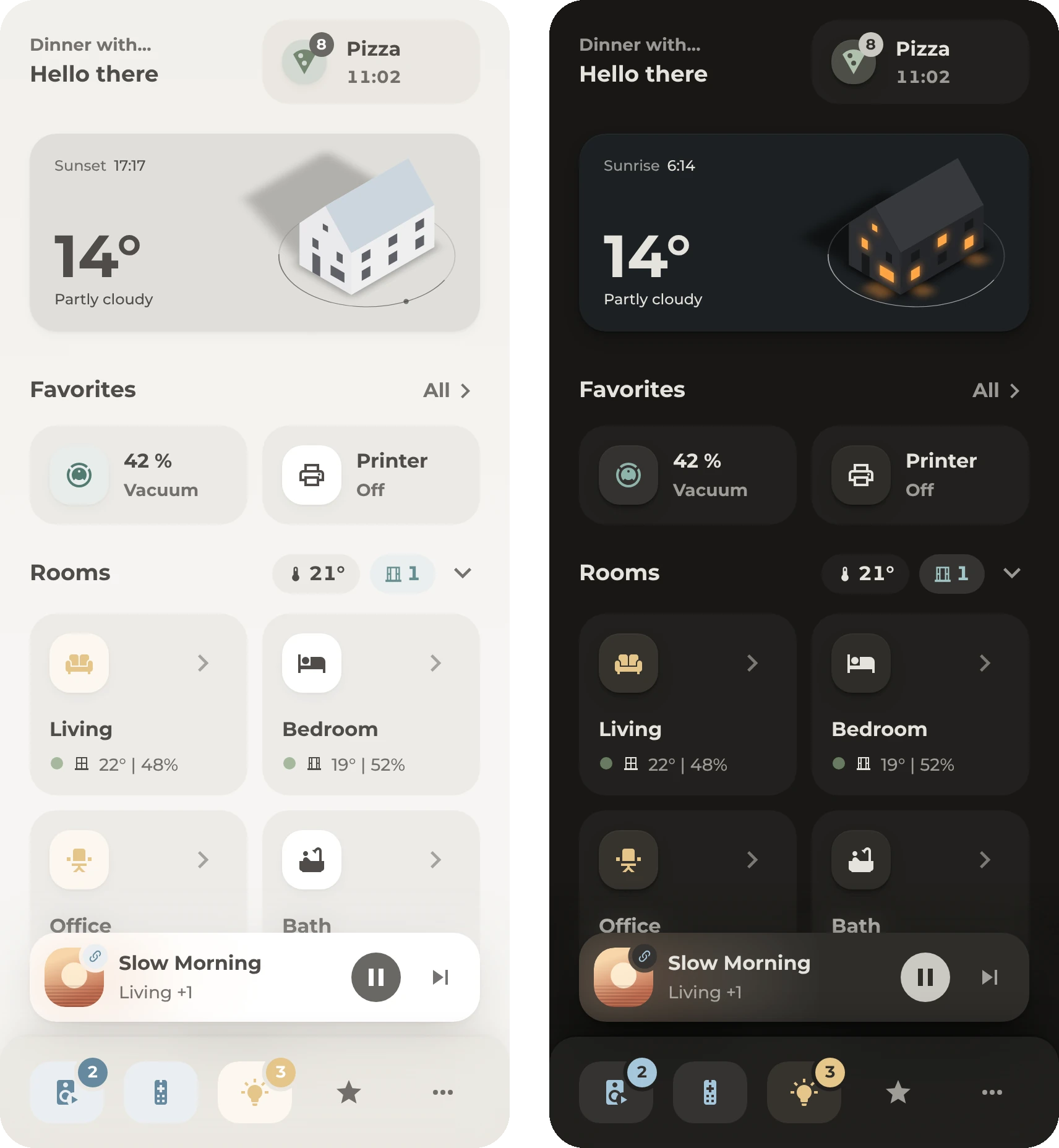
Greeting and notifications
The greeting changes with the time of day, and the next calendar event appears above it. The Origami Notifications card is next to the greeting.

How it works
- The greeting and the event line above it form a single Paper Buttons Row. The event line shows the current or next event from
calendar.household, and its text comes from the calendar's message attribute. To use another entity, change the entity and remove attribute: message. You can also delete the event line and keep only the greeting.
- Origami Notifications shows Home Assistant's notifications, repairs and updates without any configuration. Each entity that you add to the card appears only when it is relevant, for example a timer while it runs. In this example, the card watches weather warnings, a calendar, a pizza timer, the oven, the vacuum and the dinner sensor.
hide_when_empty is set to false, so the card also shows the weather and upcoming events after its entries. When there are no entries, the card shows only the weather and the events. With the default value true, the card is hidden when there is nothing to show.- When the card has several entries, it switches to the next one every 3 seconds. Tap the card to open the full list.
Entities
| Entity |
Purpose |
sensor.greetings |
The greeting, from the helpers |
calendar.household |
The event above the greeting. The notifications card shows events one day in advance. |
weather.home |
Rain, snow, thunderstorms and frost in the forecast, and the current weather |
sensor.dwd_*, timer.pizza, sensor.oven_ready_in, vacuum.robot, sensor.dinner |
These are examples. The card accepts almost any entity, as its README explains. |
All of these entities are optional.
YAML
The greeting and the notifications card share a grid card with two columns. The grid needs Paper Buttons Row, Origami Notifications and sensor.greetings from the helpers.
type: grid
square: false
columns: 2
cards:
  - type: custom:paper-buttons-row
    extra_styles: ':host { display: block; height: 100% }'
    styles:
      flex-direction: column
      justify-content: center
      height: 100%
      gap: var(--ha-space-1)
    base_config:
      layout: state
      tap_action:
        action: none
      styles:
        button:
          min-height: unset
          padding: 0px
          align-self: flex-start
          justify-content: flex-start
          pointer-events: none
        state:
          padding: 0px
    buttons:
      - entity: calendar.household
        state:
          attribute: message
        styles:
          state:
            font-size: var(--ha-font-size-s)
            font-weight: var(--ha-font-weight-bold)
            color: var(--secondary-text-color)
            white-space: nowrap
            overflow: hidden
            text-overflow: ellipsis
            max-width: 100px
      - entity: sensor.greetings
        state:
          case: first
        styles:
          state:
            font-size: var(--ha-font-size-l)
            font-weight: var(--ha-font-weight-bold)
            white-space: nowrap
            overflow: hidden
            text-overflow: ellipsis
  - type: custom:origami-notifications
    entities:
      - sensor.dwd_current_warning_level
      - sensor.dwd_advance_warning_level
      - entity: calendar.household
        before:
          days: 1
      - timer.pizza
      - entity: sensor.oven_ready_in
        type: countdown
        name: Oven
      - vacuum.robot
      - entity: sensor.dinner
        actions:
          - label: Open recipe
            tap_action:
              action: url
              url_path: https://tandoor.dev
    weather: weather.home
    hide_when_empty: false
    rotate: 3
    css: |
      :host {
        --origami-pad: var(--ha-space-4);
        --origami-gap: var(--ha-space-4);
        --origami-tile: var(--ha-space-9, 36px);
        --origami-icon: var(--icon-size-m);
        --origami-radius: var(--radius-inner);
        --origami-card-bg: var(--fill-subtle);
        --origami-row-bg: var(--fill-subtle);
        --accent-color: var(--fill-active);
        --ha-tile-info-primary-font-size: var(--ha-font-size-m);
        --ha-tile-info-primary-font-weight: var(--ha-font-weight-bold);
        --ha-tile-info-secondary-font-size: var(--ha-font-size-s);
        --ha-tile-info-secondary-font-weight: var(--ha-font-weight-bold);
        --ha-tile-info-secondary-color: var(--secondary-text-color);
      }
      ha-card { box-shadow: none; }
      .texts { min-height: calc(var(--origami-tile) + 2 * var(--origami-pad)); }
      .slide { gap: var(--ha-space-1); }
      .icon {
        border-radius: var(--radius-inner);
        background: color-mix(in srgb, var(--tile-color) var(--tint-strength), var(--ha-card-background, var(--card-background-color)));
        box-shadow: var(--ha-card-box-shadow, none);
      }
      .head .icon.idle { color: var(--primary-text-color); }
      .badge {
        top: -6px;
        inset-inline-end: -6px;
        min-width: 20px;
        height: 20px;
        padding: 0 6px;
        border-radius: 10px;
        font-size: 12px;
        font-weight: var(--ha-font-weight-bold);
        box-shadow: none;
      }
      .list { gap: var(--ha-space-2); }
      .row { padding: var(--ha-space-3); }
      .row .title {
        font-size: var(--ha-font-size-m);
        font-weight: var(--ha-font-weight-bold);
      }
      .row .message { font-size: var(--ha-font-size-s); }
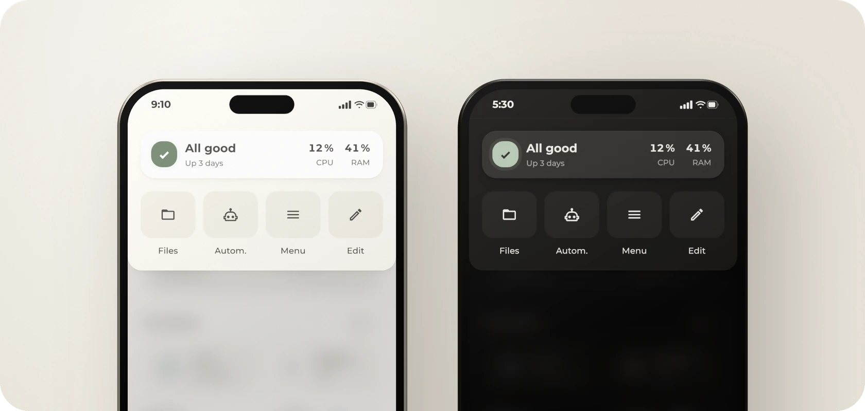
The menu comes from Origami Header, a card that the dashboard does not need at all. It exists to solve one very specific problem: Every other way to hide the Home Assistant header still shows it for a moment while the page loads. The flash is short, but it is more annoying than it should be. Origami Header truly hides the header and adds a few neat extras, such as this menu. Because the card is a bit hacky, treat it as experimental. In this dashboard, More in the navigation bar opens the menu from the top of the screen.
How it works
The menu is an Origami Header card with mode: menu, and you decide what it contains. This example contains a server card and buttons for the File editor app, automations, the sidebar and edit mode. If you do not use the File editor app, change or delete the Files button.
The server card shows a status, the uptime, the processor load and the memory use. Tap the processor or memory value to open its details. Tap anywhere else on the card to open the server pop-up, which is not included yet.
The status consists of an icon and a short message. The icon shows the overall state, and the message gives the reason, for example Backup due.
| Icon |
Meaning |
| Green check |
Everything is fine. |
| Arrow in the accent color |
Updates are available. |
| Orange |
The disk is more than 80% full, the memory use is above 85%, the processor load is above 80%, the last automatic backup is older than 3 days, or System Monitor sends no data. |
| Red |
The disk is more than 90% full, the memory use or processor load is above 95%, or the last automatic backup is older than 7 days. |
Entities
| Entity |
Purpose |
sensor.system_monitor_* |
The processor load, memory use, disk use and uptime, from System Monitor. Without these sensors, the status shows No data. |
sensor.backup_last_successful_automatic_backup |
The backup check. Without this sensor, the card does not check backups. |
YAML
The menu is one Origami Header card with a Paper Buttons Row inside. It needs Origami Header, which step 5 of the setup installs, and Paper Buttons Row.
type: custom:origami-header-card
mode: menu
position: top
layout: grid
all_users: true
buttons:
  - name: Files
    icon: mdi:folder-outline
    tap_action:
      action: navigate
      navigation_path: /app/core_configurator
  - name: Autom.
    icon: mdi:robot-outline
    tap_action:
      action: navigate
      navigation_path: /config/automation/dashboard
  - name: Menu
    icon: mdi:menu
    special: sidebar
  - name: Edit
    icon: mdi:pencil-outline
    special: edit
cards:
  type: custom:paper-buttons-row
  extra_styles: '.flex-box:active { transform: scale(var(--press-scale)) }'
  styles:
    position: relative
    gap: var(--ha-space-3)
    padding: var(--ha-space-4) var(--ha-space-5) var(--ha-space-4) var(--ha-space-4)
    background-color: var(--ha-card-background)
    border-radius: var(--ha-card-border-radius)
    box-shadow: var(--ha-card-box-shadow)
  base_config:
    layout: name|state
    tooltip: false
    styles:
      button:
        flex-direction: column
        padding: 0px
      name:
        padding: 0px
        white-space: nowrap
        font-weight: var(--ha-font-weight-bold)
        line-height: var(--ha-line-height-normal)
      state:
        padding: 0px
        margin-top: var(--ha-space-1)
        white-space: nowrap
        font-size: 12px
        font-weight: var(--ha-font-weight-medium)
        line-height: var(--ha-line-height-condensed)
        color: var(--secondary-text-color)
  buttons:
    # An invisible overlay opens the server pop-up when the card is tapped. CPU and RAM have their own tap actions.
    - layout: name
      name: ' '
      tap_action:
        action: navigate
        navigation_path: '#popup_server'
      styles:
        button:
          position: absolute
          inset: 0px
    # Status icon for ok, info (updates), warn and crit
    - layout: icon
      icon: mdi:check-bold
      state: >-
        {%- set c = states('sensor.system_monitor_processor_use') | float(-1) -%}
        {%- set r = states('sensor.system_monitor_memory_usage') | float(-1) -%}
        {%- set s = states('sensor.system_monitor_disk_usage') | float(-1) -%}
        {%- set b = as_timestamp(states('sensor.backup_last_successful_automatic_backup'), default=none) -%}
        {%- set a = (now().timestamp() - b) if b is not none else 0 -%}
        {%- set u = states.update | selectattr('state', 'eq', 'on') | list | count -%}
        {%- if s > 90 or r > 95 or c > 95 or a > 604800 -%}crit
        {%- elif s > 80 or r > 85 or c > 80 or a > 259200 or (c < 0 and r < 0 and s < 0) -%}warn
        {%- elif u > 0 -%}info
        {%- else -%}ok
        {%- endif -%}
      state_icons:
        info: mdi:arrow-up-thick
        warn: mdi:exclamation-thick
        crit: mdi:close-thick
      state_styles:
        info:
          button:
            color: var(--accent-color)
        warn:
          button:
            color: var(--warning-color)
        crit:
          button:
            color: var(--error-color)
      tap_action:
        action: none
      styles:
        button:
          color: var(--success-color)
          pointer-events: none
        icon:
          display: flex
          align-items: center
          justify-content: center
          width: var(--control-height-icon)
          height: var(--control-height-icon)
          border-radius: var(--radius-inner)
          background-color: currentColor
          box-shadow: 0 0 0 5px color-mix(in srgb, currentColor 12%, transparent)
          --mdc-icon-size: var(--icon-size-xs)
          --icon-primary-color: var(--text-color-active)
    # Status text and uptime
    - name: >-
        {%- set c = states('sensor.system_monitor_processor_use') | float(-1) -%}
        {%- set r = states('sensor.system_monitor_memory_usage') | float(-1) -%}
        {%- set s = states('sensor.system_monitor_disk_usage') | float(-1) -%}
        {%- set b = as_timestamp(states('sensor.backup_last_successful_automatic_backup'), default=none) -%}
        {%- set a = (now().timestamp() - b) if b is not none else 0 -%}
        {%- set u = states.update | selectattr('state', 'eq', 'on') | list | count -%}
        {%- if s > 90 -%}Disk almost full
        {%- elif r > 95 -%}Memory low
        {%- elif c > 95 -%}CPU high
        {%- elif a > 259200 -%}Backup due
        {%- elif s > 80 -%}Disk almost full
        {%- elif r > 85 -%}Memory low
        {%- elif c > 80 -%}CPU high
        {%- elif c < 0 and r < 0 and s < 0 -%}No data
        {%- elif u > 0 -%}{{ u }} {{ 'update' if u == 1 else 'updates' }}
        {%- else -%}All good
        {%- endif -%}
      state: >-
        {%- set n = as_timestamp(states('sensor.system_monitor_last_boot'), default=none) -%}
        {%- set d = [(now().timestamp() - n) | int, 0] | max if n is not none else -1 -%}
        {%- if d < 0 -%}Uptime unknown
        {%- elif d >= 86400 -%}Up {{ d // 86400 }} {{ 'day' if d < 172800 else 'days' }}
        {%- elif d >= 3600 -%}Up {{ d // 3600 }} {{ 'hour' if d < 7200 else 'hours' }}
        {%- else -%}Up {{ [d // 60, 1] | max }} {{ 'minute' if d < 120 else 'minutes' }}
        {%- endif -%}
      tap_action:
        action: none
      styles:
        button:
          flex: 1
          min-width: 0px
          align-items: flex-start
          pointer-events: none
        name:
          max-width: 100%
          overflow: hidden
          text-overflow: ellipsis
          font-size: var(--ha-font-size-l)
        state:
          max-width: 100%
          overflow: hidden
          text-overflow: ellipsis
    # CPU and memory, colored when high
    - name: >-
        {%- set v = states('sensor.system_monitor_processor_use') | float(none) -%}
        {{ ((v | round(0) | int) ~ ' %') if v is not none else '–' }}
      state: CPU
      tap_action:
        action: more-info
        entity: sensor.system_monitor_processor_use
      styles:
        button:
          min-width: 44px
          align-items: flex-end
        name:
          font-size: var(--ha-font-size-m)
          font-variant-numeric: tabular-nums
          color: >-
            {%- set v = states('sensor.system_monitor_processor_use') | float(0) -%}
            {{ 'var(--error-color)' if v > 95 else ('var(--warning-color)' if v > 80 else 'var(--primary-text-color)') }}
    - name: >-
        {%- set v = states('sensor.system_monitor_memory_usage') | float(none) -%}
        {{ ((v | round(0) | int) ~ ' %') if v is not none else '–' }}
      state: RAM
      tap_action:
        action: more-info
        entity: sensor.system_monitor_memory_usage
      styles:
        button:
          min-width: 44px
          align-items: flex-end
        name:
          font-size: var(--ha-font-size-m)
          font-variant-numeric: tabular-nums
          color: >-
            {%- set v = states('sensor.system_monitor_memory_usage') | float(0) -%}
            {{ 'var(--error-color)' if v > 95 else ('var(--warning-color)' if v > 85 else 'var(--primary-text-color)') }}
css: |-
  .scrim {
    backdrop-filter: blur(14px);
    background:
      linear-gradient(var(--card-shadow-color), var(--card-shadow-color)),
      color-mix(in srgb, var(--primary-background-color) 28%, transparent);
  }
  .sheet {
    padding: var(--ha-space-5) var(--ha-space-5) var(--ha-space-6, 24px) var(--ha-space-5);
    gap: var(--ha-space-5);
    box-shadow: var(--ha-card-box-shadow);
  }
  .buttons {
    gap: var(--ha-space-3);
  }
  .button {
    background: none;
    box-shadow: none;
    padding: 0 !important;
    gap: 12px !important;
  }
  .button ha-ripple {
    display: none;
  }
  .sheet .buttons .button ha-icon {
    width: 100%;
    height: 72px;
    border-radius: var(--radius-inner);
    color: var(--color, var(--primary-text-color));
    background: var(--fill-subtle);
  }
  .button:active ha-icon {
    transform: scale(var(--press-scale));
  }
  .name {
    display: block;
    white-space: nowrap;
    font-size: 13px;
  }
Other cards, such as buttons and tiles, can open the menu with this tap action. More in the navigation bar uses the same action.
tap_action:
  action: fire-dom-event
  origami_header: toggle
Weather
The weather card is an Origami Weather card. The card has many options that this example does not use, such as an animated sky, forecasts, gauges and your own images. This example uses a simple setup with one color for each weather condition.
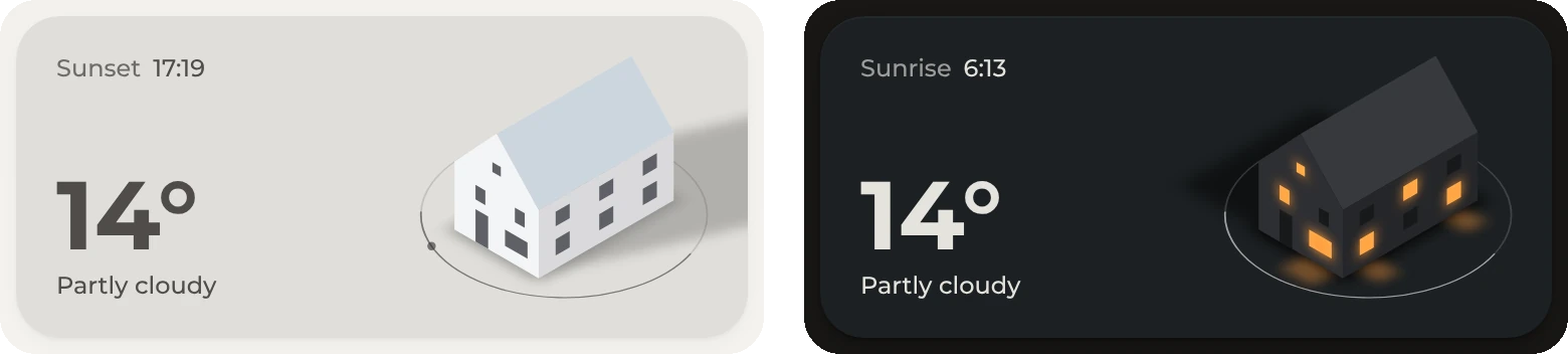
Configuration
background_mode is set to color, and background_thresholds sets a color for each condition in light and dark mode.- The sun, moon, clouds, stars, birds, balloons and planes are turned off. Rain, snow, hail and thunderstorms still appear, because
precipitation_effects is on by default.
- The house is the card's demo house. The Origami Weather README explains how to create a picture of your own home in the same style.
- The top-left corner shows the next sunset, or the next sunrise while the sun is down. The bottom-left corner shows the temperature and condition from the weather entity. To use your own temperature sensor, set it as the
entity of the button that shows the temperature, and delete attribute: temperature.
Entities
| Entity |
Purpose |
weather.home |
The condition, color and temperature |
sun.sun |
The next sunset or sunrise |
YAML
The weather is a single Origami Weather card, and it needs no helpers.
type: custom:origami-weather
weather_entity: weather.home
sun_enabled: false
moon_enabled: false
color_mode: theme
card_height: 160px
card_padding: 20px
card_offset: 16px 0px 12px 0px
# One color for each condition instead of the sky. Clouds and the other effects are off.
# Rain, snow, hail and thunderstorms still appear.
background_mode: color
background_threshold_entity: weather.home
background_thresholds:
  - value: sunny
    color: '#e7e2d9'
    color_dark: '#24211d'
  - value: clear-night
    color: '#dbdce1'
    color_dark: '#15181f'
  - value: partlycloudy
    color: '#e0deda'
    color_dark: '#1c2023'
  - value: cloudy
    color: '#d3d4d6'
    color_dark: '#222324'
  - value: fog
    color: '#e6e6e5'
    color_dark: '#272829'
  - value: windy
    color: '#dadfdd'
    color_dark: '#1c201e'
  - value: windy-variant
    color: '#d5dad9'
    color_dark: '#1a1f1e'
  - value: rainy
    color: '#cdd2d6'
    color_dark: '#181e22'
  - value: pouring
    color: '#c8cdd2'
    color_dark: '#14191e'
  - value: lightning
    color: '#cfced3'
    color_dark: '#1c1b21'
  - value: lightning-rainy
    color: '#cacacf'
    color_dark: '#18171e'
  - value: snowy
    color: '#e6eaed'
    color_dark: '#252b2e'
  - value: snowy-rainy
    color: '#d8dddf'
    color_dark: '#1f2527'
  - value: hail
    color: '#d2d9da'
    color_dark: '#1c2324'
  - value: exceptional
    color: '#ded8d2'
    color_dark: '#27221f'
cloud_effects: false
night_sky_effects: false
bird_effects: false
balloon_effects: false
plane_effects: false
grid_options:
  rows: auto
  columns: 12
button_containers:
  # The house is 20px from the top, right and bottom edges. The drawing
  # does not fill its picture, so the offsets are negative.
  - position: custom
    position_anchor: top-right
    position_x: -32px
    position_y: -10px
    custom_width: 168px
    image: demo-home-image
  # Next sunset, or sunrise while the sun is down
  - position: custom
    position_anchor: top-left
    button_gap: 6px
    buttons:
      - entity: sun.sun
        visibility:
          - condition: state
            entity: sun.sun
            state: above_horizon
        elements:
          - type: text
            size: 12px
            weight: '500'
            color: var(--secondary-text-color)
            text: Sunset
          - type: text
            size: 12px
            weight: '500'
            color: var(--primary-text-color)
            entity: sun.sun
            attribute: next_setting
      - entity: sun.sun
        visibility:
          - condition: state
            entity: sun.sun
            state: below_horizon
        elements:
          - type: text
            size: 12px
            weight: '500'
            color: var(--secondary-text-color)
            text: Sunrise
          - type: text
            size: 12px
            weight: '500'
            color: var(--primary-text-color)
            entity: sun.sun
            attribute: next_rising
  # Temperature and condition
  - position: custom
    position_anchor: bottom-left
    gap: 5px
    buttons:
      - entity: weather.home
        width: 100%
        elements:
          - type: text
            size: 48px
            weight: '700'
            color: var(--primary-text-color)
            attribute: temperature
            precision: 0
            format: °
      - entity: weather.home
        elements:
          - type: text
            size: 12px
            weight: '500'
            color: var(--primary-text-color)
Favorites
The favorites are tiles for devices and tasks that are relevant at the moment. Most tiles appear only at certain times or in certain states. The tiles use Bubble Card with the Header and Tiles modules.
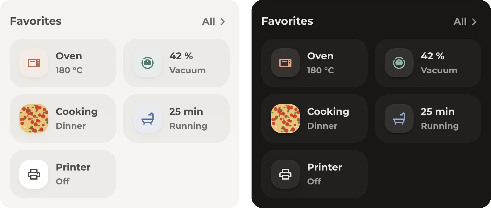
How it works
- All tiles are sub-buttons of one Bubble card. A tile with visibility conditions appears only while its conditions are met. A hidden tile leaves no gap.
- In this example, the oven tile is always first and appears while
sensor.oven is not Off. The fan tile appears while the fan runs or when the living room or bedroom is warmer than 24°. Music appears from 22:00 to 4:00, dinner from 14:00 to 21:00 with a photo of the recipe, and the bath from 11:00 to 23:00 and whenever it runs.
- The vacuum and printer tiles are always visible. While the vacuum is cleaning, its tile shows the progress and moves to the front. The bath and printer tiles show the remaining minutes while they run.
- Tap the fan, bath or printer tile to turn it on or off. The music, oven and vacuum tiles open pop-ups, and the dinner tile opens Tandoor. Hold a tile to open the details for its entity.
- To add a tile, copy an existing tile and change its entity and visibility conditions.
Entities
| Tile |
Entities |
| Oven |
sensor.oven |
| Vacuum |
vacuum.robot, number.robot_cleaning_progress |
| Fan |
fan.bedroom, sensor.living_room_temperature, sensor.bedroom_temperature |
| Dinner |
sensor.dinner with a recipe.image attribute, for example from Tandoor |
| Music |
media_player.bedroom |
| Bath |
input_boolean.bath_time, input_datetime.bath_time_end |
| Printer |
switch.printer, input_datetime.printer_end |
All of these entities are examples. If your vacuum has no progress entity, delete the name template from the vacuum tile, or the tile shows Error.
YAML
The favorites are two Bubble cards. The first one is the header with the All button.
type: custom:bubble-card
card_type: separator
name: Favorites
modules:
  - origami_header
origami_header:
  icon_size: var(--icon-size-m)
grid_options:
  columns: full
  rows: auto
sub_button:
  main:
    - name: All
      icon: mdi:chevron-right
      show_name: true
      content_layout: icon-right
      tap_action:
        action: navigate
        navigation_path: '#popup_favorites'
The second card contains the tiles.
type: custom:bubble-card
card_type: sub-buttons
modules:
  - origami_tiles
grid_options:
  columns: full
  rows: auto
sub_button:
  bottom:
    # Music, from 22:00 to 4:00
    - name: Bedroom
      entity: media_player.bedroom
      icon: mdi:speaker
      force_icon: true
      origami_tiles:
        state: Music
        color: var(--state-media_player-active-color)
      visibility:
        - condition: time
          after: '22:00'
          before: '03:59:59'
      tap_action:
        action: navigate
        navigation_path: '#popup_music'
      hold_action:
        action: more-info
    # Fan, while it runs or when the living room or the bedroom is above 24°
    - name: Fan
      entity: fan.bedroom
      icon: mdi:fan
      origami_tiles:
        state:
          'on': ${attr.percentage} %
          'off': 'Off'
      visibility:
        - condition: state
          entity: fan.bedroom
          state_not:
            - unavailable
            - unknown
        - condition: or
          conditions:
            - condition: state
              entity: fan.bedroom
              state: 'on'
            - condition: numeric_state
              entity: sensor.living_room_temperature
              above: 24
            - condition: numeric_state
              entity: sensor.bedroom_temperature
              above: 24
      tap_action:
        action: toggle
      hold_action:
        action: more-info
    # Dinner, with the recipe photo as the icon
    - name: Cooking
      entity: sensor.dinner
      icon: mdi:chef-hat
      origami_tiles:
        state: Dinner
        image: ${attr.recipe?.image}
      visibility:
        - condition: state
          entity: sensor.dinner
          state_not:
            - unknown
            - unavailable
        - condition: time
          after: '14:00'
          before: '20:59:59'
      tap_action:
        action: url
        url_path: https://tandoor.dev
      hold_action:
        action: more-info
    # Oven, only while it is on, and always first
    - name: Oven
      entity: sensor.oven
      icon: mdi:toaster-oven
      origami_tiles:
        color: var(--state-climate-heat-color)
        order: -2
      visibility:
        - condition: state
          entity: sensor.oven
          state_not: 'Off'
      tap_action:
        action: navigate
        navigation_path: '#popup_kitchen'
      hold_action:
        action: more-info
    # Vacuum. While it cleans, the progress replaces the name.
    - name: Vacuum
      entity: vacuum.robot
      icon: mdi:robot-vacuum
      force_icon: true
      origami_tiles:
        name: >-
          ${(p => Number.isNaN(p) || p < 0 ? 'Error'
          : ['docked', 'returning'].includes(state) || p >= 99 ? 'Vacuum'
          : p + ' %')(Math.round(states('number.robot_cleaning_progress')))}
        state:
          docked: 'Off'
          idle: 'Off'
          cleaning: Vacuum
        order:
          cleaning: -1
      tap_action:
        action: navigate
        navigation_path: '#popup_vacuum'
      hold_action:
        action: more-info
    # Bath, with the remaining minutes while it runs
    - name: Bath
      entity: input_boolean.bath_time
      icon: mdi:shower
      origami_tiles:
        name:
          'on': ${minutesUntil('input_datetime.bath_time_end')} min
        state:
          'on': Running
          'off': Ready
        color:
          'on': var(--blue-color)
      visibility:
        - condition: or
          conditions:
            - condition: state
              entity: input_boolean.bath_time
              state: 'on'
            - condition: time
              after: '11:00'
              before: '22:59:59'
      tap_action:
        action: toggle
      hold_action:
        action: more-info
    # Printer, with the remaining minutes while it prints
    - name: Printer
      entity: switch.printer
      icon: mdi:printer-outline
      origami_tiles:
        name:
          'on': ${minutesUntil('input_datetime.printer_end')} min
        state:
          'on': Running
          'off': 'Off'
        name_color:
          'on': initial
      tap_action:
        action: toggle
      hold_action:
        action: more-info
Rooms
Each room has a card. The first four rooms are always visible, and All rooms shows the others.
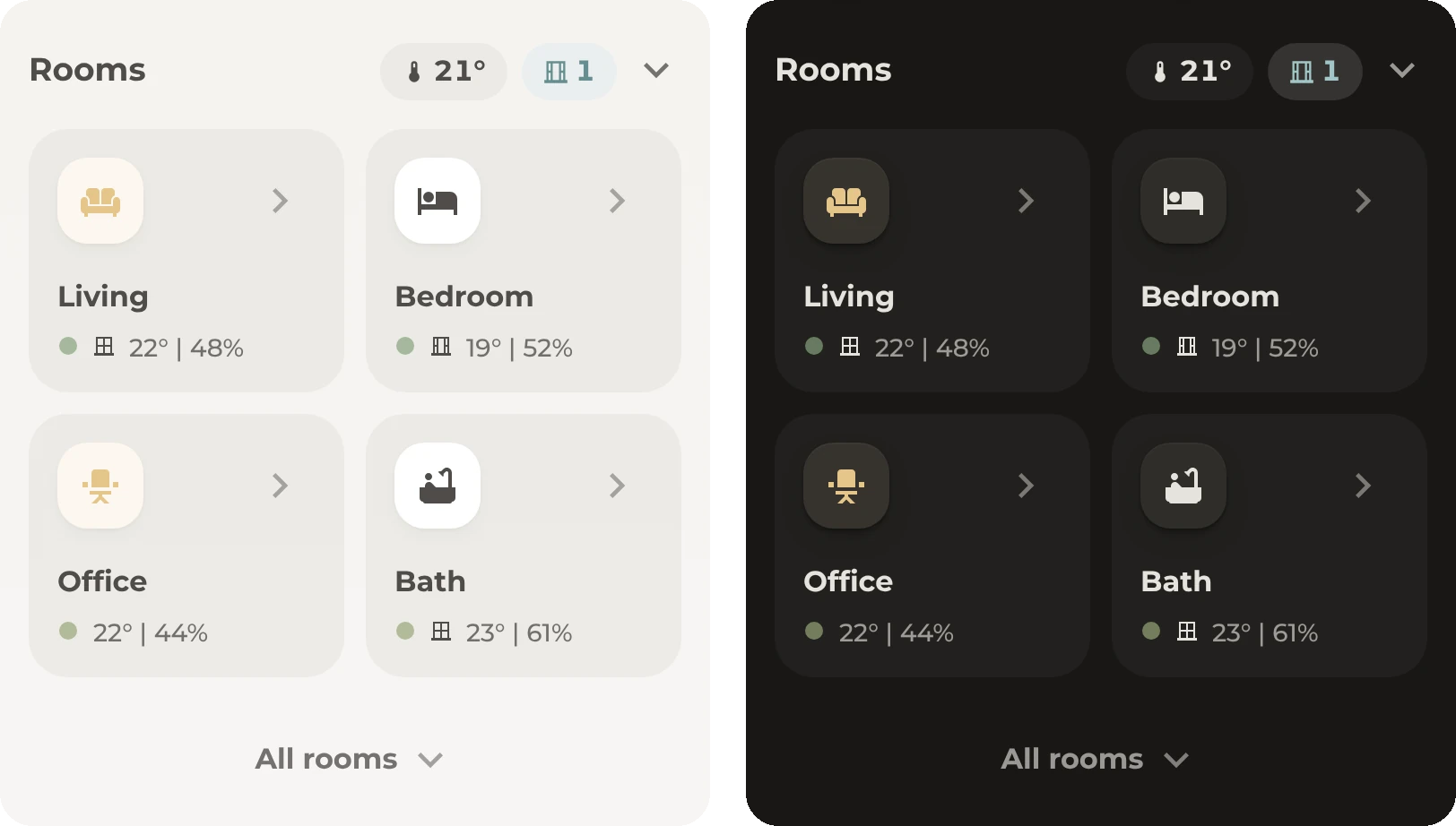
How it works
- Each room card is a single Paper Buttons Row. Tap anywhere on the card to open the room's pop-up.
- The icon is colored while the room's light is on.
- Below the name, a colored dot shows the room's temperature, from blue when it is cold to red when it is hot. A window icon follows if the room has a window contact. The temperature and humidity come last.
- The rooms header shows the average temperature and the number of open windows. Tap one of these values or the arrow to open or close the climate table.
- To add a room, copy a card and change its entities, name, icon and pop-up. Add a
sensor.climate_<room> for the room in packages/origami.yaml, and add the room to the lists in that file. The rooms after the fourth are conditional cards, which appear while input_boolean.all_rooms is on.
Entities
| Entity |
Purpose |
light.<room> |
The icon color |
sensor.climate_<room> |
The dot color, temperature and humidity, from the helpers |
binary_sensor.<room>_window |
The window icon. In the living room, this is a balcony door. |
sensor.climate_home |
The average temperature and the open windows in the header |
input_boolean.all_rooms |
The All rooms button |
YAML
The rooms header and All rooms are Bubble cards, and each room card is a Paper Buttons Row. All of them read helpers. The rooms header is the first card.
type: custom:bubble-card
card_type: separator
name: Rooms
modules:
  - origami_header
origami_header:
  value_style: chip
  icon_size: var(--icon-size-l)
grid_options:
  columns: full
  rows: auto
sub_button:
  main:
    - name: Temperature
      entity: sensor.climate_home
      icon: mdi:thermometer
      origami_header:
        name: ${attr.temperature_average}°
      tap_action:
        action: perform-action
        perform_action: input_boolean.toggle
        target:
          entity_id: input_boolean.room_climate_card
      hold_action:
        action: more-info
    - name: Windows
      entity: sensor.climate_home
      icon: mdi:window-closed-variant
      state_content: windows_open
      origami_header:
        icon: "${attr.windows_open > 0 ? 'mdi:window-open-variant' : ''}"
        color: "${attr.windows_open > 0 ? 'var(--state-binary_sensor-window-on-color)' : 'var(--secondary-text-color)'}"
        background: "${attr.windows_open > 0 ? 'var(--tint)' : ''}"
      tap_action:
        action: perform-action
        perform_action: input_boolean.toggle
        target:
          entity_id: input_boolean.room_climate_card
      hold_action:
        action: more-info
    - name: Table
      entity: input_boolean.room_climate_card
      icon: mdi:chevron-down
      show_background: false
      origami_header:
        icon:
          'on': mdi:chevron-up
      tap_action:
        action: toggle
      hold_action:
        action: more-info
The living room's card follows. The dashboard puts the room cards in a grid card with two columns.
type: custom:paper-buttons-row
styles:
  position: relative
  display: flex
  flex-wrap: wrap
  justify-content: flex-start
  align-items: center
  padding: var(--ha-space-4)
  background-color: var(--fill-subtle)
  border-radius: var(--ha-card-border-radius)
base_config:
  layout: icon
  active: []
  tap_action:
    action: navigate
    navigation_path: '#popup_living_room'
  styles:
    button:
      padding: 0px
      margin-bottom: var(--ha-space-3)
      justify-content: flex-start
      pointer-events: none
    name:
      padding: 0px
      font-size: var(--ha-font-size-m)
      font-weight: var(--ha-font-weight-bold)
      white-space: nowrap
    state:
      padding: 0px
      font-size: var(--ha-font-size-s)
      font-weight: var(--ha-font-weight-medium)
      color: var(--secondary-text-color)
buttons:
  # Invisible overlay that catches the tap for the whole card
  - entity: light.living_room
    layout: name
    name: false
    styles:
      button:
        z-index: 3
        pointer-events: all
        position: absolute
        top: 0px
        left: 0px
        width: 100%
        height: 100%
        border-radius: var(--ha-card-border-radius)
  # Icon, colored while the room's lights are on
  - entity: light.living_room
    icon: mdi:sofa
    state_styles:
      'on':
        icon:
          background-color: var(--tint)
          color: var(--state-light-active-color)
    styles:
      button:
        width: calc(100% - var(--control-height-icon))
      icon:
        --mdc-icon-size: var(--icon-size-m)
        width: var(--tile-size)
        height: var(--tile-size)
        display: flex
        justify-content: center
        align-items: center
        border-radius: var(--radius-inner)
        background-color: var(--ha-card-background)
        box-shadow: var(--ha-card-box-shadow)
        transition: var(--transition-interactive)
  - icon: mdi:chevron-right
    styles:
      button:
        width: var(--control-height-icon)
        justify-content: center
      icon:
        --mdc-icon-size: var(--icon-size-l)
        opacity: var(--opacity-quiet)
  - name: Living
    layout: name
    styles:
      button:
        width: 100%
        margin: var(--ha-space-2) 0px 0px 0px
  # Comfort dot, window, temperature and humidity
  - layout: icon
    icon: mdi:circle
    styles:
      button:
        margin: var(--ha-space-2) var(--ha-space-2) 0px 0px
      icon:
        --mdc-icon-size: var(--dot-size)
        margin: -3px 0px 0px 0px
        color: '{{ state_attr("sensor.climate_living_room", "color_code") }}'
  - entity: binary_sensor.living_room_balcony_door
    layout: icon
    icon: mdi:window-closed-variant
    state_icons:
      'on': mdi:window-open-variant
      'off': mdi:window-closed-variant
    styles:
      button:
        margin: var(--ha-space-2) var(--ha-space-2) 0px 0px
      icon:
        --mdc-icon-size: var(--dot-size)
        margin: -3px 0px 0px 0px
  - entity: sensor.climate_living_room
    layout: state
    state:
      attribute: temperature
      postfix: ° |
    styles:
      button:
        margin: var(--ha-space-2) var(--ha-space-1) 0px 0px
  - entity: sensor.climate_living_room
    layout: state
    state:
      attribute: humidity
      postfix: '%'
    styles:
      button:
        margin: var(--ha-space-2) 0px 0px 0px
All rooms is the last card. It turns input_boolean.all_rooms on and off, and the rooms after the fourth are conditional cards that appear while this toggle is on.
type: custom:bubble-card
card_type: separator
modules:
  - origami_header
origami_header:
  icon_size: var(--icon-size-l)
  icon_color: color-mix(in srgb, var(--primary-text-color) 50%, transparent)
grid_options:
  columns: full
  rows: auto
sub_button:
  main:
    - name: All rooms
      entity: input_boolean.all_rooms
      icon: mdi:chevron-down
      show_name: true
      content_layout: icon-right
      origami_header:
        name:
          'on': Fewer rooms
        icon:
          'on': mdi:chevron-up
      tap_action:
        action: toggle
      hold_action:
        action: more-info
styles: |-
  ha-card .bubble-sub-button-container {
    justify-content: center !important;
    margin: 0 !important;
  }
  ha-card .bubble-sub-button-container .bubble-sub-button.content-icon-right .bubble-sub-button-icon:not(.hidden) {
    margin-left: var(--ha-space-1) !important;
  }
Climate table
The climate table shows all rooms at once. It opens under the rooms header.
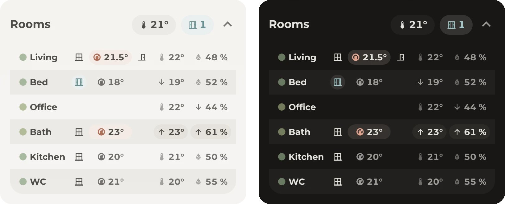
How it works
- Tap the arrow or one of the values in the rooms header to open or close the table.
- Each row shows one room with its colored dot, name, window, thermostat, temperature and humidity. The living room row also shows the front door.
- An open window or door turns cyan, and a thermostat that is heating turns deep orange. Arrows mark the warmest and coldest rooms and the most and least humid rooms.
- Tap a room to open its thermostat. Tap a window or the door to open its contact sensor.
- The table is a single Paper Buttons Row with a grid layout. Keep the room names short so that the table fits on a phone. To add a room, copy a row and increase the 6 in
repeat(6, …).
Entities
| Entity |
Purpose |
sensor.climate_<room> |
The temperature, humidity, arrows and dot color |
binary_sensor.<room>_window, binary_sensor.front_door |
The windows and the door |
climate.<room> |
The target temperature and whether the thermostat is heating |
input_boolean.room_climate_card |
Whether the table is open |
If a room has no thermostat or window contact, delete that button. The cell stays empty, as in the office row.
YAML
The table is a Paper Buttons Row inside a grid card, and it reads the room helpers. The grid's visibility condition shows the table while input_boolean.room_climate_card is on. The header above the table is the rooms header from the Rooms section.
type: grid
square: false
columns: 1
visibility:
  - condition: state
    entity: input_boolean.room_climate_card
    state: 'on'
cards:
  - type: custom:paper-buttons-row
    extra_styles: |
      @keyframes fadeInUp { to { opacity: 1; transform: translateY(0) } }
    styles:
      display: grid
      grid-template-columns: auto auto auto 1fr auto auto
      grid-template-rows: repeat(6, var(--control-height-icon))
      column-gap: var(--ha-space-1)
      padding: 0px var(--ha-space-2)
      margin-bottom: var(--ha-space-5)
      border-radius: var(--ha-card-border-radius)
      opacity: 0
      transform: translateY(10px)
      animation: fadeInUp var(--duration-slow) ease-in forwards
      background-image: >-
        repeating-linear-gradient(to bottom, transparent, transparent var(--control-height-icon),
        var(--fill-subtle) var(--control-height-icon), var(--fill-subtle) calc(var(--control-height-icon) * 2))
    base_config:
      layout: icon|name
      tap_action:
        action: more-info
      state_icons:
        warmest: mdi:arrow-up
        coldest: mdi:arrow-down
        most_humid: mdi:arrow-up
        driest: mdi:arrow-down
      state_styles:
        'on':
          button:
            background-color: var(--tint)
            color: var(--state-binary_sensor-window-on-color)
          icon:
            color: var(--state-binary_sensor-window-on-color)
        heating:
          button:
            background-color: var(--tint)
            color: var(--state-climate-heat-color)
          icon:
            color: var(--state-climate-heat-color)
          name:
            color: var(--primary-text-color)
        warmest:
          button:
            background-color: var(--fill-subtle)
            color: var(--primary-text-color)
          icon:
            opacity: 1
        most_humid:
          button:
            background-color: var(--fill-subtle)
            color: var(--primary-text-color)
          icon:
            opacity: 1
        coldest:
          icon:
            opacity: 1
        driest:
          icon:
            opacity: 1
      styles:
        button:
          padding: 0px 6px
          min-height: var(--icon-size-m)
          justify-content: center
          border-radius: var(--radius-inner)
        icon:
          --mdc-icon-size: var(--icon-size-2xs)
          margin-right: var(--ha-space-1)
          display: flex
          align-items: center
          justify-content: center
        name:
          padding: 0px
          font-size: var(--ha-font-size-s)
          font-weight: var(--ha-font-weight-bold)
          font-variant-numeric: tabular-nums
          white-space: nowrap
        state:
          padding: 0px
    buttons:
      # Living
      - entity: sensor.climate_living_room
        icon: mdi:circle
        name: Living
        tap_action:
          entity: climate.living_room
        styles:
          button:
            grid-column: 1
            justify-content: flex-start
          icon:
            color: '{{ state_attr("sensor.climate_living_room", "color_code") }}'
      - entity: binary_sensor.living_room_balcony_door
        layout: icon
        state_icons:
          'on': mdi:window-open-variant
          'off': mdi:window-closed-variant
        styles:
          button:
            grid-column: 2
            padding: 0px
            width: var(--icon-size-m)
          icon:
            margin-right: 0px
      - entity: climate.living_room
        icon: mdi:thermostat
        name:
          attribute: temperature
          postfix: °
        state:
          attribute: hvac_action
        styles:
          button:
            grid-column: 3
            color: var(--secondary-text-color)
      - entity: binary_sensor.front_door
        layout: icon
        state_icons:
          'on': mdi:door-open
          'off': mdi:door-closed
        styles:
          button:
            grid-column: 4
            padding: 0px
            width: var(--icon-size-m)
          icon:
            margin-right: 0px
      - entity: sensor.climate_living_room
        icon: mdi:thermometer
        name:
          attribute: temperature
          postfix: °
        state:
          attribute: temp_rank
        tap_action:
          entity: climate.living_room
        styles:
          button:
            grid-column: 5
            color: var(--secondary-text-color)
          icon:
            opacity: var(--opacity-muted)
      - entity: sensor.climate_living_room
        icon: mdi:water-percent
        name:
          attribute: humidity
          postfix: ' %'
        state:
          attribute: humidity_rank
        tap_action:
          entity: climate.living_room
        styles:
          button:
            grid-column: 6
            color: var(--secondary-text-color)
          icon:
            opacity: var(--opacity-muted)
      # Bedroom
      - entity: sensor.climate_bedroom
        icon: mdi:circle
        name: Bed
        tap_action:
          entity: climate.bedroom
        styles:
          button:
            grid-column: 1
            justify-content: flex-start
          icon:
            color: '{{ state_attr("sensor.climate_bedroom", "color_code") }}'
      - entity: binary_sensor.bedroom_window
        layout: icon
        state_icons:
          'on': mdi:window-open-variant
          'off': mdi:window-closed-variant
        styles:
          button:
            grid-column: 2
            padding: 0px
            width: var(--icon-size-m)
          icon:
            margin-right: 0px
      - entity: climate.bedroom
        icon: mdi:thermostat
        name:
          attribute: temperature
          postfix: °
        state:
          attribute: hvac_action
        styles:
          button:
            grid-column: 3
            color: var(--secondary-text-color)
      - entity: sensor.climate_bedroom
        icon: mdi:thermometer
        name:
          attribute: temperature
          postfix: °
        state:
          attribute: temp_rank
        tap_action:
          entity: climate.bedroom
        styles:
          button:
            grid-column: 5
            color: var(--secondary-text-color)
          icon:
            opacity: var(--opacity-muted)
      - entity: sensor.climate_bedroom
        icon: mdi:water-percent
        name:
          attribute: humidity
          postfix: ' %'
        state:
          attribute: humidity_rank
        tap_action:
          entity: climate.bedroom
        styles:
          button:
            grid-column: 6
            color: var(--secondary-text-color)
          icon:
            opacity: var(--opacity-muted)
      # Office
      - entity: sensor.climate_office
        icon: mdi:circle
        name: Office
        styles:
          button:
            grid-column: 1
            justify-content: flex-start
          icon:
            color: '{{ state_attr("sensor.climate_office", "color_code") }}'
      - entity: sensor.climate_office
        icon: mdi:thermometer
        name:
          attribute: temperature
          postfix: °
        state:
          attribute: temp_rank
        styles:
          button:
            grid-column: 5
            color: var(--secondary-text-color)
          icon:
            opacity: var(--opacity-muted)
      - entity: sensor.climate_office
        icon: mdi:water-percent
        name:
          attribute: humidity
          postfix: ' %'
        state:
          attribute: humidity_rank
        styles:
          button:
            grid-column: 6
            color: var(--secondary-text-color)
          icon:
            opacity: var(--opacity-muted)
      # Bath
      - entity: sensor.climate_bathroom
        icon: mdi:circle
        name: Bath
        tap_action:
          entity: climate.bathroom
        styles:
          button:
            grid-column: 1
            justify-content: flex-start
          icon:
            color: '{{ state_attr("sensor.climate_bathroom", "color_code") }}'
      - entity: binary_sensor.bathroom_window
        layout: icon
        state_icons:
          'on': mdi:window-open-variant
          'off': mdi:window-closed-variant
        styles:
          button:
            grid-column: 2
            padding: 0px
            width: var(--icon-size-m)
          icon:
            margin-right: 0px
      - entity: climate.bathroom
        icon: mdi:thermostat
        name:
          attribute: temperature
          postfix: °
        state:
          attribute: hvac_action
        styles:
          button:
            grid-column: 3
            color: var(--secondary-text-color)
      - entity: sensor.climate_bathroom
        icon: mdi:thermometer
        name:
          attribute: temperature
          postfix: °
        state:
          attribute: temp_rank
        tap_action:
          entity: climate.bathroom
        styles:
          button:
            grid-column: 5
            color: var(--secondary-text-color)
          icon:
            opacity: var(--opacity-muted)
      - entity: sensor.climate_bathroom
        icon: mdi:water-percent
        name:
          attribute: humidity
          postfix: ' %'
        state:
          attribute: humidity_rank
        tap_action:
          entity: climate.bathroom
        styles:
          button:
            grid-column: 6
            color: var(--secondary-text-color)
          icon:
            opacity: var(--opacity-muted)
      # Kitchen
      - entity: sensor.climate_kitchen
        icon: mdi:circle
        name: Kitchen
        tap_action:
          entity: climate.kitchen
        styles:
          button:
            grid-column: 1
            justify-content: flex-start
          icon:
            color: '{{ state_attr("sensor.climate_kitchen", "color_code") }}'
      - entity: binary_sensor.kitchen_window
        layout: icon
        state_icons:
          'on': mdi:window-open-variant
          'off': mdi:window-closed-variant
        styles:
          button:
            grid-column: 2
            padding: 0px
            width: var(--icon-size-m)
          icon:
            margin-right: 0px
      - entity: climate.kitchen
        icon: mdi:thermostat
        name:
          attribute: temperature
          postfix: °
        state:
          attribute: hvac_action
        styles:
          button:
            grid-column: 3
            color: var(--secondary-text-color)
      - entity: sensor.climate_kitchen
        icon: mdi:thermometer
        name:
          attribute: temperature
          postfix: °
        state:
          attribute: temp_rank
        tap_action:
          entity: climate.kitchen
        styles:
          button:
            grid-column: 5
            color: var(--secondary-text-color)
          icon:
            opacity: var(--opacity-muted)
      - entity: sensor.climate_kitchen
        icon: mdi:water-percent
        name:
          attribute: humidity
          postfix: ' %'
        state:
          attribute: humidity_rank
        tap_action:
          entity: climate.kitchen
        styles:
          button:
            grid-column: 6
            color: var(--secondary-text-color)
          icon:
            opacity: var(--opacity-muted)
      # WC
      - entity: sensor.climate_small_bathroom
        icon: mdi:circle
        name: WC
        tap_action:
          entity: climate.small_bathroom
        styles:
          button:
            grid-column: 1
            justify-content: flex-start
          icon:
            color: '{{ state_attr("sensor.climate_small_bathroom", "color_code") }}'
      - entity: binary_sensor.small_bathroom_window
        layout: icon
        state_icons:
          'on': mdi:window-open-variant
          'off': mdi:window-closed-variant
        styles:
          button:
            grid-column: 2
            padding: 0px
            width: var(--icon-size-m)
          icon:
            margin-right: 0px
      - entity: climate.small_bathroom
        icon: mdi:thermostat
        name:
          attribute: temperature
          postfix: °
        state:
          attribute: hvac_action
        styles:
          button:
            grid-column: 3
            color: var(--secondary-text-color)
      - entity: sensor.climate_small_bathroom
        icon: mdi:thermometer
        name:
          attribute: temperature
          postfix: °
        state:
          attribute: temp_rank
        tap_action:
          entity: climate.small_bathroom
        styles:
          button:
            grid-column: 5
            color: var(--secondary-text-color)
          icon:
            opacity: var(--opacity-muted)
      - entity: sensor.climate_small_bathroom
        icon: mdi:water-percent
        name:
          attribute: humidity
          postfix: ' %'
        state:
          attribute: humidity_rank
        tap_action:
          entity: climate.small_bathroom
        styles:
          button:
            grid-column: 6
            color: var(--secondary-text-color)
          icon:
            opacity: var(--opacity-muted)
Navigation bar
The navigation bar is a Navbar Card with buttons for music, the TV, the lights, the favorites and the menu. A card above the bar shows what is playing.
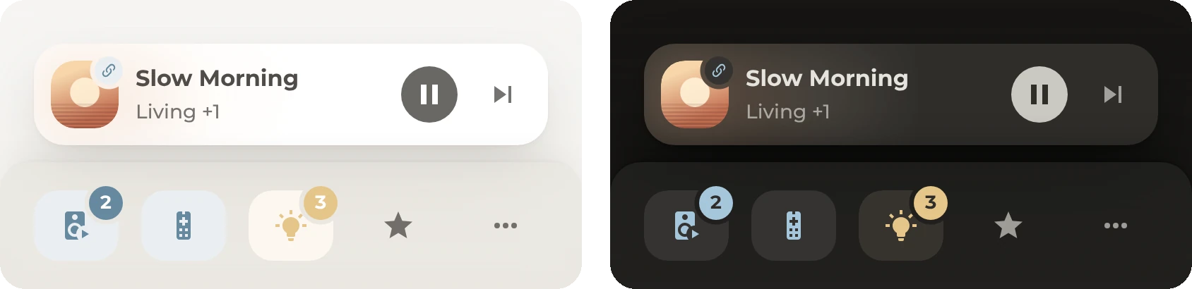
How it works
- The music button turns light blue while a speaker is playing, and the TV button turns light blue while the TV is on. The lights button turns amber while a light is on. Badges on the music and lights buttons show how many speakers are playing and how many lights are on.
- Hold Music to play or pause the active speaker, unless the speaker is playing TV audio. Tap TV to open the TV pop-up, or hold it to open the TV entity's controls.
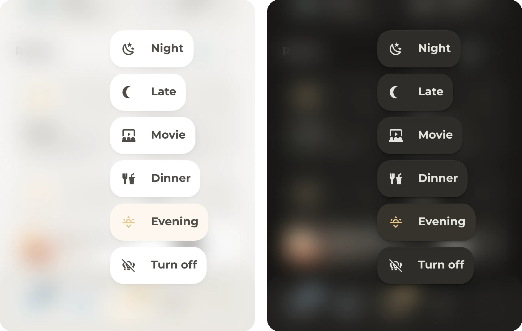
- Hold Lights to open a menu. The menu contains the living room scenes and a button that turns all lights on or off. The active scene is amber.
- More opens the Origami Header menu. Administrators see a dot on this button while updates are available.
- The card above the bar shows either the TV or the most relevant speaker, which comes from
sensor.active_speaker.
- In Navbar Card's
[[[ ]]] templates, read a state with states['sensor.x'].state. The states('sensor.x') function only works in Jinja and in the ${ } templates of the Bubble Card modules.
Entities
| Entity |
Purpose |
sensor.active_speaker_count, sensor.lights_on_count |
The numbers on the badges, from the helpers |
sensor.active_speaker |
The card above the bar, from the helpers |
media_player.living_room_tv, media_player.tv_ump |
The TV button and the TV in the card above the bar |
light.all_lights, script.lights_toggle |
Turning all lights on or off |
scene.living_room_*, sensor.living_room_scene |
The scenes and the active scene |
Except for the helpers, all of these entities are examples. Delete the buttons and scenes that you do not need.
YAML
The navigation bar and the card above it are one Navbar Card. It reads several helpers, such as sensor.active_speaker and sensor.lights_on_count. If you do not use Origami Header, delete the route under # Opens the Origami Header menu.
type: custom:navbar-card
routes:
  - label: Music
    icon: mdi:speaker
    icon_selected: mdi:speaker-play
    selected_color: var(--state-media_player-active-color)
    selected: "[[[ return Number(states['sensor.active_speaker_count']?.state) > 0; ]]]"
    tap_action:
      action: navigate
      navigation_path: '#popup_music'
    hold_action:
      action: custom-js-action
      code: |-
        [[[
          // Holding the button plays or pauses the active speaker. Music Assistant
          // owns the queue when it delivers the cover, so it gets the command.
          // This only works for music, so the TV sound is never paused by accident.
          const active = states['sensor.active_speaker'];
          const target = active?.state;
          const chip = active?.attributes?.chip ?? '';
          if (!states[target] || !/^(playing|paused)_/.test(chip)) return;
          const ma = `${target}_mass`;
          const entity_id = chip.endsWith('_art') && states[ma] ? ma : target;
          hass.callService('media_player', 'media_play_pause', { entity_id });
        ]]]
    badge:
      show: "[[[ return Number(states['sensor.active_speaker_count']?.state) > 0; ]]]"
      count: "[[[ return states['sensor.active_speaker_count']?.state ?? ''; ]]]"
  - label: TV
    icon: mdi:remote-tv
    selected_color: var(--state-media_player-active-color)
    selected: "[[[ return states['media_player.living_room_tv']?.state === 'on'; ]]]"
    tap_action:
      action: navigate
      navigation_path: '#popup_tv'
    hold_action:
      action: more-info
      entity: media_player.living_room_tv
  - label: Lights
    icon: mdi:lightbulb
    icon_selected: mdi:lightbulb-on
    selected_color: var(--state-light-active-color)
    selected: "[[[ return Number(states['sensor.lights_on_count']?.state) > 0; ]]]"
    tap_action:
      action: navigate
      navigation_path: '#popup_lights'
    hold_action:
      action: open-popup
    badge:
      show: "[[[ return Number(states['sensor.lights_on_count']?.state) > 0; ]]]"
      count: "[[[ return states['sensor.lights_on_count']?.state ?? ''; ]]]"
    popup:
      - label: "[[[ return states['light.all_lights']?.state === 'on' ? 'Turn off' : 'Turn on'; ]]]"
        icon: "[[[ return states['light.all_lights']?.state === 'on' ? 'mdi:lightbulb-group-off-outline' : 'mdi:lightbulb-group-outline'; ]]]"
        tap_action:
          action: perform-action
          perform_action: script.lights_toggle
      - label: Evening
        icon: mdi:weather-sunset-down
        selected: "[[[ return states['sensor.living_room_scene']?.state === 'evening'; ]]]"
        tap_action:
          action: perform-action
          perform_action: scene.turn_on
          target:
            entity_id: scene.living_room_evening
      - label: Dinner
        icon: mdi:food-fork-drink
        selected: "[[[ return states['sensor.living_room_scene']?.state === 'dinner'; ]]]"
        tap_action:
          action: perform-action
          perform_action: scene.turn_on
          target:
            entity_id: scene.living_room_dinner
      - label: Movie
        icon: mdi:theater
        selected: "[[[ return states['sensor.living_room_scene']?.state === 'movie'; ]]]"
        tap_action:
          action: perform-action
          perform_action: scene.turn_on
          target:
            entity_id: scene.living_room_movie
      - label: Late
        icon: mdi:moon-waning-crescent
        selected: "[[[ return states['sensor.living_room_scene']?.state === 'late'; ]]]"
        tap_action:
          action: perform-action
          perform_action: scene.turn_on
          target:
            entity_id: scene.living_room_late
      - label: Night
        icon: mdi:weather-night
        selected: "[[[ return states['sensor.living_room_scene']?.state === 'night'; ]]]"
        tap_action:
          action: perform-action
          perform_action: scene.turn_on
          target:
            entity_id: scene.living_room_night
  - label: Favorites
    icon: mdi:star
    tap_action:
      action: navigate
      navigation_path: '#popup_favorites'
  # Opens the Origami Header menu
  - label: More
    icon: mdi:dots-horizontal
    tap_action:
      action: fire-dom-event
      origami_header: toggle
    badge:
      show: "[[[ return !!user?.is_admin && Object.keys(states).some(id => id.startsWith('update.') && states[id].state === 'on'); ]]]"
media_player:
  album_cover_background: true
  desktop_position: bottom-right
  show: '[[[ return !navbar.isDesktop; ]]]'
  players:
    - entity: |-
        [[[
          // The Music Assistant twin when it delivers the cover (right artwork,
          // progress and skip), otherwise the speaker itself
          const active = states['sensor.active_speaker'];
          const target = states[active?.state] ? active.state : 'media_player.living_room';
          const ma = `${target}_mass`;
          return (active?.attributes?.chip ?? '').endsWith('_art') && states[ma] ? ma : target;
        ]]]
      show: |-
        [[[
          const active = states['sensor.active_speaker'];
          return !!active && !!states[active.state] && /^(playing|paused)_/.test(active.attributes?.chip ?? '');
        ]]]
      title: "[[[ return (states['sensor.active_speaker']?.attributes?.title ?? '').split(' | ')[0]; ]]]"
      subtitle: |-
        [[[
          const a = states['sensor.active_speaker']?.attributes ?? {};
          // CSS cannot read entity states, so the group state is passed to the stylesheet as a variable
          document.documentElement.style.setProperty('--navbar-player-group', a.group === 'yes' ? '1' : '0');
          return a.speaker ?? '';
        ]]]
      tap_action:
        action: navigate
        navigation_path: '#popup_music'
    - entity: media_player.tv_ump
      title: "[[[ return states['media_player.tv_ump']?.attributes?.media_title || 'TV'; ]]]"
      icon: "[[[ return states['media_player.tv_ump']?.attributes?.entity_picture ? null : 'mdi:television'; ]]]"
      subtitle: "[[[ return states['media_player.tv_ump']?.attributes?.app_name ?? ''; ]]]"
      tap_action:
        action: navigate
        navigation_path: '#popup_tv'
desktop:
  position: right
  mode: floating
  min_width: 700
  show_labels: popup_only
  show_popup_label_backgrounds: true
mobile:
  mode: floating
  show_labels: popup_only
haptic:
  url: false
  tap_action: true
layout:
  reflect_child_state: true
  auto_padding:
    enabled: true
    mobile_px: 100
    media_player_px: 84
styles: |
  /* Bar */
  :host {
    --navbar-background-color: var(--fill-subtle);
    --navbar-box-shadow: var(--navbar-shadow);
    --navbar-box-shadow-mobile-floating: var(--navbar-shadow);
    --navbar-box-shadow-desktop: var(--navbar-shadow-side, var(--navbar-shadow));
  }

  .navbar-card {
    gap: var(--ha-space-2) !important;
    padding: var(--ha-space-5) !important;
    backdrop-filter: var(--blur-strong);
    -webkit-backdrop-filter: var(--blur-strong);
    margin-bottom: 0px !important;
    border-radius: var(--ha-card-border-radius) var(--ha-card-border-radius) 0px 0px !important;
    border-top: 2px solid var(--border-color);
  }

  ha-ripple {
    display: none !important;
  }

  .route {
    overflow: visible;
    border-radius: var(--ha-card-border-radius);
    --icon-primary-color: var(--secondary-text-color);
  }

  /* The buttons have no ripple, so the press effect is the only feedback */
  .route > .button {
    isolation: isolate;
    transition: scale var(--duration-fast) var(--ease-standard);
  }

  .route:active > .button {
    scale: var(--press-scale);
  }

  /* The icon has the color, and the background behind it is the tint.
     The tint is drawn on ::before, so a badge can cut into it
     without clipping itself. */
  .button.active {
    color: var(--navbar-primary-color);
    background: none !important;
    border-radius: var(--radius-inner);
  }

  .button.active::before {
    content: "";
    position: absolute;
    inset: 0;
    z-index: -1;
    border-radius: inherit;
    background: var(--tint);
    -webkit-mask: var(--b-cutout, none);
    mask: var(--b-cutout, none);
    animation: navbar-fade-in var(--duration-normal) var(--ease-standard);
  }

  .navbar.mobile,
  .navbar.mobile.floating {
    overflow: visible !important;
  }

  /* Content slides under the bar and fades into the page,
     like it does under the header at the top. */
  .navbar.mobile.floating::before {
    content: "";
    position: absolute;
    left: 0;
    right: 0;
    bottom: 0;
    height: calc(100% + var(--ha-space-10, 40px));
    z-index: -2;
    pointer-events: none;
    background: linear-gradient(to top, var(--dashboard-background), var(--backdrop-background-color) 45%, transparent);
    backdrop-filter: var(--blur-soft);
    -webkit-backdrop-filter: var(--blur-soft);
    -webkit-mask: linear-gradient(to top, #000 45%, transparent);
    mask: linear-gradient(to top, #000 45%, transparent);
  }

  /* Each badge is a solid circle in the route's color on the button's top-right
     corner. The circle cuts a gap of --b-gap out of the tint.
     On an inactive button without a tint, it cuts into the icon instead. */
  .route > .button {
    --b-size: var(--icon-size-m);
    --b-gap: 3px;
    --b-out: 3px;
    --b-x: calc(100% - var(--b-size) / 2 + var(--b-out));
    --b-y: calc(var(--b-size) / 2 - var(--b-out));
    --b-reach: calc(var(--b-size) / 2 + var(--b-gap));
  }

  .route > .button:not(.active) {
    --b-x: calc(50% + var(--navbar-route-icon-size) / 2);
    --b-y: calc(50% - var(--navbar-route-icon-size) / 2);
  }

  .route > .button:has(.badge:not(.with-counter)) {
    --b-size: var(--dot-size);
  }

  .route > .button:has(.badge) {
    --b-cutout: radial-gradient(circle at var(--b-x) var(--b-y),
      #0000 var(--b-reach), #000 calc(var(--b-reach) + .5px));
  }

  .route > .button:not(.active):has(.badge) > .icon {
    -webkit-mask: radial-gradient(circle at 100% 0, #0000 var(--b-reach), #000 calc(var(--b-reach) + .5px));
    mask: radial-gradient(circle at 100% 0, #0000 var(--b-reach), #000 calc(var(--b-reach) + .5px));
  }

  .route .badge {
    width: var(--b-size) !important;
    height: var(--b-size) !important;
    min-width: 0 !important;
    padding: 0 !important;
    left: calc(var(--b-x) - var(--b-size) / 2) !important;
    top: calc(var(--b-y) - var(--b-size) / 2) !important;
    right: auto !important;
    border-radius: var(--radius-circle) !important;
    background: var(--navbar-primary-color) !important;
    color: var(--text-color-active) !important;
    font-size: calc(var(--b-size) * .55) !important;
    font-weight: var(--ha-font-weight-bold) !important;
    line-height: 1 !important;
    font-variant-numeric: tabular-nums;
    animation: navbar-badge-in var(--duration-normal) var(--ease-standard);
  }

  @keyframes navbar-badge-in {
    from { scale: .4; opacity: 0; }
  }

  @keyframes navbar-fade-in {
    from { opacity: 0; }
  }

  @media (prefers-reduced-motion: reduce) {
    .route .badge,
    .button.active::before { animation: none; }
    .route:active > .button { scale: none; }
  }

  /* Pop-ups */
  .navbar-popup-backdrop {
    background: transparent !important;
    backdrop-filter: var(--blur-strong);
    -webkit-backdrop-filter: var(--blur-strong);
  }

  /* The menu on the right is aligned with the screen edge */
  .navbar-popup.mobile.open-up.label-left {
    right: var(--view-bleed) !important;
  }

  .popup-item {
    background-color: var(--ha-card-background);
    box-shadow: var(--ha-card-box-shadow);
    border-radius: var(--ha-card-border-radius) !important;
  }

  .navbar-popup.mobile .popup-item .button {
    width: 70px !important;
    height: 60px !important;
  }

  .popup-item .button {
    background: transparent !important;
    box-shadow: none !important;
  }

  .label {
    padding: 0px 0px 0px var(--ha-space-4) !important;
    font-size: var(--ha-font-size-l) !important;
    font-weight: 600 !important;
  }

  /* Pop-ups that open to the right, such as the light scenes, need mirrored padding */
  .navbar-popup.mobile .popup-item.label-right .label {
    padding: 0px var(--ha-space-4) 0px 0px !important;
  }

  /* Active scene. The icon is amber on an amber tint, and the label keeps the text color. */
  .popup-item.active {
    --icon-primary-color: var(--state-light-active-color);
    background-color: color-mix(in srgb, var(--state-light-active-color) var(--tint-strength), var(--ha-card-background)) !important;
  }

  .popup-item.active .button {
    color: inherit !important;
  }

  /* The now playing card is as wide as the dashboard cards.
     It stays above the content, so it uses the elevated shadow. */
  .navbar.mobile {
    gap: var(--ha-space-3) !important;
  }

  .media-player {
    --navbar-primary-color: var(--state-media_player-active-color);
    background: var(--ha-card-background) !important;
    box-shadow: var(--shadow-elevated) !important;
    border-radius: var(--ha-card-border-radius) !important;
    padding: var(--card-padding) !important;
    gap: var(--ha-space-3) !important;
  }

  .media-player.mobile {
    width: auto !important;
    align-self: stretch !important;
    margin: 0 var(--view-bleed) !important;
  }

  .media-player-image,
  .media-player-info {
    position: relative;
  }

  /* The cover's colors glow only behind the artwork and fade out before the text */
  .media-player .media-player-bg {
    -webkit-mask: linear-gradient(to right, #000, transparent 55%);
    mask: linear-gradient(to right, #000, transparent 55%);
  }

  /* Text that does not fit ends in an ellipsis before the buttons */
  .media-player .media-player-info {
    padding-right: var(--ha-space-10, 40px);
  }

  .media-player .media-player-title,
  .media-player .media-player-artist {
    white-space: nowrap;
    overflow: hidden;
    text-overflow: ellipsis !important;
  }

  /* The progress bar is hidden. The card only reads media_position and does not update in between,
     so the bar would not move smoothly. */
  .media-player .media-player-progress-bar {
    display: none !important;
  }

  .media-player-image {
    width: var(--tile-size) !important;
    height: var(--tile-size) !important;
    margin: 0 !important;
    border-radius: var(--radius-inner) !important;
  }

  .media-player-icon-fallback {
    color: var(--state-media_player-active-color);
    --icon-primary-color: currentColor;
    background: var(--tint) !important;
  }

  .media-player-title {
    font-size: var(--ha-font-size-m) !important;
    font-weight: var(--ha-font-weight-bold) !important;
    line-height: var(--ha-line-height-normal);
    margin-bottom: 3px;
  }

  .media-player-artist {
    font-size: var(--ha-font-size-s) !important;
    color: var(--secondary-text-color) !important;
    line-height: var(--ha-line-height-normal);
  }

  .navbar-icon-button.media-player-button {
    width: var(--control-height-icon) !important;
    height: var(--control-height-icon) !important;
    flex-shrink: 0;
    color: var(--secondary-text-color);
    --icon-primary-color: currentColor;
  }

  /* The play and pause button has a filled background and an icon in the active text color */
  .navbar-icon-button.media-player-button-play-pause {
    width: calc(var(--tile-size) - var(--ha-space-2)) !important;
    height: calc(var(--tile-size) - var(--ha-space-2)) !important;
    background: var(--fill-active) !important;
    color: var(--text-color-active) !important;
  }

  /* The group badge on the cover is a tinted circle with a link icon in the media color.
     The subtitle template sets --navbar-player-group to 1 when the speaker is grouped and to 0 otherwise. */
  .media-player {
    --g-on: var(--navbar-player-group, 0);
    --g-size: var(--icon-size-s);
    --g-gap: 3px;
    --g-out: 3px;
    --g-reach: calc(var(--g-size) / 2 + var(--g-gap));
  }

  .media-player::before,
  .media-player::after {
    content: "";
    position: absolute;
    z-index: 2;
    width: var(--g-size);
    height: var(--g-size);
    left: calc(var(--card-padding) + var(--tile-size) - var(--g-size) + var(--g-out));
    top: calc(50% - var(--tile-size) / 2 - var(--g-out));
    scale: var(--g-on);
    transition: scale var(--duration-normal) var(--ease-standard);
    pointer-events: none;
  }

  .media-player-image {
    -webkit-mask: radial-gradient(circle at calc(100% - var(--g-size) / 2 + var(--g-out)) calc(var(--g-size) / 2 - var(--g-out)),
      #0000 calc(var(--g-reach) * var(--g-on)), #000 calc((var(--g-reach) + .5px) * var(--g-on)));
    mask: radial-gradient(circle at calc(100% - var(--g-size) / 2 + var(--g-out)) calc(var(--g-size) / 2 - var(--g-out)),
      #0000 calc(var(--g-reach) * var(--g-on)), #000 calc((var(--g-reach) + .5px) * var(--g-on)));
  }

  .media-player::before {
    border-radius: var(--radius-circle);
    background: color-mix(in srgb, var(--state-media_player-active-color) var(--tint-strength), var(--ha-card-background));
  }

  .media-player::after {
    background: var(--state-media_player-active-color);
    -webkit-mask: url("data:image/svg+xml,%3Csvg xmlns='http://www.w3.org/2000/svg' viewBox='0 0 24 24'%3E%3Cpath d='M10.59,13.41C11,13.8 11,14.44 10.59,14.83C10.2,15.22 9.56,15.22 9.17,14.83C7.22,12.88 7.22,9.71 9.17,7.76V7.76L12.71,4.22C14.66,2.27 17.83,2.27 19.78,4.22C21.73,6.17 21.73,9.34 19.78,11.29L18.29,12.78C18.3,11.96 18.17,11.14 17.89,10.36L18.36,9.88C19.54,8.71 19.54,6.81 18.36,5.64C17.19,4.46 15.29,4.46 14.12,5.64L10.59,9.17C9.41,10.34 9.41,12.24 10.59,13.41M13.41,9.17C13.8,8.78 14.44,8.78 14.83,9.17C16.78,11.12 16.78,14.29 14.83,16.24V16.24L11.29,19.78C9.34,21.73 6.17,21.73 4.22,19.78C2.27,17.83 2.27,14.66 4.22,12.71L5.71,11.22C5.7,12.04 5.83,12.86 6.11,13.65L5.64,14.12C4.46,15.29 4.46,17.19 5.64,18.36C6.81,19.54 8.71,19.54 9.88,18.36L13.41,14.83C14.59,13.66 14.59,11.76 13.41,10.59C13,10.2 13,9.56 13.41,9.17Z'/%3E%3C/svg%3E") center / calc(var(--g-size) * .6) no-repeat;
    mask: url("data:image/svg+xml,%3Csvg xmlns='http://www.w3.org/2000/svg' viewBox='0 0 24 24'%3E%3Cpath d='M10.59,13.41C11,13.8 11,14.44 10.59,14.83C10.2,15.22 9.56,15.22 9.17,14.83C7.22,12.88 7.22,9.71 9.17,7.76V7.76L12.71,4.22C14.66,2.27 17.83,2.27 19.78,4.22C21.73,6.17 21.73,9.34 19.78,11.29L18.29,12.78C18.3,11.96 18.17,11.14 17.89,10.36L18.36,9.88C19.54,8.71 19.54,6.81 18.36,5.64C17.19,4.46 15.29,4.46 14.12,5.64L10.59,9.17C9.41,10.34 9.41,12.24 10.59,13.41M13.41,9.17C13.8,8.78 14.44,8.78 14.83,9.17C16.78,11.12 16.78,14.29 14.83,16.24V16.24L11.29,19.78C9.34,21.73 6.17,21.73 4.22,19.78C2.27,17.83 2.27,14.66 4.22,12.71L5.71,11.22C5.7,12.04 5.83,12.86 6.11,13.65L5.64,14.12C4.46,15.29 4.46,17.19 5.64,18.36C6.81,19.54 8.71,19.54 9.88,18.36L13.41,14.83C14.59,13.66 14.59,11.76 13.41,10.59C13,10.2 13,9.56 13.41,9.17Z'/%3E%3C/svg%3E") center / calc(var(--g-size) * .6) no-repeat;
  }

  /* The TV card is recognized by its cover or its fallback icon. It has no group
     badge, and its buttons show remote control icons. OK (a ring) replaces
     play and pause, and right replaces skip. */
  .media-player:is(:has(img.media-player-image[src*="media_player.tv_ump"]),
                   :has(.media-player-icon-fallback[icon="mdi:television"])) {
    --g-on: 0;
  }

  .media-player:is(:has(img.media-player-image[src*="media_player.tv_ump"]),
                   :has(.media-player-icon-fallback[icon="mdi:television"])) .media-player-button > ha-icon {
    display: none;
  }

  .media-player:is(:has(img.media-player-image[src*="media_player.tv_ump"]),
                   :has(.media-player-icon-fallback[icon="mdi:television"])) .media-player-button-play-pause::after {
    content: "";
    width: var(--mdc-icon-size, 24px);
    height: var(--mdc-icon-size, 24px);
    background: currentColor;
    -webkit-mask: url("data:image/svg+xml,%3Csvg xmlns='http://www.w3.org/2000/svg' viewBox='0 0 24 24'%3E%3Cpath d='M12,20A8,8 0 0,1 4,12A8,8 0 0,1 12,4A8,8 0 0,1 20,12A8,8 0 0,1 12,20M12,2A10,10 0 0,0 2,12A10,10 0 0,0 12,22A10,10 0 0,0 22,12A10,10 0 0,0 12,2Z'/%3E%3C/svg%3E") center / contain no-repeat;
    mask: url("data:image/svg+xml,%3Csvg xmlns='http://www.w3.org/2000/svg' viewBox='0 0 24 24'%3E%3Cpath d='M12,20A8,8 0 0,1 4,12A8,8 0 0,1 12,4A8,8 0 0,1 20,12A8,8 0 0,1 12,20M12,2A10,10 0 0,0 2,12A10,10 0 0,0 12,22A10,10 0 0,0 22,12A10,10 0 0,0 12,2Z'/%3E%3C/svg%3E") center / contain no-repeat;
  }

  .media-player:is(:has(img.media-player-image[src*="media_player.tv_ump"]),
                   :has(.media-player-icon-fallback[icon="mdi:television"])) .media-player-button-skip::after {
    content: "";
    width: var(--mdc-icon-size, 24px);
    height: var(--mdc-icon-size, 24px);
    background: currentColor;
    -webkit-mask: url("data:image/svg+xml,%3Csvg xmlns='http://www.w3.org/2000/svg' viewBox='0 0 24 24'%3E%3Cpath d='M8.59,16.58L13.17,12L8.59,7.41L10,6L16,12L10,18L8.59,16.58Z'/%3E%3C/svg%3E") center / contain no-repeat;
    mask: url("data:image/svg+xml,%3Csvg xmlns='http://www.w3.org/2000/svg' viewBox='0 0 24 24'%3E%3Cpath d='M8.59,16.58L13.17,12L8.59,7.41L10,6L16,12L10,18L8.59,16.58Z'/%3E%3C/svg%3E") center / contain no-repeat;
  }

  /* On desktop, the bar is attached to the right edge and centered vertically. */
  .navbar.desktop {
    overflow: visible !important;
  }

  .navbar.desktop.right {
    right: 0px !important;
    margin-right: 0px !important;
    --navbar-border-radius: var(--ha-card-border-radius);
  }

  .navbar.desktop.right .navbar-card.desktop.right {
    border-radius: var(--ha-card-border-radius) 0px 0px var(--ha-card-border-radius) !important;
    border: 2px solid var(--border-color) !important;
    border-right: none !important;
    padding: var(--ha-space-4) var(--ha-space-4) var(--ha-space-4) var(--ha-space-3) !important;
    margin: 0px !important;
    min-width: 0px !important;
    overflow: hidden;
  }

  /* Mobile */
  .navbar-card.mobile,
  .navbar-card.mobile.floating {
    width: 100% !important;
    border-radius: var(--ha-card-border-radius) var(--ha-card-border-radius) 0px 0px !important;
  }

  .navbar-card.mobile .route {
    height: 50px !important;
  }

  .navbar-card.mobile .route .button {
    height: 100% !important;
  }
Pop-ups
The dashboard contains three Bubble Card pop-ups for a room, the TV and the fan. They are at the end of dashboard.yaml, under # Pop-ups. A pop-up opens when a button navigates to its hash, such as #popup_tv. To close a pop-up, tap the close button or swipe down. The scripts and helpers that the pop-ups use are in the package. Each pop-up's YAML section contains the whole pop-up as one Bubble card. Add it to the same view as the button that opens it.
Room
Each room can have the same kind of pop-up, which opens from its room card. From top to bottom, the pop-up shows the media in the room, the lights and the climate. The living room pop-up is the example to copy for other rooms.
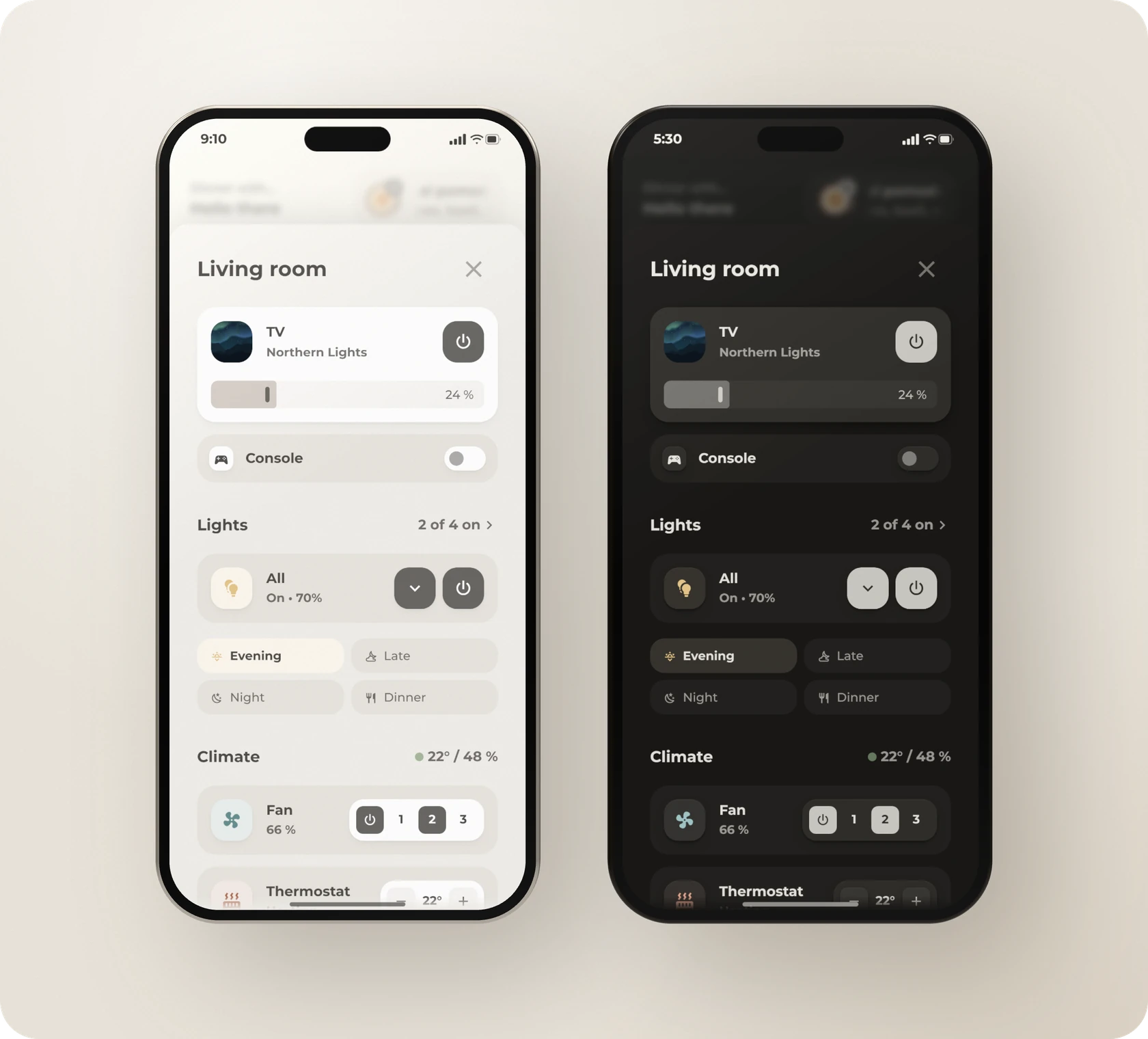
How it works
- The pop-up's hash is
#popup_living_room, which is the living room card's navigation path.
- The media card shows the TV while it is on, and the speaker at all other times. Tap the TV card to open the TV pop-up. Smaller controls for the room go under the media card. In this example, a smart plug appears as a compact row with a switch.
- The lights header shows how many lights in the room's light group are on. The power button on the All card turns the whole group on or off, and the arrow next to it shows the scenes. A tap on the card opens the group's details. The scene that was turned on last is highlighted.
- The climate header shows the temperature and humidity, with a dot in the room's comfort color. Tap the fan card to open the fan pop-up. The plus and minus buttons change the thermostat's target temperature by half a degree.
- Everything off turns off the lights, fans, media players and switches in the room's area. The list of these domains is in
script.room_off.
- When you close the pop-up, the scenes are hidden again.
Entities
| Entity |
Purpose |
media_player.living_room_tv, media_player.living_room_tv_cast |
The TV card, which the TV section explains |
media_player.living_room |
The speaker and both volume sliders |
switch.living_room_console |
The smart plug |
light.living_room |
The room's light group. The header counts the lights in this group. |
scene.living_room_*, sensor.living_room_scene |
The scenes and the scene that was turned on last |
input_boolean.living_room_scenes |
Whether the scenes are visible |
sensor.climate_living_room |
The temperature, humidity and comfort color |
fan.living_room, climate.living_room |
The fan and the thermostat |
script.thermostat_step, script.room_off |
The thermostat buttons and Everything off |
All of these entities are examples. The scripts, the toggle and sensor.living_room_scene are in the package, and the sensor contains the list of scenes.
To create a pop-up for another room, copy the living room pop-up and give it the hash that the room card opens, such as #popup_bedroom. Then change the name, the entities and the area of Everything off. The new room's scenes need their own toggle and scene sensor. You can also remove the scenes. A different fan needs its own fan pop-up.
YAML
This pop-up needs Bubble Card and the package.
type: custom:bubble-card
card_type: pop-up
hash: '#popup_living_room'
name: Living room
button_type: name
show_header: true
show_name: true
show_icon: false
card_layout: large
buttons_position: right
scrolling_effect: false
margin: 7px
margin_top_mobile: 22px
margin_top_desktop: 30%
bg_color: transparent
bg_opacity: '100'
bg_blur: '0'
shadow_opacity: '12'
hide_backdrop: false
modules:
- default
- origami_popup
origami_popup:
subtitle_style: text
# Hides the scenes again when you close the pop-up
close_action:
action: perform-action
perform_action: input_boolean.turn_off
target:
entity_id: input_boolean.living_room_scenes
cards:
- type: vertical-stack
cards:
# The media card shows the TV while it is on and the speaker at all other times.
- type: vertical-stack
cards:
- type: conditional
conditions:
- condition: state
entity: media_player.living_room_tv
state_not:
- 'off'
- standby
- unavailable
- unknown
card:
type: custom:bubble-card
card_type: media-player
button_type: state
entity: media_player.living_room_tv
name: TV
icon: mdi:television
modules:
- origami_base
- origami_media
origami_media:
art_entity: media_player.living_room_tv_cast
app_entity: media_player.living_room_tv
hide:
power_button: true
previous_button: true
next_button: true
volume_button: true
play_pause_button: true
tap_action:
action: navigate
navigation_path: '#popup_tv'
button_action:
tap_action:
action: navigate
navigation_path: '#popup_tv'
sub_button:
main:
- icon: mdi:power
show_background: true
tap_action:
action: perform-action
perform_action: media_player.toggle
target:
entity_id: media_player.living_room_tv
bottom:
- entity: media_player.living_room
sub_button_type: slider
always_visible: true
rows: '2.2'
state_content: state
- type: conditional
conditions:
- condition: state
entity: media_player.living_room_tv
state:
- 'off'
- standby
- unavailable
- unknown
card:
type: custom:bubble-card
card_type: media-player
button_type: state
entity: media_player.living_room
name: Speaker
icon: mdi:speaker
scrolling_effect: true
modules:
- origami_base
- origami_media
origami_base:
group: true
hide:
power_button: true
previous_button: true
next_button: true
volume_button: true
play_pause_button: true
tap_action:
action: more-info
button_action:
tap_action:
action: more-info
sub_button:
main:
# Play or pause, depending on the state
- icon: mdi:play
show_background: true
tap_action:
action: perform-action
perform_action: media_player.media_play_pause
target:
entity_id: media_player.living_room
visibility:
- condition: state
entity: media_player.living_room
state_not: playing
- icon: mdi:pause
show_background: true
tap_action:
action: perform-action
perform_action: media_player.media_play_pause
target:
entity_id: media_player.living_room
visibility:
- condition: state
entity: media_player.living_room
state: playing
- icon: mdi:skip-next
show_background: false
tap_action:
action: perform-action
perform_action: media_player.media_next_track
target:
entity_id: media_player.living_room
# Bluetooth as the source, filled while it is active
- icon: mdi:bluetooth
show_background: false
tap_action:
action: perform-action
perform_action: media_player.select_source
target:
entity_id: media_player.living_room
data:
source: Bluetooth
visibility:
- condition: state
entity: media_player.living_room
attribute: source
state_not: Bluetooth
- icon: mdi:bluetooth-connect
show_background: true
tap_action:
action: perform-action
perform_action: media_player.select_source
target:
entity_id: media_player.living_room
data:
source: Bluetooth
visibility:
- condition: state
entity: media_player.living_room
attribute: source
state: Bluetooth
bottom:
- entity: media_player.living_room
sub_button_type: slider
always_visible: true
rows: '2.2'
state_content: state
# A plug as a compact row with a switch
- type: custom:bubble-card
card_type: button
button_type: switch
entity: switch.living_room_console
name: Console
icon: mdi:controller
modules:
- origami_base
origami_base:
compact: true
toggle: true
tile: true
sub_button:
main:
- icon: mdi:circle
show_background: true
tap_action:
action: toggle
rows: 1
# Lights header, all lights and the scenes
- type: vertical-stack
cards:
- type: custom:bubble-card
card_type: separator
name: Lights
modules:
- origami_header
origami_header:
icon_size: var(--icon-size-s)
grid_options:
rows: auto
sub_button:
main:
# Counts the lights in the group that are on
- entity: light.living_room
icon: mdi:chevron-right
show_name: true
content_layout: icon-right
show_background: false
origami_header:
name: >-
${(ids => (n => n ? n + ' of ' + ids.length + ' on' : 'All off')(ids.filter((id) => states(id) === 'on').length))(attr.entity_id ?? [])}
tap_action:
action: more-info
- type: custom:bubble-card
card_type: button
button_type: switch
entity: light.living_room
name: All
icon: mdi:lightbulb-multiple
modules:
- origami_base
- origami_light
origami_base:
tile: true
scrolling_effect: false
tap_action:
action: more-info
button_action:
tap_action:
action: more-info
sub_button:
main:
# Shows and hides the scenes below
- entity: input_boolean.living_room_scenes
icon: mdi:chevron-down
show_background: true
tap_action:
action: toggle
- icon: mdi:power
show_background: true
tap_action:
action: perform-action
perform_action: light.toggle
target:
entity_id: light.living_room
state_content:
- state
- brightness
rows: 1.375
- type: conditional
conditions:
- condition: state
entity: input_boolean.living_room_scenes
state: 'on'
card:
type: custom:bubble-card
card_type: sub-buttons
modules:
- origami_button
origami_button:
columns: 2
animate: true
padding: var(--ha-space-1) 0 0 0
# The scene that was turned on last is highlighted
active: "{{ states('sensor.living_room_scene') }}"
sub_button:
main: []
bottom:
- name: Evening
icon: mdi:weather-sunset-down
show_name: true
tap_action:
action: perform-action
perform_action: scene.turn_on
target:
entity_id: scene.living_room_evening
- name: Late
icon: mdi:weather-night-partly-cloudy
show_name: true
tap_action:
action: perform-action
perform_action: scene.turn_on
target:
entity_id: scene.living_room_late
- name: Night
icon: mdi:weather-night
show_name: true
tap_action:
action: perform-action
perform_action: scene.turn_on
target:
entity_id: scene.living_room_night
- name: Dinner
icon: mdi:silverware-fork-knife
show_name: true
tap_action:
action: perform-action
perform_action: scene.turn_on
target:
entity_id: scene.living_room_dinner
# Climate header, the fan and the thermostat
- type: vertical-stack
cards:
- type: custom:bubble-card
card_type: separator
name: Climate
modules:
- origami_header
origami_header:
# The dot uses the comfort color
icon_color: '{{ state_attr("sensor.climate_living_room", "color_code") }}'
grid_options:
rows: auto
sub_button:
main:
- entity: sensor.climate_living_room
icon: mdi:circle
show_name: true
show_background: false
origami_header:
name: ${attr.temperature}° / ${attr.humidity} %
tap_action:
action: more-info
- type: conditional
conditions:
- condition: state
entity: fan.living_room
state_not: unavailable
card:
type: custom:bubble-card
card_type: button
button_type: switch
entity: fan.living_room
name: Fan
icon: mdi:fan
modules:
- origami_base
- origami_fan
origami_base:
group: true
tile: true
scrolling_effect: false
# A tap on the card opens the fan pop-up
tap_action:
action: navigate
navigation_path: '#popup_fan'
button_action:
tap_action:
action: navigate
navigation_path: '#popup_fan'
sub_button:
main:
- icon: mdi:power
show_background: true
tap_action:
action: perform-action
perform_action: fan.toggle
target:
entity_id: fan.living_room
- name: '1'
show_icon: false
show_name: true
show_background: false
tap_action:
action: perform-action
perform_action: fan.set_percentage
target:
entity_id: fan.living_room
data:
percentage: 33
- name: '2'
show_icon: false
show_name: true
show_background: false
tap_action:
action: perform-action
perform_action: fan.set_percentage
target:
entity_id: fan.living_room
data:
percentage: 66
- name: '3'
show_icon: false
show_name: true
show_background: false
tap_action:
action: perform-action
perform_action: fan.set_percentage
target:
entity_id: fan.living_room
data:
percentage: 100
state_content:
- state
- percentage
rows: 1.375
- type: custom:bubble-card
card_type: button
button_type: switch
entity: climate.living_room
name: Thermostat
icon: mdi:thermostat
modules:
- origami_base
- origami_climate
origami_base:
group: true
tile: true
scrolling_effect: false
tap_action:
action: more-info
button_action:
tap_action:
action: more-info
sub_button:
main:
- icon: mdi:minus
show_background: true
tap_action:
action: perform-action
perform_action: script.thermostat_step
data:
thermostat: climate.living_room
step: -0.5
- entity: climate.living_room
css_class: readout
show_icon: false
show_name: false
show_background: false
state_content: temperature
tap_action:
action: more-info
- icon: mdi:plus
show_background: true
tap_action:
action: perform-action
perform_action: script.thermostat_step
data:
thermostat: climate.living_room
step: 0.5
state_content: []
rows: 1.375
# Turns everything in the room off, shown as a plain text button
- type: custom:bubble-card
card_type: sub-buttons
modules:
- origami_button
origami_button:
background: false
align: center
muted: true
icon_size: var(--icon-size-xs)
padding: var(--ha-space-6, 24px) 0 100px 0
sub_button:
main: []
bottom:
- name: Everything off
icon: mdi:power
show_name: true
tap_action:
action: perform-action
perform_action: script.room_off
data:
area: living_room
rows: 1.75
TV
The TV pop-up is a remote control for the TV. It opens from TV in the navigation bar or from the TV card in the room pop-up.
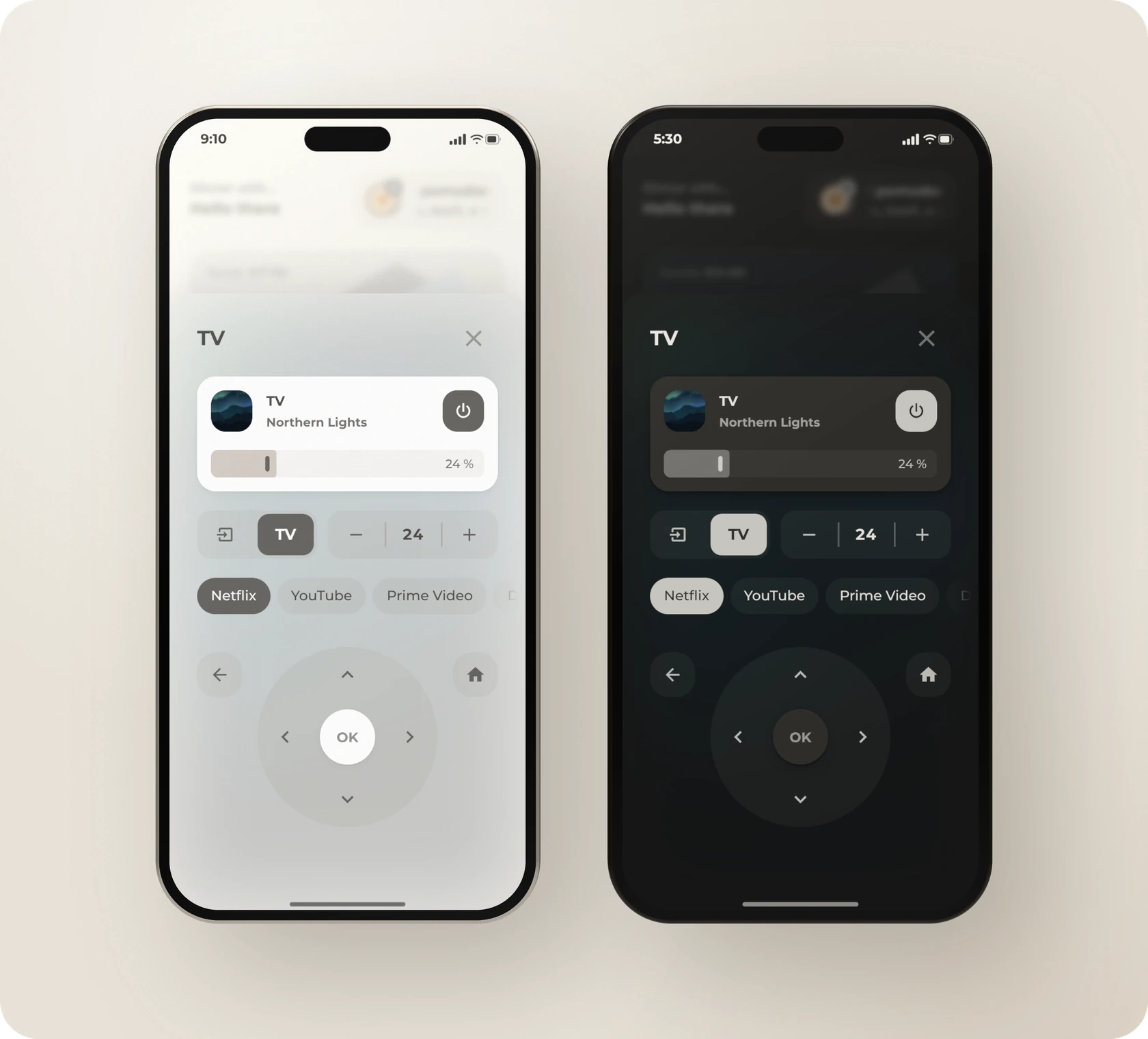
How it works
- The top card shows the TV, its current program and its power button. A separate speaker plays the TV's sound, and the card's slider sets the speaker's volume. A blurred picture of the current program appears behind the pop-up.
- The input button sends the
TV_INPUT command to the TV. The TV button switches the speaker to its TV input, and it is filled while the speaker uses that input.
- The minus and plus buttons change the volume by 1%. A double tap changes it by 5%, and holding the button changes it by 10%. Tap the number to mute the speaker.
- The app buttons scroll sideways, and the running app's button is filled. Tap an app to start it with
media_player.select_source.
- The remote has a back button, a home button and a round pad with an OK button. Hold an arrow button to repeat its command.
The commands, such as DPAD_UP, DPAD_CENTER and TV_INPUT, are for the Android TV Remote integration. Other remotes use different command names. The app buttons need your TV's source names.
Entities
| Entity |
Purpose |
media_player.living_room_tv |
The TV and its apps, from Android TV Remote |
remote.living_room_tv |
The remote, from Android TV Remote |
media_player.living_room_tv_cast |
The current program and its picture, from Google Cast |
media_player.living_room |
The speaker that plays the TV's sound |
script.volume |
The volume steps and mute, from the package |
In this example, the speaker's TV input is called Optical In. If you do not have a separate speaker, point the volume buttons and the slider to the TV and delete the TV button.
YAML
This pop-up needs Bubble Card, Paper Buttons Row and script.volume from the package.
type: custom:bubble-card
card_type: pop-up
hash: '#popup_tv'
name: TV
button_type: name
show_icon: false
margin_top_mobile: 72px
margin_top_desktop: 300px
bg_opacity: 100
shadow_opacity: '12'
popup_mode: adaptive-dialog
with_bottom_offset: true
performance_mode: performance
modules:
- origami_popup
# A blurred picture of the current program appears behind the pop-up
styles: |-
${(() => {
const cast = hass.states["media_player.living_room_tv_cast"];
const art = cast?.attributes?.entity_picture_local ?? cast?.attributes?.entity_picture;
const on = ["playing", "paused", "buffering"].includes(cast?.state);
const url = on && typeof art === "string" && art ? 'url("' + art.replace(/"/g, "%22") + '")' : null;
return `.bubble-pop-up-background::after {
content: "";
position: absolute;
inset: 0;
z-index: 0;
border-radius: inherit;
background-image: ${url ?? "none"};
background-size: cover;
background-position: center;
filter: blur(50px) saturate(170%);
opacity: ${url ? "0.16" : "0"};
pointer-events: none;
clip-path: inset(0 round var(--bubble-pop-up-border-radius, var(--bubble-border-radius, 42px)) var(--bubble-pop-up-border-radius, var(--bubble-border-radius, 42px)) 0 0);
transition: opacity var(--duration-normal, 0.3s) ease;
}
.bubble-pop-up-container > * {
position: relative;
z-index: 1;
}`;
})()}
cards:
- type: vertical-stack
cards:
# The TV card shows the app or the cast program, a power button and the speaker's volume
- type: custom:bubble-card
card_type: media-player
button_type: state
entity: media_player.living_room_tv
name: TV
icon: mdi:television
modules:
- origami_base
- origami_media
- '!default'
origami_media:
art_entity: media_player.living_room_tv_cast
app_entity: media_player.living_room_tv
scrolling_effect: false
slider_live_update: false
cover_background: false
hide:
power_button: true
previous_button: true
next_button: true
volume_button: true
play_pause_button: true
tap_action:
action: more-info
button_action:
tap_action:
action: more-info
sub_button:
main:
- icon: mdi:power
show_background: true
tap_action:
action: perform-action
perform_action: media_player.toggle
target:
entity_id: media_player.living_room_tv
bottom:
- entity: media_player.living_room
sub_button_type: slider
always_visible: true
custom_height: 26
rows: '2.2'
state_content: state
# Input, TV sound through the speaker, and the volume in steps
- type: custom:paper-buttons-row
extra_styles: >-
paper-button:active { background-color: var(--fill-strong) !important }
paper-button[data-state="optical in" i], paper-button[data-state="optical in" i] + paper-button { background-image: none !important }
styles:
align-items: stretch
margin: var(--ha-space-2) 0px
padding: 0px
background-color: transparent
box-shadow: none
--pbs-button-bg-color: var(--fill-subtle)
base_config:
layout: icon
tap_action:
action: call-service
service: script.volume
styles:
button:
flex: 1
height: var(--control-height)
padding: 0px
border-radius: 0px
box-shadow: none
background-image: linear-gradient(var(--fill-loud), var(--fill-loud))
background-repeat: no-repeat
background-size: 2px 50%
background-position: left center
transition: var(--transition-interactive)
icon:
--mdc-icon-size: var(--icon-size-m)
margin-right: 0px
opacity: var(--opacity-strong)
buttons:
- icon: mdi:import
tooltip: Input
tap_action:
service: remote.send_command
target:
entity_id: remote.living_room_tv
service_data:
command: TV_INPUT
styles:
button:
border-radius: var(--radius-inner) 0px 0px var(--radius-inner)
background-image: none
# The button is filled while the speaker plays the TV's sound, like the active buttons in the fan pop-up
- layout: name
name: TV
tooltip: TV sound through the speaker
state:
entity: media_player.living_room
attribute: source
active:
- optical in
state_styles:
optical in:
button:
background-color: var(--fill-subtle)
name:
color: var(--ha-card-background)
background-color: var(--fill-active)
opacity: 1
tap_action:
service: media_player.select_source
target:
entity_id: media_player.living_room
service_data:
source: Optical In
styles:
button:
box-sizing: border-box
padding: var(--ha-space-1)
margin-right: var(--ha-space-3)
border-radius: 0px var(--radius-inner) var(--radius-inner) 0px
name:
display: flex
align-items: center
justify-content: center
box-sizing: border-box
width: 100%
height: 100%
padding: 0px
border-radius: calc(var(--radius-inner) - var(--ha-space-1))
font-size: var(--ha-font-size-l)
font-weight: var(--ha-font-weight-bold)
transition: var(--transition-interactive)
# A tap changes the volume by 1%, a double tap by 5% and holding by 10%
- icon: mdi:minus
tooltip: Quieter
tap_action:
service_data:
speaker: media_player.living_room
step: -0.01
double_tap_action:
action: call-service
service: script.volume
service_data:
speaker: media_player.living_room
step: -0.05
hold_action:
action: call-service
service: script.volume
service_data:
speaker: media_player.living_room
step: -0.1
styles:
button:
border-radius: var(--radius-inner) 0px 0px var(--radius-inner)
background-image: none
# Shows the volume, or a muted icon while the speaker is muted. A tap mutes the speaker.
- layout: state|icon
icon: mdi:volume-off
tooltip: Mute
state: >-
{% set s = 'media_player.living_room' %}{{ 'off' if states(s) in ['unavailable', 'unknown', 'off']
else 'muted' if state_attr(s, 'is_volume_muted')
else ((state_attr(s, 'volume_level') | float(0)) * 100) | round(0) | int }}
state_text:
'off': –
muted: ' '
state_styles:
muted:
state:
transform: scale(0)
icon:
transform: scale(1)
tap_action:
service_data:
speaker: media_player.living_room
mute: true
hold_action:
action: more-info
entity: media_player.living_room
styles:
button:
position: relative
state:
padding: 0px
font-size: var(--ha-font-size-l)
font-weight: var(--ha-font-weight-bold)
font-variant-numeric: tabular-nums
transition: transform var(--duration-normal) ease
icon:
--mdc-icon-size: var(--icon-size-s)
position: absolute
transform: scale(0)
transition: transform var(--duration-normal) ease
- icon: mdi:plus
tooltip: Louder
tap_action:
service_data:
speaker: media_player.living_room
step: 0.01
double_tap_action:
action: call-service
service: script.volume
service_data:
speaker: media_player.living_room
step: 0.05
hold_action:
action: call-service
service: script.volume
service_data:
speaker: media_player.living_room
step: 0.1
styles:
button:
border-radius: 0px var(--radius-inner) var(--radius-inner) 0px
# The app buttons scroll sideways. The running app's button is filled.
- type: custom:paper-buttons-row
extra_styles: >-
paper-button.button-active { background-color: var(--fill-active) !important; box-shadow: none !important }
paper-button.button-active span { color: var(--ha-card-background) !important; opacity: 1 !important }
styles:
justify-content: start
gap: var(--ha-space-2)
margin: calc(var(--scroller-bleed) * -1)
padding: var(--scroller-padding)
overflow-x: scroll
overscroll-behavior-x: contain
scroll-snap-type: x mandatory
scrollbar-width: none
mask-image: var(--scroller-mask)
base_config:
layout: name
state:
entity: media_player.living_room_tv
attribute: app_id
tap_action:
action: call-service
service: media_player.select_source
target:
entity_id: media_player.living_room_tv
styles:
button:
scroll-snap-align: start
scroll-margin-left: var(--scroller-bleed)
padding: calc(var(--control-padding-x) / 1.4) var(--control-padding-x)
border-radius: var(--ha-card-border-radius)
background-color: var(--fill-subtle)
box-shadow: var(--card-ring)
transition: var(--transition-interactive)
name:
padding: 0px
font-size: var(--ha-font-size-m)
font-weight: var(--ha-font-weight-normal)
white-space: nowrap
buttons:
- name: Netflix
active:
- com.netflix.ninja
tap_action:
service_data:
source: Netflix
- name: YouTube
active:
- com.google.android.youtube.tv
tap_action:
service_data:
source: YouTube
- name: Prime Video
active:
- com.amazon.amazonvideo.livingroom
tap_action:
service_data:
source: Prime Video
- name: Disney+
active:
- com.disney.disneyplus
tap_action:
service_data:
source: Disney+
- name: Spotify
active:
- com.spotify.tv.android
tap_action:
service_data:
source: Spotify
- name: Plex
active:
- com.plexapp.android
tap_action:
service_data:
source: Plex
# The remote has back and home buttons and a round pad. Holding an arrow repeats its command.
- type: custom:paper-buttons-row
extra_styles: 'paper-button:active { transform: scale(var(--press-scale)) }'
styles:
display: grid
grid-template-columns: 1fr var(--control-height-lg) var(--control-height-lg) var(--control-height-lg) 1fr
grid-template-rows: repeat(3, var(--control-height-lg))
grid-template-areas: '"back . up . home" ". left ok right ." ". . down . ."'
gap: var(--ha-space-2)
margin-top: var(--ha-space-2)
align-items: center
justify-items: center
base_config:
layout: icon
tap_action:
action: call-service
service: remote.send_command
target:
entity_id: remote.living_room_tv
hold_action:
action: call-service
service: remote.send_command
target:
entity_id: remote.living_room_tv
repeat: 300
styles:
button:
width: var(--control-height)
height: var(--control-height)
padding: 0px
border-radius: var(--radius-inner)
background-color: transparent
box-shadow: none
icon:
--mdc-icon-size: var(--icon-size-l)
margin-right: 0px
opacity: var(--opacity-strong)
name:
padding: 0px
buttons:
# The round pad behind the arrows
- layout: name
name: ' '
tooltip: false
tap_action:
action: none
hold_action:
action: none
styles:
button:
grid-row: 1 / 4
grid-column: 2 / 5
width: calc(var(--control-height-lg) * 3 + var(--ha-space-2) * 2)
height: calc(var(--control-height-lg) * 3 + var(--ha-space-2) * 2)
border-radius: var(--radius-circle)
background-color: var(--fill-subtle)
box-shadow: var(--card-ring)
pointer-events: none
- icon: mdi:arrow-left
tooltip: Back
tap_action:
service_data:
command: BACK
hold_action:
action: none
styles:
button:
grid-area: back
justify-self: start
width: var(--control-height-sm)
height: var(--control-height-sm)
border-radius: var(--ha-card-border-radius)
background-color: var(--fill-subtle)
box-shadow: var(--card-ring)
icon:
--mdc-icon-size: var(--icon-size-m)
- icon: mdi:home
tooltip: Home
tap_action:
service_data:
command: HOME
hold_action:
action: none
styles:
button:
grid-area: home
justify-self: end
width: var(--control-height-sm)
height: var(--control-height-sm)
border-radius: var(--ha-card-border-radius)
background-color: var(--fill-subtle)
box-shadow: var(--card-ring)
icon:
--mdc-icon-size: var(--icon-size-m)
- icon: mdi:chevron-up
tap_action:
service_data:
command: DPAD_UP
hold_action:
service_data:
command: DPAD_UP
styles:
button:
grid-area: up
- icon: mdi:chevron-left
tap_action:
service_data:
command: DPAD_LEFT
hold_action:
service_data:
command: DPAD_LEFT
styles:
button:
grid-area: left
- layout: name
name: OK
tap_action:
service_data:
command: DPAD_CENTER
hold_action:
action: none
styles:
button:
grid-area: ok
width: var(--control-height-lg)
height: var(--control-height-lg)
border-radius: var(--radius-circle)
background-color: var(--ha-card-background)
box-shadow: var(--ha-card-box-shadow)
name:
font-size: var(--ha-font-size-m)
font-weight: var(--ha-font-weight-bold)
opacity: var(--opacity-muted)
- icon: mdi:chevron-right
tap_action:
service_data:
command: DPAD_RIGHT
hold_action:
service_data:
command: DPAD_RIGHT
styles:
button:
grid-area: right
- icon: mdi:chevron-down
tap_action:
service_data:
command: DPAD_DOWN
hold_action:
service_data:
command: DPAD_DOWN
styles:
button:
grid-area: down
Fan
The fan pop-up controls one fan. It sets the speed, the mode and a timer, and turns oscillation on or off. The pop-up opens from the fan card in the room pop-up.
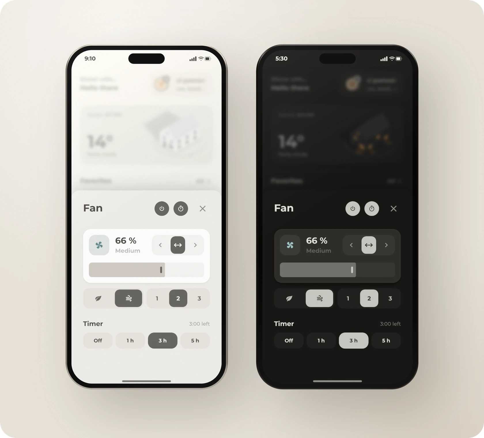
How it works
- The title shows the fan's name. Both the power button and the fan button turn the fan on and off, and the fan icon spins while the fan is running.
- The arrow buttons turn the fan's head with
fan.set_direction. This works with fans that use the direction setting to turn the head, such as Xiaomi fans. The middle button turns oscillation on or off.
- The slider can set any speed. The leaf button selects the
nature preset, and the wind button selects normal. Buttons 1, 2 and 3 set the speed to 33, 66 and 100%.
- The timer button shows the timer row, which has the options Off, 1 hour, 3 hours and 5 hours. When the timer ends, an automation in the package turns the fan off.
- Small templates in the buttons decide which button is filled, for example the button for the fan's current speed range.
Entities
| Entity |
Purpose |
fan.living_room |
The fan, which is an example |
timer.living_room_fan |
The timer, together with the automation that turns the fan off |
input_boolean.fan_popup_timer |
Whether the timer row is visible |
script.fan_oscillation |
Turning oscillation on or off |
The timer, the toggle, the script and the automation are in the package. To use your own fan, replace fan.living_room in the pop-up and in the automation. If your fan uses other preset names, change nature and normal. You can delete the buttons that your fan does not support, such as the arrows. A second fan needs its own copy of the pop-up with its own hash, timer, toggle and automation.
YAML
This pop-up needs Bubble Card, Paper Buttons Row and the package.
type: custom:bubble-card
card_type: pop-up
hash: '#popup_fan'
name: Fan
show_header: false
show_close_button: false
show_name: false
show_icon: false
card_layout: large
margin: 7px
bg_color: var(--popup-background)
bg_opacity: '100'
bg_blur: '10'
shadow_opacity: '20'
hide_backdrop: false
popup_mode: fit-content
with_bottom_offset: true
modules:
- origami_popup
styles: '.bubble-pop-up-container { mask-image: none !important; }'
# Hides the timer row again when you close the pop-up
close_action:
action: perform-action
perform_action: input_boolean.turn_off
target:
entity_id: input_boolean.fan_popup_timer
cards:
- type: vertical-stack
cards:
# The fan's name and the power, timer and close buttons
- type: custom:paper-buttons-row
extra_styles: |
paper-button:active { transform: scale(var(--press-scale)) }
styles:
margin: var(--ha-space-5) 0 var(--ha-space-2) 0
display: grid
grid-template-columns: auto 1fr auto auto auto
grid-template-areas: '"title title power timer close" "chip . power timer close"'
align-items: flex-start
gap: var(--ha-space-1) var(--ha-space-3)
base_config:
layout: icon
styles:
button:
width: var(--control-height-icon)
height: var(--control-height-icon)
padding: 0px
justify-content: center
border-radius: var(--radius-circle)
background-color: var(--fill-subtle)
box-shadow: none
icon:
--mdc-icon-size: var(--icon-size-xs)
margin-right: 0px
name:
padding: 0px
state:
padding: 0px
buttons:
# The fan's name as the title
- entity: fan.living_room
layout: name
tap_action:
action: none
hold_action:
action: none
styles:
button:
grid-area: title
width: auto
height: auto
justify-content: flex-start
background-color: transparent
box-shadow: none
pointer-events: none
name:
padding: 0px
font-size: var(--font-size-headline)
font-weight: var(--ha-font-weight-bold)
line-height: var(--ha-line-height-normal)
color: var(--primary-text-color)
- entity: fan.living_room
icon: mdi:power
tooltip: On or off
tap_action:
action: toggle
state_styles:
'on':
button:
background-color: var(--fill-active)
icon:
color: var(--ha-card-background)
opacity: 1
styles:
button:
grid-area: power
- entity: input_boolean.fan_popup_timer
icon: mdi:timer-outline
tooltip: Timer
tap_action:
action: toggle
state_styles:
'on':
button:
background-color: var(--fill-active)
icon:
color: var(--ha-card-background)
opacity: 1
styles:
button:
grid-area: timer
- icon: mdi:close
tooltip: Close
tap_action:
action: navigate
navigation_path: '#'
styles:
button:
grid-area: close
margin-left: var(--ha-space-2)
background-color: transparent
icon:
--mdc-icon-size: var(--icon-size-l)
color: var(--primary-text-color)
opacity: var(--opacity-muted)
# An empty row that keeps the spacing even
- type: custom:paper-buttons-row
base_config:
layout: icon
tap_action:
action: none
styles:
button:
min-height: 0px
max-height: 0px
padding: 0px
justify-content: flex-start
pointer-events: none
icon:
--mdc-icon-size: 0px
name:
padding: 0px
state:
padding: 0px
buttons:
- icon: mdi:backspace-reverse
# Speed and head direction, then the slider
- type: entities
entities:
- type: custom:paper-buttons-row
extra_styles: >-
paper-button:active { transform: scale(var(--press-scale)) }
paper-button[title^="Turn"]:active, paper-button[title="Oscillate"]:active { transform: none; background-color: var(--fill-strong) !important }
styles:
display: flex
flex-wrap: wrap
align-items: center
gap: var(--ha-space-2)
margin-bottom: var(--ha-space-3)
base_config:
layout: icon
styles:
button:
flex: 1 1 30%
min-width: 0px
height: var(--control-height-row)
padding: 0px
justify-content: center
border-radius: var(--radius-inner)
background-color: var(--fill-subtle)
box-shadow: none
icon:
--mdc-icon-size: var(--icon-size-m)
margin-right: 0px
opacity: var(--opacity-muted)
name:
padding: 0px
font-size: var(--ha-font-size-s)
font-weight: var(--ha-font-weight-bold)
state:
padding: 0px
font-size: var(--ha-font-size-s)
font-weight: var(--ha-font-weight-medium)
opacity: var(--opacity-quiet)
buttons:
# Turns the fan on and off. The icon spins while the fan runs and uses the same colors as the Bubble cards' icons.
- entity: fan.living_room
icon: mdi:fan
tap_action:
action: toggle
state_styles:
'on':
button:
background-color: color-mix(in srgb, var(--org-fan-color) var(--tint-strength), var(--fill-subtle))
icon:
color: var(--org-fan-color)
animation: rotating 2.4s linear infinite
styles:
button:
flex: 0 0 auto
width: var(--control-height)
height: var(--control-height)
--org-fan-color: var(--state-fan-on-color, var(--state-fan-active-color, var(--state-active-color)))
icon:
color: var(--primary-text-color)
opacity: 1
# The speed in percent and its name
- layout: name_state
name: >-
{{ state_attr('fan.living_room', 'percentage') | int(0) if is_state('fan.living_room', 'on') else 0 }} %
state: >-
{% set p = state_attr('fan.living_room', 'percentage') | float(0) %}
{%- if not is_state('fan.living_room', 'on') %}Off
{%- elif state_attr('fan.living_room', 'preset_mode') == 'nature' %}Breeze
{%- elif p <= 34 %}Low
{%- elif p <= 67 %}Medium
{%- else %}High{% endif %}
tap_action:
action: none
hold_action:
action: none
styles:
button:
flex: 1 1 0px
min-width: 0px
height: auto
margin-left: var(--ha-space-2)
align-items: center
justify-content: flex-start
background-color: transparent
box-shadow: none
pointer-events: none
name:
align-self: flex-start
padding: 0px
font-size: var(--ha-font-size-2xl, 24px)
font-weight: var(--ha-font-weight-bold)
line-height: var(--ha-line-height-condensed)
state:
align-self: flex-start
margin-top: var(--ha-space-1)
padding: 0px
font-size: var(--ha-font-size-m)
font-weight: var(--ha-font-weight-bold)
color: var(--secondary-text-color)
# Turns the fan's head on fans that use the direction for this. Holding the button repeats the step.
- icon: mdi:chevron-left
tooltip: Turn left
tap_action:
action: call-service
service: fan.set_direction
target:
entity_id: fan.living_room
service_data:
direction: reverse
hold_action:
action: call-service
service: fan.set_direction
target:
entity_id: fan.living_room
service_data:
direction: reverse
repeat: 400
styles:
button:
flex: 0 0 auto
width: calc(var(--control-height) - var(--ha-space-2))
height: var(--control-height)
border-radius: var(--radius-inner) 0px 0px var(--radius-inner)
# The oscillation button is filled while oscillation is on
- icon: mdi:arrow-left-right
tooltip: Oscillate
state: >-
{{ 'on' if is_state('fan.living_room', 'on') and state_attr('fan.living_room', 'oscillating') else 'off' }}
tap_action:
action: call-service
service: script.fan_oscillation
service_data:
fan: fan.living_room
state_styles:
'on':
icon:
color: var(--ha-card-background)
background-color: var(--fill-active)
opacity: 1
styles:
button:
flex: 0 0 auto
box-sizing: border-box
width: calc(var(--control-height) - var(--ha-space-2))
height: var(--control-height)
padding: var(--ha-space-1)
border-radius: 0px
margin-left: calc(0px - var(--ha-space-2))
icon:
display: flex
align-items: center
justify-content: center
box-sizing: border-box
width: 100%
height: 100%
border-radius: calc(var(--radius-inner) - var(--ha-space-1))
transition: var(--transition-interactive)
- icon: mdi:chevron-right
tooltip: Turn right
tap_action:
action: call-service
service: fan.set_direction
target:
entity_id: fan.living_room
service_data:
direction: forward
hold_action:
action: call-service
service: fan.set_direction
target:
entity_id: fan.living_room
service_data:
direction: forward
repeat: 400
styles:
button:
flex: 0 0 auto
width: calc(var(--control-height) - var(--ha-space-2))
height: var(--control-height)
border-radius: 0px var(--radius-inner) var(--radius-inner) 0px
margin-left: calc(0px - var(--ha-space-2))
- type: custom:bubble-card
card_type: button
button_type: slider
entity: fan.living_room
show_name: false
show_state: false
show_icon: false
scrolling_effect: false
slider_value_position: hidden
modules:
- origami_base
- origami_slider
# Mode and three speeds, as one segmented row
- type: custom:paper-buttons-row
extra_styles: >-
paper-button:active { background-color: var(--fill-strong) !important }
paper-button[data-state="on"], paper-button[data-state="on"] + paper-button { background-image: none !important }
styles:
align-items: stretch
margin: 0px 0px var(--ha-space-3) 0px
padding: 0px
background-color: transparent
box-shadow: none
--pbs-button-bg-color: var(--fill-subtle)
base_config:
layout: name
# The active button shows a filled pill inside the track, like the timer buttons
state_styles:
'on':
button:
background-color: var(--fill-subtle)
icon:
color: var(--ha-card-background)
background-color: var(--fill-active)
opacity: 1
name:
color: var(--ha-card-background)
background-color: var(--fill-active)
opacity: 1
tap_action:
action: call-service
target:
entity_id: fan.living_room
styles:
button:
flex: 1
box-sizing: border-box
height: var(--control-height)
padding: var(--ha-space-1)
background-color: var(--fill-subtle)
border-radius: 0px
box-shadow: none
background-image: linear-gradient(var(--fill-loud), var(--fill-loud))
background-repeat: no-repeat
background-size: 2px 50%
background-position: left center
transition: var(--transition-interactive)
icon:
--mdc-icon-size: var(--icon-size-s)
display: flex
align-items: center
justify-content: center
box-sizing: border-box
width: 100%
height: 100%
margin-right: 0px
border-radius: calc(var(--radius-inner) - var(--ha-space-1))
opacity: var(--opacity-strong)
transition: var(--transition-interactive)
name:
display: flex
align-items: center
justify-content: center
box-sizing: border-box
width: 100%
height: 100%
padding: 0px
border-radius: calc(var(--radius-inner) - var(--ha-space-1))
font-size: var(--ha-font-size-m)
font-weight: var(--ha-font-weight-bold)
opacity: var(--opacity-strong)
transition: var(--transition-interactive)
buttons:
# These are the fan's presets. Use your fan's preset names.
- layout: icon
icon: mdi:leaf
tooltip: Breeze
state: >-
{{ 'on' if is_state('fan.living_room', 'on') and state_attr('fan.living_room', 'preset_mode') == 'nature' else 'off' }}
tap_action:
service: fan.set_preset_mode
service_data:
preset_mode: nature
styles:
button:
flex: 1.5
border-radius: var(--radius-inner) 0px 0px var(--radius-inner)
background-image: none
- layout: icon
icon: mdi:weather-windy
tooltip: Normal
state: >-
{{ 'on' if is_state('fan.living_room', 'on') and state_attr('fan.living_room', 'preset_mode') != 'nature' else 'off' }}
tap_action:
service: fan.set_preset_mode
service_data:
preset_mode: normal
styles:
button:
flex: 1.5
border-radius: 0px var(--radius-inner) var(--radius-inner) 0px
margin-right: var(--ha-space-2)
# Three speeds. The button for the current speed range is filled.
- name: '1'
tooltip: Low
state: >-
{{ 'on' if is_state('fan.living_room', 'on') and state_attr('fan.living_room', 'percentage') | float(0) <= 34 else 'off' }}
tap_action:
service: fan.set_percentage
service_data:
percentage: 33
styles:
button:
border-radius: var(--radius-inner) 0px 0px var(--radius-inner)
background-image: none
- name: '2'
tooltip: Medium
state: >-
{% set p = state_attr('fan.living_room', 'percentage') | float(0) %}{{ 'on' if is_state('fan.living_room', 'on') and 34 < p <= 67 else 'off' }}
tap_action:
service: fan.set_percentage
service_data:
percentage: 66
- name: '3'
tooltip: High
state: >-
{{ 'on' if is_state('fan.living_room', 'on') and state_attr('fan.living_room', 'percentage') | float(0) > 67 else 'off' }}
tap_action:
service: fan.set_percentage
service_data:
percentage: 100
styles:
button:
border-radius: 0px var(--radius-inner) var(--radius-inner) 0px
# Timer row, shown by the timer button. It turns the fan off after 1, 3 or 5 hours.
- type: conditional
conditions:
- condition: state
entity: input_boolean.fan_popup_timer
state: 'on'
card:
type: custom:paper-buttons-row
extra_styles: |
paper-button:active { transform: scale(var(--press-scale)) }
styles:
display: flex
flex-wrap: wrap
align-items: center
gap: var(--ha-space-2)
padding: 0px
base_config:
layout: name
tap_action:
action: call-service
service: timer.start
target:
entity_id: timer.living_room_fan
state_styles:
'on':
button:
background-color: var(--fill-active)
box-shadow: none
name:
color: var(--ha-card-background)
opacity: 1
styles:
button:
flex: 1 1 0px
min-width: 0px
height: var(--control-height-row)
padding: 0px var(--ha-space-2)
justify-content: center
border-radius: var(--radius-inner)
background-color: var(--fill-subtle)
name:
padding: 0px
font-size: var(--ha-font-size-s)
font-weight

 Origami is a theme and dashboard layout for Home Assistant, built from a real home. It can be used only as a visual theme, or as a full pre-built sections dashboard with cards, pop-ups and automation helpers that you adapt to your own entities.