BoardUI




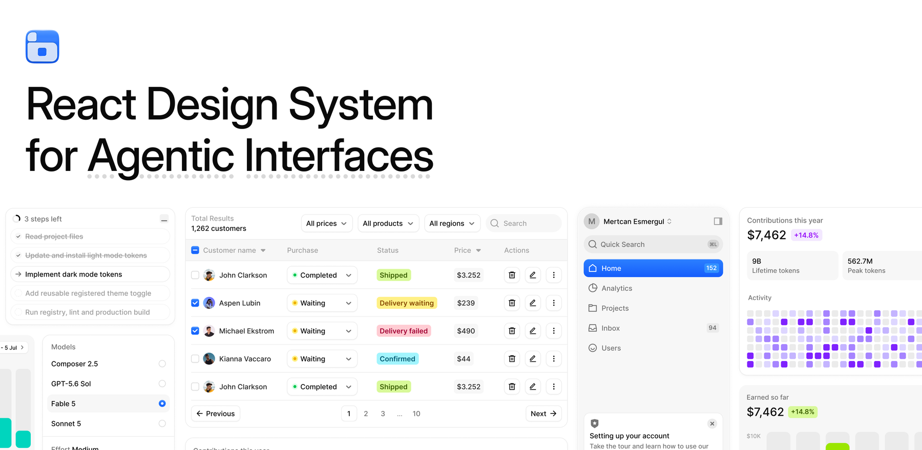
BoardUI is a React design system for agentic interfaces: the parts an AI product needs and the parts every dashboard needs, in one visual language, as source files in your project. This repository is the whole free tier, and its homepage is a working AI chat on your own model key.

Click the button, paste one API key when Vercel asks for it, and the first deploy already answers.
This repository is generated from BoardUI's source and takes no pull requests. See CONTRIBUTING.md.
Why BoardUI?
- Built for agent products. Chat, thinking indicator, agent log, composer and sidebar, next to the tables, cards and forms around them.
- Source, not a dependency.
npx boardui add copies the files into your project. Change anything.
- One visual language. Figma first, 400+ semantic tokens, light and dark from the same classes.
- Accessible by default. React Aria Components underneath, Tailwind CSS v4 on top, no runtime CSS.
- Agent-native. MCP server, agent skill,
AGENTS.md rules and llms.txt, so coding agents build with the system.
What's in this repository
- All 62 free items as source: base components, application blocks, tokens and type scale. The catalogue is below.
- The app: a chat at
/, a dashboard with the two free charts, and sign-in and sign-up screens, all built from the components in this repository. Chat history stays in the visitor's browser. No database.
app/api/chat/route.ts, which reads your key server-side and streams replies. The key never reaches the browser.
Bring your own key
One variable. The provider is read from the key itself:
| Key looks like |
Provider |
Default model |
sk-ant-... |
Anthropic |
claude-haiku-4-5 |
sk-or-... |
OpenRouter |
openai/gpt-5-nano |
sk-... |
OpenAI |
gpt-5.4-mini |
AIza... |
Google Gemini |
gemini-2.5-flash |
vck_... |
Vercel AI Gateway |
openai/gpt-5-nano |
gsk_... |
Groq |
llama-3.3-70b-versatile |
xai-... |
xAI |
grok-4-fast-non-reasoning |
Create the key with a spending limit where the provider offers one: OpenRouter can cap the credits a key may spend, OpenAI has usage limits per project. The key never reaches the browser, but the chat itself is open to anyone who has your URL, so the cap is what bounds the cost.
Set CHAT_MODEL to use a different model. For Mistral or DeepSeek, whose keys have no recognisable shape, add AI_PROVIDER=mistral or AI_PROVIDER=deepseek. For any OpenAI-compatible server (Ollama, LM Studio, vLLM, LiteLLM, Together) set AI_BASE_URL and CHAT_MODEL. Every provider's usual variable (OPENAI_API_KEY, ANTHROPIC_API_KEY, ...) works too. See .env.example.
Run it locally
npm install
cp .env.example .env.local   # then put your key in AI_API_KEY
npm run dev
Install into an existing project
Every component in this repository also installs on its own, as source, into any Next.js project.
With an agent
BoardUI has an MCP server, so Claude Code, Cursor and any MCP client can browse the catalog and install for you. Add it once:
claude mcp add boardui -- npx -y boardui@latest mcp
Cursor and most other clients take the same server in their MCP config:
{
  "mcpServers": {
    "boardui": { "command": "npx", "args": ["-y", "boardui@latest", "mcp"] }
  }
}
Then ask in plain words. "Install every free BoardUI component" installs the whole free catalog in one go. "Add a data table and stat cards to the dashboard" installs just those and wires them in. The rules in AGENTS.md keep whatever it builds on BoardUI's tokens and type scale. Setup for VS Code, Codex and the rest is at boardui.com/mcp.
With the CLI
npx boardui@latest list              # every component, one line each
npx boardui@latest add data-table    # one component and what it depends on
npx boardui@latest add --all         # everything in this repository
Components
Application blocks
Composed screens and panels: sidebars, chat, tables, settings, cards.
| Component |
What it is |
Install |
| Agent Chat |
A working chat app: app sidebar, streaming replies, thinking indicator, a composer pill with stop control, a chat-history rail with local thread switching, and a setup notice when no provider key is set. |
npx boardui@latest add agent-chat |
| Agent Log |
Shared streaming-log machinery: the reveal ticker, the blur-in with its soft clipping edge, and the curved tree guide that draws itself. Behind Task List and Web Search. |
npx boardui@latest add agent-log |
| Agent Thinking |
Agent thinking indicator for chat composers — dot wave, dot spin, stars, and infinity variants with a shimmering label and elapsed timer. |
npx boardui@latest add agent-thinking |
| App Shell |
Page frame for the chat starter: the sidebar, a phone drawer, and a titled content card, carrying the starter's own navigation so the sidebar only links to pages the app has. |
npx boardui@latest add app-shell |
| Auth Card |
Sign-in and sign-up cards with social providers stacked with labels or inline as icons, plus email fields and a CTA. |
npx boardui@latest add auth-card |
| Composer Loader |
Loading state that wraps a chat composer — an iridescent light band orbiting the rim with a soft inward bloom, fading in while the agent works. |
npx boardui@latest add composer-loader |
| Data Table |
TanStack-powered data table with sorting, selection, and pagination. |
npx boardui@latest add data-table |
| Important Alerts Card |
Scrollable alert feed with tinted icon circles and date pills. |
npx boardui@latest add important-alerts-card |
| Notification Center |
Tabbed activity inbox with grouped notifications, unread state, avatars, status icons, and inline actions. |
npx boardui@latest add notification-center |
| Orders Chart Card |
Free chart card: a year of monthly orders as bars, this year beside last year for every month, with a count-up headline, delta chip and hover readout. |
npx boardui@latest add orders-chart-card |
| Patient Info Card |
Profile card with avatar and label/value detail rows. |
npx boardui@latest add patient-info-card |
| Revenue Chart Card |
Free chart card: a year of monthly revenue as an area against the year before, with a count-up headline, delta chip and hover readout per month. |
npx boardui@latest add revenue-chart-card |
| Settings Modal |
Controlled multi-page settings dialog with General, Profile, Tools, and Storage views. |
npx boardui@latest add settings-modal |
| Sidebar |
The floating dashboard sidebar with team menu, nav, announcement, and user menu. |
npx boardui@latest add sidebar |
| Stat Cards |
KPI stat card row with delta chips. |
npx boardui@latest add stat-cards |
| Theme Toggle |
Manual light/dark control with a click-origin reveal, local persistence, and no system-theme dependency. |
npx boardui@latest add theme-toggle |
Base components
The everyday building blocks.
| Component |
What it is |
Install |
| Announcement |
Dismissible announcement card used in the sidebar footer. |
npx boardui@latest add announcement |
| Avatar |
Image or initials avatar in multiple sizes and tints. |
npx boardui@latest add avatar |
| Badge |
Counter pills and the Kbd shortcut hint. |
npx boardui@latest add badge |
| Breadcrumb |
Icon-capable breadcrumb trail. |
npx boardui@latest add breadcrumb |
| Button |
Primary, secondary, ghost, and danger buttons in three sizes with icon support. |
npx boardui@latest add button |
| Button Group |
Row of secondary-style buttons fused into one bordered control with hairline dividers and selectable items. |
npx boardui@latest add button-group |
| Carousel |
Gallery carousel built on CSS scroll-snap: swipe, arrows and a position indicator. |
npx boardui@latest add carousel |
| Checkbox |
React Aria checkbox with animated tick and indeterminate state. |
npx boardui@latest add checkbox |
| Checkbox Card |
Bordered selectable card driven by a checkbox. |
npx boardui@latest add checkbox-card |
| Chip |
Status/delta chips in bold and soft variants across the accent palette. |
npx boardui@latest add chip |
| Close Button |
Compact dismiss button for banners, modals, and chips. |
npx boardui@latest add close-button |
| Date Picker |
Single-date picker with month navigation, built on React Aria. |
npx boardui@latest add date-picker |
| Date Range Picker |
Two-month range picker sharing the date-picker chrome. |
npx boardui@latest add date-range-picker |
| Divider |
Horizontal content divider with single-line, double-line, filled, and aligned variants. |
npx boardui@latest add divider |
| Dropdown |
Composable popover menu (trigger, panel, groups, rows, dividers) built on React Aria — the recipe behind the sidebar team/account menus. |
npx boardui@latest add dropdown |
| File Upload |
Drag-and-drop file upload with validation, animated progress, and a completion callback. |
npx boardui@latest add file-upload |
| Icon Button |
Square icon-only button in two sizes. |
npx boardui@latest add icon-button |
| Input |
Text input with label, hint text, error states, and leading icon support. |
npx boardui@latest add input |
| Input OTP |
One-time-code field with a monospace box per digit, paste distribution and autofill support. |
npx boardui@latest add input-otp |
| Kbd |
Keyboard shortcut hint pill. |
npx boardui@latest add kbd |
| Link Button |
Inline text action styled like a link — primary/secondary variants, three sizes, icon support, renders or . |
npx boardui@latest add link-button |
| Meeting Scheduler |
Date + time-slot scheduler popover. |
npx boardui@latest add meeting-scheduler |
| Notification |
Dismissible notification with status icons, avatars, action buttons, and timed countdown. |
npx boardui@latest add notification |
| Pagination |
Numbered pagination with prev/next and ellipsis collapsing. |
npx boardui@latest add pagination |
| Radio |
React Aria radio group with the gradient selected dot, two sizes, and the bare RadioDot glyph for menu rows. |
npx boardui@latest add radio |
| Radio Card |
Bordered selectable card driven by a radio — the radio flavor of Checkbox Card. |
npx boardui@latest add radio-card |
| Segmented Control |
Pill-style segmented control (Weekly / Monthly / Yearly switchers). |
npx boardui@latest add segmented-control |
| Select |
React Aria select with styled trigger, non-modal popover, and free-form item content. |
npx boardui@latest add select |
| Slider |
Single-value and min/max range sliders with exact-value bubbles and keyboard controls. |
npx boardui@latest add slider |
| Social Button |
Sign-in buttons for 24 providers, with brand logos, three colour treatments and an icon-only form. |
npx boardui@latest add social-button |
| Status Dot |
Colored status indicator dot used inside selects and tables. |
npx boardui@latest add status-dot |
| Switch |
Skeuomorphic toggle switch in two sizes. |
npx boardui@latest add switch |
| Switch Card |
Bordered settings row driven by a switch. |
npx boardui@latest add switch-card |
| Table |
Static table primitives matching the dashboard tables. |
npx boardui@latest add table |
| Tabs |
Underline and pill tab variants built on React Aria. |
npx boardui@latest add tabs |
| Tooltip |
Light-surface tooltip built on React Aria. |
npx boardui@latest add tooltip |
Foundations
Tokens, type scale, global styles, utilities, and the agent rules.
| Component |
What it is |
Install |
| Agent rules |
Always-on design rules for AI agents (semantic tokens, type scale, conventions), installed as a Cursor rule file. |
npx boardui@latest add rules |
| Agent runtime |
Streaming chat endpoint for agent templates: one AI_API_KEY from OpenAI, Anthropic, Google, OpenRouter, Groq, xAI or Vercel AI Gateway (or any OpenAI-compatible server by URL), a config probe for unconfigured deploys, and the message contract the BoardUI chat UI installs against. |
npx boardui@latest add agent-runtime |
| Chevron icons |
Custom chevron glyphs (select caret, sortable table headers) matching the Figma strokes. |
npx boardui@latest add chevrons |
| cx utility |
tailwind-merge wrapper aware of BoardUI's composite text styles, plus the sortCx helper. |
npx boardui@latest add cx |
| Global styles |
Tailwind entry css: dark-mode variant, base resets, component animations, and table styling. Imports theme.css and typography.css. |
npx boardui@latest add globals |
| Logo |
BoardUI brand mark placeholder — swap with your own logo component. |
npx boardui@latest add logo |
| Theme tokens |
Color primitives, semantic tokens (text/background/border/foreground/chart), radii, shadows, and button gradient utilities. |
npx boardui@latest add theme |
| Typography tokens |
The full Figma type scale as composite text-{family}-{weight} Tailwind utilities. |
npx boardui@latest add typography |
| useCountUp hook |
Animated rolling number hook used by chart headline figures. |
npx boardui@latest add use-count-up |
| useDismissOnOutsidePress hook |
Closes React Aria popovers on outside press without swallowing the outside click. |
npx boardui@latest add use-dismiss-on-outside-press |
BoardUI Pro
Everything in this repository is free and complete. Pro adds the full-page templates and the richer components, 8 templates and 23 components, installed into the same project as source: npx boardui@latest login <key> once, then add as usual. One-off payment, no subscription. See www.boardui.com/#pricing.
The 8 templates
| Name |
What it is |
| AI Chat Template |
Full AI chat app: sidebar, resizable code panel, composer with model/effort controls. |
| AI Image Generation Template |
Prompt thread with a live generation frame and feedback actions, plus a gallery panel of past generations. |
| AI Profile Template |
AI contributions profile: cover card with activity heatmap, 30-day agents bar chart, and tokens trend chart. |
| Finance Dashboard Template |
Balance KPIs, a cash-flow sankey, spending rings, portfolio bubbles, a daily spending heatmap, and a transactions data table. |
| Home Dashboard Template |
KPI stat cards, revenue trend, earnings chart, contributions heatmap, and a customers table in a responsive app shell. |
| HR Management Template |
Headcount KPIs, recent hires, hiring pipeline, engagement radar, hires vs. attrition, team breakdowns, and an employees data table. |
| Marketing Dashboard Template |
Campaign KPIs, acquisition funnel, spend by channel, traffic sources, ad spend vs. ROAS, visitors by channel, and a campaigns data table. |
| Medical Report Template |
Patient overview with steps, sleep score, activity rings, and most-active-days charts. |
The 23 components
| Name |
What it is |
| Activity Rings Card |
Apple Watch-style concentric goal rings with stat tiles. |
| Agent Limits Card |
Context window usage bar with an expandable token breakdown, collapsible groups, and plan usage limits with reset times. |
| Agent Progress |
Collapsible multi-step AI task progress with animated active, pending, and completed states. |
| [Area Chart Card](https:/ |
|

 BoardUI is a React design system for agentic interfaces: UI pieces an AI product needs (chat, thinking indicators, agent logs) plus the usual dashboard pieces (tables, cards, forms), delivered as source files you copy into your own project.